Gold – Potential Choppy Price Action AheadThe market got what it wanted from the Federal Reserve last night when a widely anticipated interest rate cut of 25bps (0.25%) was announced, a move which as a rule is positive for Gold prices as it is an asset that doesn’t bear any interest itself. Initially this was the case, with the popular metal trading from opening levels at 4210 before the Fed decision on Wednesday up to a one week high of 4248 early this morning. However, that is where the positive story ended and Gold prices have since traded back down to 4210 again at the time of writing (0700 GMT).
On a longer-term basis, the drivers underpinning prices still seem to remain in place, namely central bank buying dips, concerns over swelling government debt and an uncertain geopolitical outlook, but in the short-term Gold prices could be at the mercy of general risk sentiment, which is wavering after a disappointing Q3 earnings release from Oracle overnight, and positioning readjustment. This situation isn’t helped by the reality that there is little in the way of scheduled risk events for traders to focus on until the release of US Non-farm Payrolls next Tuesday, December 16th (1330 GMT) and the interest rate decisions from the Bank of England, European Central Bank (December 18th) and Bank of Japan (December 19th).
This backdrop could suggest potential for some choppy price action ahead which may require traders to keep monitoring important support and resistance levels that could impact the direction of Gold moving forward.
Gold Technical Update: Watching the 4245/4265 Resistance Band
Since posting the 4381 October 20th high and 3887 October 28th low, Gold has entered a more balanced phase of sideways trading between these extremes. The over‑extended upside price conditions seen after the recent sharp acceleration higher are currently being unwound by this activity.
This current balance between buyers and sellers is evident in the chart below, but it also highlights that no successful closing breakout has yet materialised in price.
Gold’s initial response to the Fed interest rate cut and subsequent press conference yesterday was more positive, with fresh price strength emerging. However, there is still no evidence of a successful breakout to the topside on a closing basis.
As such, maintaining an awareness of both key support and resistance levels could be important in gauging whether the recent sideways trading range is nearing an end.
Possible Resistance Levels:
As the chart below highlights, there is a combination of potential resistance levels situated just above current price activity. This zone reflects both the downtrend line connecting price highs back to October 20th, which sits at 4245 and the December 1st high at 4265. Having previously marked areas where selling pressure has emerged, traders may now be focused on how this resistance band is defended on a closing basis.
Closing breaks above 4245/4265 could lead to a fresh phase of price strength, marking an upside break in Gold from its sideways activity. While not a guarantee of sustained gains, such a move could open potential to challenge the 4381 October 20th extreme and possibly extend further if that level also gives way on a closing basis.
Potential Support Levels:
For now, the 4245/4265 resistance band remains intact. While this area continues to cap attempts at price strength on a closing basis, risks may shift toward the downside, bringing the Bollinger mid‑average at 4155 into play as a potential support level to monitor.
Closing breaks below this support at 4155, if seen, could suggest scope for continued declines toward 3998, the November 18th low. If this level also gave way, it may open the path toward 3887, the October 28th downside extreme.
The material provided here has not been prepared accordance with legal requirements designed to promote the independence of investment research and as such is considered to be a marketing communication. Whilst it is not subject to any prohibition on dealing ahead of the dissemination of investment research, we will not seek to take any advantage before providing it to our clients.
Pepperstone doesn’t represent that the material provided here is accurate, current or complete, and therefore shouldn’t be relied upon as such. The information, whether from a third party or not, isn’t to be considered as a recommendation; or an offer to buy or sell; or the solicitation of an offer to buy or sell any security, financial product or instrument; or to participate in any particular trading strategy. It does not take into account readers’ financial situation or investment objectives. We advise any readers of this content to seek their own advice. Without the approval of Pepperstone, reproduction or redistribution of this information isn’t permitted.
Community ideas

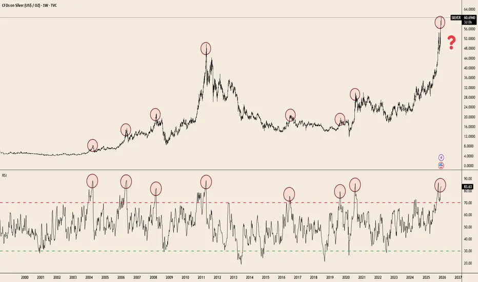
Silver at Extremes: RSI Signals Haven’t Missed in 20 YearsTVC:SILVER has delivered a massive breakout — up +109.9% YTD — but the weekly RSI is now pushing into one of the most extreme zones seen in two decades. Historically, every major spike into the 80–85 RSI band has preceded cooling periods, consolidations, or full reversals.
The chart makes the pattern clear:
• Each parabolic advance since 2004 ended with RSI extremes similar to today.
• Price is testing the same overextension zone seen at the 2011 blow-off top and the 2020 surge.
• Weekly RSI rarely stays above 80 for long — momentum tends to reset before the next leg can form.
This doesn’t guarantee a top.
But when a commodity doubles in a single year and hits long-term RSI ceilings simultaneously, risk/reward becomes asymmetric.
Silver’s trend remains powerful — the question now is how sustainable the slope is.
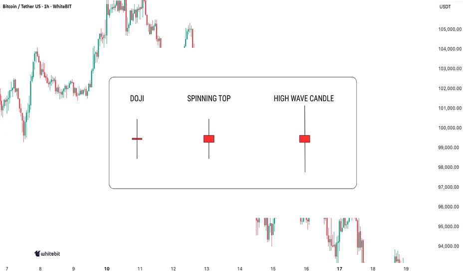
Indecision on the Chart: What These Candles Really MeanIndecision in the market? You're not alone. Every trader has faced those moments when the charts seem to scream confusion. But here's the thing: indecision candlestick patterns aren't just noise. They hold secrets that, when decoded, can give you the upper hand. Let's dive in and learn how to spot these patterns and use them to your advantage.
Mastering Indecision Candlestick Patterns
The most well-known indecision candles are the Doji, Spinning Top, and High Wave Candle. These candlesticks might seem tricky at first, but once you learn to recognize them and understand their context, they can serve as valuable tools in your trading strategy.
Doji
A Doji has a small body with nearly identical open and close prices, and long upper and lower wicks, indicating market indecision—neither buyers nor sellers gain control during that period.
When to look for confirmation: A Doji alone isn’t enough to trade. Wait for confirmation from the next candle: a bearish one after an uptrend may signal a reversal, while a bullish one after a downtrend might indicate the start of a rally.
Spinning Top
A Spinning Top is an indecision candle with a small body and longer upper and lower shadows. It indicates uncertainty, with more volatility than a Doji.
When to look for confirmation: A Spinning Top is more meaningful after a strong trend. Following an uptrend, it could signal weakening momentum. Wait for the next few candles to confirm the market’s direction.
High Wave Candle
The High Wave Candle is like the Spinning Top but with even longer wicks. It shows high volatility with no clear direction, as the price fluctuates widely but the open and close remain close, indicating indecision.
When to look for confirmation: Use the High Wave Candle with trend analysis. If it appears during consolidation or after a major move, it may signal a breakout. As with other indecision candles, wait for confirmation before acting.
Combining Indecision Candles with Indicators
While indecision candle patterns can provide useful insights, they are most effective when combined with other technical indicators. Here are some ways to use them in combination:
Moving Averages: Use moving averages (like the 50-period or 200-period) as a trend filter. If a Doji or Spinning Top forms above a moving average and the next candle confirms a reversal, it may signal trend continuation.
Relative Strength Index (RSI) : If an indecision candle forms when RSI is at extreme levels (above 70 or below 30), it may signal an upcoming pullback or reversal.
Volume: A high-volume candle following an indecision candlestick often confirms strong follow-through. Without volume, these patterns may be less reliable.
Where to Avoid Using Indecision Candles
While indecision candles are useful, there are some scenarios where relying on them without confirmation can be misleading:
Choppy Markets: Indecision candles appear frequently and may not signal real reversals.
During News Events: Sharp price spikes can create false indecision signals.
Lack of Context: A Doji in sideways price action has less significance than one after a strong trend.
Indecision candles signal uncertainty, but don’t act on them blindly. Always combine them with other analysis and make decisions based on your own judgment!
If you don’t know this pattern, you’ll miss out the main profits🌀 Complete Guide to Rounded Bottom and Rounded Top Patterns for Traders
The rounded bottom and rounded top patterns are among the most reliable reversal patterns in technical analysis. They form gradually and usually indicate a major trend reversal in the market.
🔵 Rounded Bottom Pattern
📌 Definition
A rounded bottom forms when the price gradually declines and then slowly starts to rise.
This pattern looks like a large U-shape or semicircle.
📌 Nature of the Pattern
Downtrend → exhausted
Sellers → weakening
Buyers → gradually entering
📌 Key Features
1️⃣ Gradual Formation
Unlike double bottoms or twin peaks that form quickly, this pattern takes time.
2️⃣ Gradual Volume Decrease
Volume decreases at first
Lowest volume occurs in the middle
Volume rises again as the price recovers
⚠️ In low-volume markets (e.g., some crypto assets), be cautious.
3️⃣ No Sharp Candlestick Shadows
Candles usually have smooth and steady movement.
4️⃣ Curved Path
The price moves along a curved trajectory.
🔍 How to Identify a Rounded Bottom
The prior trend must be downward. Without a preceding downtrend, the pattern is meaningless.
Candles should start from a point and move with low volatility, indicating a “tired” market.
The middle of the pattern has lowest price fluctuation and volume, like the bottom of a bowl.
After the midpoint, candles gradually become larger and buyers gain strength.
If a curved line is drawn, the price should not break it; otherwise, the pattern is invalid.
🔵 Rounded Top Pattern
Same as the rounded bottom, but in reverse.
Prior trend: uptrend
Buyer enthusiasm decreases
Price gradually reverses
Price begins to decline
🎯 Best Timeframes
H1, H4, D1
Smaller timeframes (1m, 5m, 15m) are noisy and can produce false breakouts.
🧠 Entry Points (Trading Setup)
1️⃣ Entry after Breakout (Safer)
Rounded Bottom: draw a resistance line at the highest peak on the right → enter when candle closes above it.
Rounded Top: draw a support line → enter short after a confirmed breakout.
2️⃣ Entry on Pullback (Lower Risk + Higher Reward)
Wait for the price to pull back after the breakout
Enter after confirmation of the reversal
🛑 Stop Loss
Rounded Bottom: below the center or lowest point on the right
Rounded Top: above the center or highest peak on the right
🎯 Take Profit
Set the target equal to the height of the pattern from the breakout point.
Subsequent targets can be set at next support/resistance levels.
✔️ Psychological Aspect on Chart
Rounded Bottom: 🟢 from despair to hope
Rounded Top: 🔴 from euphoria to selling pressure
🎯 Professional Confirmation Filters
Positive divergence in rounded bottom
Negative divergence in rounded top
Volume increase after breakout
Strong breakout candle
⚠️ Common Mistakes
Using very small timeframes → fractal patterns look like rounded but are false
Entering before breakout → most common cause of losses
Drawing wrong curve → sharp spikes or shadows invalidate the pattern
Ignoring volume → shallow markets (e.g., small altcoins) can distort the pattern
📌 Golden Rule for Traders
Rounded Bottom → signals the start of a long-term uptrend
Rounded Top → signals a correction or temporary decline
✅ Best practice: enter at the breakout point and ride the main trend

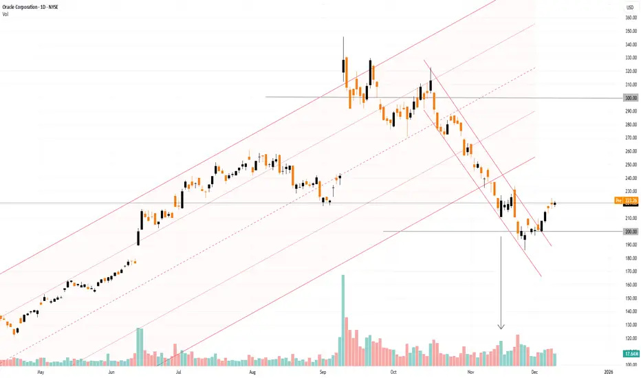
Oracle (ORCL) Share Price Rebounds Ahead of Earnings ReleaseOracle (ORCL) Share Price Rebounds Ahead of Earnings Release
Oracle is due to publish its quarterly results today after the close of the main trading session. Analysts are expecting solid year-on-year growth compared with the same period last year:
→ Revenue: forecast to rise by around 15% to $16.15–16.2 billion.
→ Earnings per share (EPS): expected at $1.63–1.65, up roughly 11%.
At the same time, the market’s focus will be on the company’s plans in two key areas:
→ Order backlog growth: investors are looking for confirmation that demand for AI infrastructure remains strong. Previously, orders exceeded $500 billion.
→ Debt and capital expenditure (capex): Oracle is spending aggressively on data centres (capex could rise to as much as $25 billion per year) while taking on additional debt. This has raised concerns that costs may be increasing faster than the actual profits generated from AI.
Today’s results are particularly important in light of the market reaction to the previous earnings release.
On 15 September, we noted that ORCL shares surged with a bullish gap above the psychological $300 level. Since then, however, the share price has fallen by more than 30%. One possible explanation is that “smart money” used the spike in speculative demand to lock in profits on long positions — a view supported by exceptionally high trading volumes. Once demand faded, the price moved lower within a descending channel.
Within the broader long-term channel (shown in orange), the price briefly broke below the lower boundary but failed to follow through. Meanwhile, the narrowing candle body on 21 November (marked by the arrow), combined with a spike in volume, may suggest that institutional investors were absorbing selling pressure, potentially signalling expectations of higher prices ahead.
Positive signs include:
→ a false bearish break below the psychological $200 level;
→ a break of the red downward trajectory;
→ a rise in ORCL shares in pre-market trading today.
If Oracle’s actual results and management’s outlook impress investors, the ORCL share price could move back into the orange ascending channel.
This article represents the opinion of the Companies operating under the FXOpen brand only. It is not to be construed as an offer, solicitation, or recommendation with respect to products and services provided by the Companies operating under the FXOpen brand, nor is it to be considered financial advice.
USDJPY breakout supported at 155.60The USDJPY remains in a bullish trend, with recent price action showing signs of a corrective pullback within the broader uptrend.
Support Zone: 155.60 – a key level from previous consolidation. Price is currently testing or approaching this level.
A bullish rebound from 155.60 would confirm ongoing upside momentum, with potential targets at:
158.00 – initial resistance
159.00 – psychological and structural level
159.70 – extended resistance on the longer-term chart
Bearish Scenario:
A confirmed break and daily close below 155.60 would weaken the bullish outlook and suggest deeper downside risk toward:
155.00 – minor support
154.60 – stronger support and potential demand zone
Outlook:
Bullish bias remains intact while the USDJPY holds above 155.60. A sustained break below this level could shift momentum to the downside in the short term.
This communication is for informational purposes only and should not be viewed as any form of recommendation as to a particular course of action or as investment advice. It is not intended as an offer or solicitation for the purchase or sale of any financial instrument or as an official confirmation of any transaction. Opinions, estimates and assumptions expressed herein are made as of the date of this communication and are subject to change without notice. This communication has been prepared based upon information, including market prices, data and other information, believed to be reliable; however, Trade Nation does not warrant its completeness or accuracy. All market prices and market data contained in or attached to this communication are indicative and subject to change without notice.

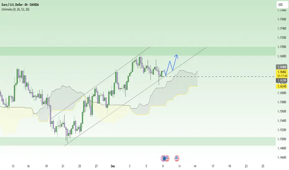
Waiting for the Fed: EURUSD set to explode!When the entire market is focused on the upcoming Fed meeting , EURUSD looks like an athlete that has fully warmed up and is just waiting for the starting whistle. The current context slightly favors the euro, as the Fed is expected to cut rates soon after a series of weakening labor data, while Eurozone GDP and inflation remain relatively stable. With U.S. interest rates trending lower and the ECB not too dovish, conditions are quite supportive for the euro to regain strength against the USD.
On the H4 chart, price has repeatedly bounced from the lower boundary of the ascending channel and the Ichimoku cloud, showing that the main trend is still upward. The area around 1.1630 acts as a near support level, aligning with the trendline and the upper edge of the cloud, meaning any pullback here is more of a buying opportunity rather than a reversal signal.
The preferred scenario is that if price holds above 1.1630 and forms a strong bullish candle, EURUSD may continue climbing towards 1.1680, which is the previous high and a short-term resistance zone. In short, with both fundamentals and technicals aligned, the sensible strategy right now is to wait for a retest of support to buy with the trend, instead of trying to call a top in a market still driven by bullish fundamentals .
UNH: 50% Inception"All I want to buy in 2025 is Healthcare" has been what I've told people that ask me about this tech stock or that AI company. It is my nature to look for what sector is the most downtrodden and find opportunity there... NOT in what "everyone" is talking about. I still feel that way as 2025 comes to a close.
The big move in this sector this year was $NYSE:UNH. I played this a few ways on the drop. My first entry was on the raw 50% Retracement of the trend from the bottom of 2008 to the All Time High of November 2024. Such a fast and deep retracement on such a high capitalization stock cannot be ignored. These things come around literally once per generation.
The second entry was the Volume Profile level of the pre-COVID years. This was the last possible Support and if price had traded any lower I would have had to cut my position for risk management. However, it was then soon reported that both the GOAT trend trader, Warren Buffet... and the GOAT contrarian Michael Burry... had BOTH taken large positions in the company and price responded bullishly.
I have continued to watch my position and today on my scanner for morning 30m Spikes I saw UNH.
This Spike comes at the near perfect intersection of both the short term (November 19th-December 4th) trend AND the long term generational 50%. It's a "must take" trade so I added it to my short term trading accounts to supplement my long term position.

Solana ~ TRADE The CHOP: 3 Ways to Make ATLEAST +15%Choppy markets are identified by low volume and sideways trading / range trading. It seems uninteresting in most cases, but you don't have to sit around and wait for the next big impulse wave!
Here are three plays YOU can take during choppy markets:
1) 4H : Short Resistance
Chop trading can be a blessing - the price often touches the same support zone and the same resistance zone 2 - 3 times, before breaking out either way. This means that if you spot your zone early, you could take a short timeframe swing trade. Another way to find a trade is to look for gaps in the candles, for example:
2) 4H : Long Support
South Africa is in a time of turbulence, and the Rand is unpredictable as the effects of G20 settle in. During these times, and this counts for all markets, placing a low risk leveraged long on support is a way to trade the chop:
3) Daily : SPOT Hold to TP Zone
Nothing like a classic low risk trade - but you may need some patience with it! If you're not willing to look at charts all day, or have alarms wake you up at 2:30am to take a trade then this is your style., for example:
What do you do during choppy markets?

Trading Wedges - Quick Guide in 5 StepsWelcome back everyone to another guide, today we will speed run "Trading wedges" in a quick 5 step guide. Be sure to like, follow and join the community!
1) Identify the wedges:
- Falling Wedge
- Rising Wedge
- Symmetrical Wedge (Triangle)
2) Identify Breakout Direction:
- Falling Wedge > Bullish Breakout Expected
- Rising Wedge > Bearish Breakout Expected
- Symmetrical Wedge (Triangle) > Consolidation Expected
Breakout should show a candle closing outside the wedge.
3) Wait for retest to take place on previous key level or resistance (which would now be support)
If the retest holds with a strong rejection candle or consolidation - begin to long.
4) Enter Trade:
Enter on successful retest confirmation
SL for longs should be below previous low's
SL for shorts should be above previous highs.
5) TP levels:
TP 1) First high target
TP 2) Second high target
TP 3) Third high target.
RESULTS:
Price has soared up high and hit all three Take profits.
For trader who are wanting more profits you can potentially enable TP trailing afterwards - however I don't recommend this as you need to factor in your emotions of "GREED"
Thank you all so much for reading! Hopefully this is a useful guide in the future or present! If you would like me to make any simplified guides, let me know in the comments below or contact me through trading view!

Tesla Stock Lifts 2025 Gains to 20% as Traders Eye Santa RallyA megacap squeezing in one more rally before year-end? Yes, please.
🚗 A Holiday Glide Higher for Tesla Shares
Tesla NASDAQ:TSLA is heading into December with solid momentum. Coming into Monday, the stock has risen 20% since January, putting it on track for a third straight annual gain .
Investors will gladly take it. Tesla isn’t exactly a low-volatility cuddle toy — this is a stock that fell 65% in 2022, then turned around and doubled in 2023, then tacked on another 63% in 2024.
Still, the long arc is impressive: since Tesla's 2010 IPO, the stock has only posted annual declines twice — in 2016 and that infamous crash year of 2022. This year’s 20% gain looks tame by Tesla standards, but context matters: tame is good.
🎅 Santa Rally Season: Will Tesla Join the Party?
This is the time of year when traders start looking for that special year-end swing called Santa rally.
Fortunately, December has been good to Tesla shares. Really good. The stock has risen in more than half of all Decembers since its flotation 15 years ago, with nine monthly gains and six declines over its life as a public company.
Why does the Santa rally happen?
• Some say it’s psychology: investors in a good mood tend to buy.
• Some say it’s portfolio managers smoothing out their year-end reports.
• Others point to tax strategies, retail flows, or just holiday optimism.
No one really knows — which makes it the perfect market myth. But if Santa does show up this year, Tesla benefits. A few cheerful sessions could be enough to lock in another positive annual finish.
Just don’t confuse December with easy money. Historically, it’s just as volatile as every other month — and sometimes worse.
🔥 When December Isn’t So Jolly
Want a reminder that Tesla can rewrite the script in both directions? Look no further than December 2022, when the stock plunged 37% in a single month.
Back then, investors worried CEO Elon Musk’s bold acquisition of Twitter (now X) was consuming far too much of his attention — at the cost of Tesla’s market cap.
The 2025 backdrop is far calmer. Today’s concerns are more traditional Tesla fare:
• How many cars will it deliver?
• What will margins look like?
• Is the growth runway intact?
• What type of robots will Elon talk about on the next call?
December can still swing.
📦 Deliveries: The Real Catalyst on Deck
But traders love a year-cap rally. Even more so when there’s something to bet on.
Expectations for Tesla’s Q4 2025 deliveries sit between 507,000 and 512,000 vehicles, a number that would help confirm a steady, if not explosive, growth narrative.
More importantly, full-year 2025 deliveries are projected to exceed 2 million units, aligning with Elon Musk’s long-term growth target of 20–30% year-over-year production.
In Tesla’s world, hitting numbers is the difference between “Tesla has momentum” and “Tesla is broken again.”
That means Q4 data — arriving Thursday, January 1 or Friday, January 2, 2026 — will be key for this year’s narrative. The numbers drop early in the morning while everyone is still recovering from celebrations, and suddenly your phone buzzes with either joy or existential dread.
Earnings are a big factor, too. The next report date, as per the earnings calendar , is set for January 28.
🎁 The Takeaway: A Rally Within Reach
Tesla’s 20% gain in 2025 looks solid heading into the final stretch, and seasonality is on its side.
• December tends to be kind.
• Santa rallies tend to lift boats.
• Analysts are optimistic about deliveries.
• The stock has historical resilience.
But this is still Tesla — a stock with a personality, a fanbase, a fierce opposition , and a volatility profile that can make your stomach churn.
Off to you : How do you see Tesla stock performing in December? Share your views in the comments!

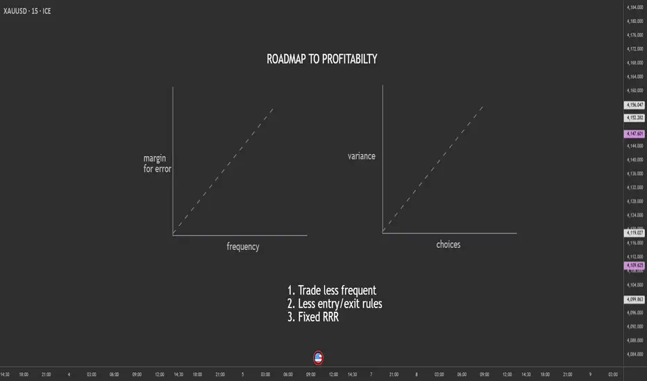
Trade Less, Choose Less, Profit More: The Counterintuitive Edge.Most retail traders believe they need more—more trades, more setups, more indicators, more signals. But in reality, the traders who survive (and thrive) do the opposite. They trade less frequently, reduce the number of decisions, and lock in a fixed risk-to-reward ratio that keeps their edge stable.
Here’s why simplifying your trading increases your chances of long-term profitability.
1. Trading Less Reduces Mistakes
Every trade is a decision.
Every decision carries emotional and cognitive load.
The more trades you take:
the more tired your brain becomes
the more emotional impulses creep in
the more likely you are to overreact to noise
the more commissions/spreads you pay
the more small errors compound into big losses
By reducing trading frequency, you automatically reduce the number of opportunities for mistakes.
Fewer trades → Higher quality → More consistency.
Elite traders don’t take every “okay” trade.
They wait for the A+ setups that align perfectly with their plan.
2. Fewer Choices = Lower Variance in Outcomes
When you have too many signals, too many strategies, or too many timeframes, your decision-making becomes inconsistent. Choice overload raises the variance in outcomes—you might catch a big win today and then give it all back tomorrow on impulsive trades.
Reducing choices tightens your performance curve.
When you:
trade one setup type
focus on one pair or market
use one timeframe
follow one clear trigger
…your results stabilize. The randomness disappears, and your edge becomes measurable.
A stable edge is a profitable edge.
3. A Fixed RRR Protects You From Yourself
Most traders blow accounts not because of strategy, but because of inconsistent risk-to-reward ratios.
Sometimes they take 1:3, sometimes they settle for 1:1, sometimes they hold for 1:6 and give it back. This inconsistency destroys expectancy.
A fixed RRR:
forces discipline
keeps losses small
standardizes wins
makes your edge mathematically trackable
creates predictable long-term performance
Your job is NOT to predict the market.
Your job is to control the asymmetry between risk and reward.
A consistent 1:2 or 1:3 turns even a 40% win rate into profitability.
Final Thought
If you feel stuck, overwhelmed, or inconsistent, don’t add more tools.
Remove them.
The fewer decisions you have to make, the fewer mistakes you make.
The fewer trades you take, the higher your quality becomes.
And the more consistent your RRR, the more likely you are to stay profitable.
In trading, less really is more.
Understanding the Midpoint Magnet: Weekly Price Filling The concept of 50% price filling on a weekly candle within a consolidation area relates to the common technical analysis practice of looking for a midpoint retracement before a potential breakout. When an asset's price enters a consolidation phase on the weekly chart—meaning it's trading sideways within a defined high and low (often forming patterns like rectangles or triangles)—traders view the 50% level of that range (the distance from the high to the low) as a key point of equilibrium or balance between buyers and sellers. This level, which is a psychological point often included in the Fibonacci retracement tool despite not being a true Fibonacci ratio, can act as a magnet where price action is likely to 'fill' or return to before initiating the next major move. Therefore, a weekly candle's wick or body penetrating and reversing at this 50% level suggests a rebalancing of orders and offers a high-probability zone for traders to anticipate either a continuation of the prior trend or a strong breakout from the consolidation range.
Consolidation area
Identifying Consolidation and Key Levels
Consolidation Area: The broader charts show the price of Gold Spot (XAUUSD) entering a period of sideways trading, characterized by alternating weekly bullish (green) and bearish (red) candles, often within a defined high and low range. This area represents a balance or indecision between supply and demand.
Key Candle/Range: The concept then focuses on a specific high-momentum candle (e.g., the Nov 2nd Week Candle) or the entire range of the consolidation to establish the boundaries for the analysis.
The 50% Level: The critical level is the 50% retracement (or midpoint) of this chosen range. This level is considered the Equilibrium (EQ) point, where buyers and sellers are perfectly balanced.
Example
On this chart, we see:
Each weekly candle dipped into the midpoint of the one before it,
Created reaction,
And built a foundation for continuation.
As long as the market keeps holding above the 50% zone, the structure remains intact and biased toward continuation.
During consolidation phases, the market often displays a repetitive behaviour:
each weekly candle tends to retrace and fill approximately 50% of the previous week’s candle before continuing in either direction.
This happens because the midpoint of a strong weekly candle is a fair value zone, where:
liquidity is gathered,
trapped orders are resolved,
and the market achieves balance before the next move.
How the Chart Demonstrates This
November 2nd week candle
A large bullish candle created a strong move upward.
This left an imbalance in price.
The midpoint of this candle sits around 4,122.
Following weeks
Price entered consolidation.
Each weekly candle retraced into the 50% zone of the previous week’s candle.
When price reached the midpoint, buyers stepped in again, causing a bounce.
Repeat Structure
This pattern repeated across the next candles:
wick down → fill midpoint → rejection → continuation
Showing a rhythmic behaviour characteristic of consolidation:
Slow pullback
Midpoint fill
Reaction
Next candle repeats
Current Candle
Again moved back into the midpoint zone, confirming the same behaviour.
Holding above the 50% level maintains a bullish continuation structure.
Why This Happens
The 50% zone of a strong candle is often where:
-institutions reload
-pending orders sit
-imbalances are corrected
This zone is neither expensive nor cheap — it’s fair value.
So, during sideways phases, price frequently returns there to:
✔ collect liquidity
✔ balance the market
✔ establish support or resistance
Before the next directional move occurs.
Key Takeaway
In consolidation, the market does not trend strongly.
Instead, it oscillates around the previous candle’s midpoint.

Why Bitcoin Endures While 90% of Altcoins Are Born to… Die Over more than five years of observing the crypto market, one clear pattern stands out: Bitcoin survives every cycle, while most altcoins only last a few storms before vanishing. This is not a subjective impression but a reality that any serious investor must understand. Bitcoin and altcoins differ in origin, value, and market strength, and these differences are what allow BTC to endure while most altcoins fade away early.
Bitcoin was created with the mission of becoming “digital gold.” It has a fixed supply of 21 million, operates in a decentralized manner, is not controlled by any single organization, and is widely accepted as a global asset. In contrast, around 90% of altcoins are launched primarily to raise capital, for marketing purposes, or to chase technological trends. Bitcoin exists because of real value; altcoins exist on temporary expectations. When these expectations fade, altcoins die, while trust in BTC grows, allowing Bitcoin to continue evolving and remain a cornerstone of the market.
Another distinction lies in cycles. Bitcoin follows a four-year halving cycle, moving through stages of accumulation, boom, correction, and re-accumulation. BTC consistently surpasses previous highs thanks to its stable cycle and long-term capital, which ensures enduring vitality. Altcoins, however, often experience a short life cycle: launch, hype, pump, dump, and eventual oblivion. Most altcoins stop at the final stage and never return to previous peaks, while Bitcoin always finds a way to reach new highs, demonstrating superior resilience.
Capital backing is also a decisive factor. Bitcoin is accumulated by ETFs, major banks, financial institutions, certain countries like El Salvador, and large corporations such as MicroStrategy. This represents long-term, sustainable capital capable of withstanding market fluctuations. Altcoins, on the other hand, rely mainly on short-term traders, retail FOMO, or social media marketing, making their prices highly volatile when capital exits. Thanks to stable institutional flows, Bitcoin is continuously accumulated and is rarely at risk of “dying” in any cycle.
Token structure creates another clear difference. Altcoins often undermine their own value through tokenomics: early unlocks, large team allocations, high inflation, and weak real demand. Bitcoin is entirely different: fixed supply, no one can mint more, and halving reduces supply over time. This increasing scarcity acts as a shield for its value, explaining why Bitcoin endures over time.
The biggest distinction also lies in the role of each type of currency. Bitcoin serves as the standard and backbone of the market; altcoins are merely “experimental products.” When BTC rises, altcoins revive; when BTC moves sideways, altcoins pump along with the flow; when BTC drops sharply, altcoins crash the hardest. This is a crucial reason for investors to understand that Bitcoin is a real asset, whereas altcoins are interchangeable products that can fail at any time.
Smart investing starts with understanding this difference. Bitcoin survives because of trust, economic structure, and real value, while altcoins exist on expectations, marketing, and short-term capital. To thrive long-term in the crypto market, you should treat Bitcoin as a foundational, enduring pillar and view altcoins as short-term, high-risk opportunities. Once you grasp this rule, you will avoid being swept into “moonshot” projects or holding altcoins that never return to previous highs, and instead invest with strategic vision rather than emotion.

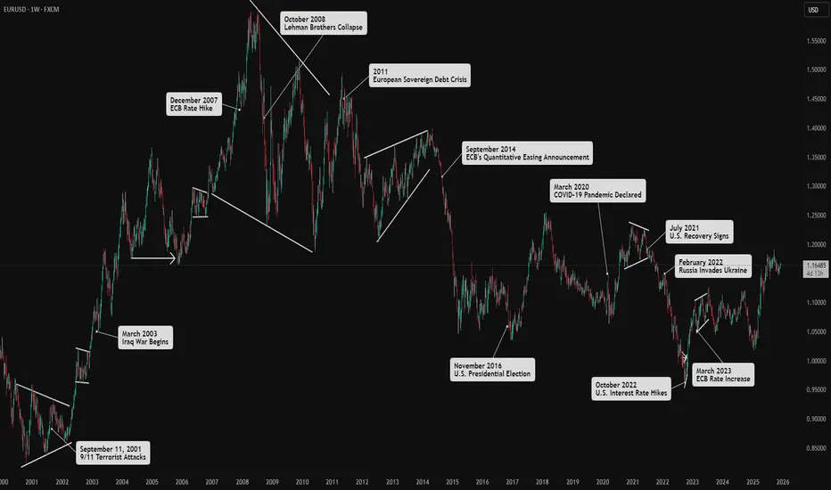
How Market Drivers Influence Forex PhasesI examined the key drivers and major players in the Forex market. Price patterns are a direct reflection of human psychology responding to significant events and the subsequent flow of institutional money. Therefore, understanding what influences overall market direction is crucial.
Above, you'll find a few historical events on the EUR/USD chart to analyze their effects on price movements.
Below is a brief overview of the four main drivers and the role of speculation in the Forex market.
******************
Key Triggers for Market Shifts
Market shifts in Forex are influenced by several key drivers. Grasping these drivers enables better identification of market phases and the price patterns that emerge within them.
Economic Health
Refers to consumers' financial stability and purchasing power.
A healthy consumer sector boosts economic growth and strengthens a country's currency.
Positive consumer sentiment leads to bullish currency trends, while negative sentiment results in bearish trends.
Monetary Policy
Central banks influence currency rates through interest rate policies.
Decisions regarding interest rates are high-impact news in Forex.
Central banks aim for maximum employment and inflation control, affecting currency value through their policies.
Fiscal Policy
Government expenditure on services and infrastructure impacts aggregate demand and GDP.
Increased spending can stimulate the economy, leading to currency appreciation.
However, if spending is funded by borrowing, it may lead to a higher budget deficit, causing loss of investor confidence and currency depreciation.
Political Stability
Refers to the reliability of a country's government and policies.
Stability encourages foreign investment and capital inflow, leading to currency appreciation.
Political unpredictability can deter investment and negatively impact currency value.
******************
Role of Speculation
Speculation from investors, based on perceived outcomes of these market drivers, creates volatility.
Major Market Players:
Investment Banks: The largest players in the Forex market, trading significant volumes between themselves and on behalf of clients like hedge funds and governments.
Hedge Funds: The third-largest players, trading pooled capital with long-term strategies.
Retail Traders: Although they contribute a high volume of transactions, their collective impact is smaller compared to institutional investors.
Speculation fuels volatility and price fluctuations.
Understanding these components helps identify patterns in the Forex market, leading to better trading strategies.
When to Trade — When to Stay OutWhen to Trade — When to Stay Out: A Deep, Practical Guide for Traders
Timing is a core edge. Not every hour, session, or chart condition is trade-worthy. The difference between a profitable trader and an active losing trader is not how many trades they take — it’s which trades they take and when. This article gives you a detailed, systematic framework to decide when to trade and when to stay out, with concrete rules, time windows, checklists and worked examples.
Big-picture logic
Markets are driven by liquidity (where orders sit), volatility (how fast price moves) and participants (who is trading). Good timing aligns these three:
Liquidity concentration (institutions, marketmakers) produces cleaner, higher-probability moves.
Right volatility means enough movement to reach targets but not so much that stop losses are random.
Recognizable market structure (trends, ranges, breaks) allows rules to be applied consistently.
If any of the three is missing, edge declines and risk of random losses rises.
Session windows — when the market is most tradable
Below are standard session definitions in UTC+00:00. Adjust for daylight savings if required (noted where relevant).
Tokyo / Asian Session
⏵ UTC+00:00: 23:00 – 08:00 ( main liquidity often 23:00–02:00 UTC )
⏵ Characteristic: lower liquidity for major FX pairs, choppier price action. Exceptions: JPY crosses, pairs with Asia-led liquidity, and crypto (24/7).
London Session
⏵ UTC+00:00: 07:00 – 16:00 (most active 08:00–11:00 UTC)
⏵ Characteristic: heavy institutional flow, high liquidity. Many clear directional moves begin here.
New York Session
⏵ UTC+00:00: 12:00 – 21:00 (most active 13:00–16:00 UTC)
⏵ Characteristic: continuation or reversal of London moves; major news releases occur here.
Key overlap (best single window)
⏵ London–New York overlap: UTC+00:00 ~12:00–16:00. Highest combined liquidity and volatility; most “clean” trends and reliable breakouts occur here.
Rule of thumb: Prefer intraday trades during the London session and the London–New York overlap. Be selective in Asia unless trading JPY pairs or range-break strategies designed for low liquidity.
Concrete: Best times to trade (prioritized)
Session open impulse — first 60–120 minutes of London or New York sessions.
Overlap window — London + New York overlap (UTC+00:00 ~12:00–16:00).
Post-news verified moves — 10–30 minutes after high-impact macro prints, if market structure becomes clear and isn’t just noise.
Clear breakouts after consolidation during active sessions (volume confirmation, sweep of liquidity, not just a one-bar spike).
When to avoid trading (and why)
Low-volume Asian hours for majors — price tends to chop and give false signals.
Right before major macro releases (NFP, CPI, FOMC) — price can gap or spike unpredictably. Exceptions: defined volatility playbook with strict hedges.
Midday lulls after initial session impulse — often flat ranges and low edge.
On unclear structure / messy price action — wide, overlapping candles, no clear swing highs/lows.
During market holidays or early close days — liquidity is thin; spreads widen.
Pre-trade checklist
Time window OK? (London / NY open or high liquidity event)
Major news? (No significant release within ±30 mins)
Higher timeframe structure clear? (H4 or Daily trend / range)
Trade idea defined (entry, stop, target) — use price levels, not indicators only.
Risk per trade ≤ planned % of account (see position sizing).
Reward : Risk ≥ your minimum (e.g., 1.5–3:1 depending on edge).
Catastrophic stop capability confirmed (can you absorb worst-case slippage?)
Exit rules set (profit-taking scale or full exit)
Trade logged in journal immediately after (reason, setup, time, bias)
Position sizing — exact worked example (step-by-step)
Use a fixed % of equity for risk per trade (commonly 0.5%–2%). Example uses 1% risk.
Assume:
Account size = $10,000.
Risk per trade = 1% of account = $10,000 × 0.01.
We compute digit-by-digit: 10,000 × 0.01 = 100. So maximum $100 risk on this trade.
Generic position-size formula:
Position size (units) = (Account Size × Risk%) ÷ (Stop Distance in price units × Value per price unit per 1 unit)
Always recalc pip/value for cross rates and for instruments (stocks, futures, crypto) — adapt the “value per price unit” accordingly.
Money Management is much more important than a strategy. You should learn Money Management before trying any strategy.
Order types & execution rules
Limit entries at confluence levels (support/resistance + liquidity sweep zone) — better price and less slippage.
Stop orders for breakout entries — use when you want to enter only after momentum confirms.
OCO (One Cancels Other) for scaling / invalidation management — reduces manual errors.
Avoid market entries during major news due to slippage/gap risk, unless your plan accounts for it.
Trade management & exits
Initial target: defined by structure (previous swing, ATR multiples, measured moves).
Scale out: consider taking partial profits at the first reasonable target, let the rest run with a trailing stop.
Stop relocation: only move stop to breakeven after a predefined profit multiple reached (e.g., after +1R or after price clears a new structure). Don’t move stops based on emotion.
If price returns and breaks your entry zone invalidating the setup, exit — the market changed.
Strategy-specific timing tweaks
Trend-following: prefer strong sessions (London/NY) and avoid Asian low-liquidity hours. Enter on retracements that align with higher timeframe trend.
Range / mean-reversion: worst during session opens; best during mid-session lulls, but only if volatility is low and boundaries are clear.
Breakout strategies: require confirmation — e.g., breakout during overlap or accompanied by increased volume / volatility. Avoid breakouts in thin Asian hours.
News scalping: high risk; only for experienced traders with defined entry, strict spread/latency controls, and capital to absorb spikes.
Common mistakes (and how to fix them)
Trading outside your chosen time windows — fix: enforce a trading clock.
Overtrading in chop — fix: increase minimum R:R and wait for clear structure.
Ignoring spreads and liquidity — fix: include spread in stop/target math and avoid thin sessions.
Moving stops prematurely — fix: use rules (e.g., only move after +1R).
Trading news impulsively — fix: have a news plan: either avoid or have a predefined volatility playbook.
Emotional trading (e.g. not closing the position when the price hits stop-loss)
Psychological & routine rules
Trade only when rested and focused.
Limit screen time to your pre-set sessions.
Keep a journal: reason for trade, outcome, lessons. Review weekly.
Daily routine: pre-market scan 30–60 minutes before your active session, post-session journal entry.
FAQ
Q: Can I trade during Asian hours?
A: Yes — but selectively. Prefer JPY pairs, Asia-centric instruments, or strategies built for low volatility.
Q: What if my timeframe and session disagree?
A: Give priority to higher timeframe structure. If H4 / Daily shows trend, trade during active sessions for better fills.
Q: How much should I risk per trade?
A: Conservative traders use 0.5%–1% per trade. More aggressive ones use up to 2%. The key is consistency and drawdown planning.
Focus your trading during high-liquidity windows (London, New York, and their overlap), avoid low-volume and pre-news periods, always validate trades with liquidity + volatility + clear market structure, use strict risk management (e.g., 1% per trade with position sizing), and follow a pre-trade checklist to avoid low-quality setups. Better timing = better edge.
Enjoy!
GBPUSD: Rallies Are Getting Sold, & Dollar Still Has Upper HandEvery time GBPUSD tries to lift its head, it seems to run straight into supply. Zooming out, this chart feels like a classic distribution phase after a strong first-half rally. Fundamentally, that makes sense. Sterling has lost its earlier policy edge, while the dollar continues to benefit from relative growth resilience and sticky US yields. From here, GBPUSD looks more like a corrective bounce inside a bigger bearish structure than the start of a fresh uptrend.
Current Bias
Bearish.
GBPUSD is trading below key trend resistance, and recent upside attempts are being capped. Until price can reclaim and hold above the upper supply zones, rallies look vulnerable to renewed selling.
Key Fundamental Drivers
Bank of England vs Fed divergence fading
Earlier GBP strength was built on the idea that the BoE would be more restrictive for longer. That narrative has weakened. UK inflation has cooled, growth data is soft, and rate cuts are firmly on the table for 2026.
Meanwhile, the Fed is preparing to cut, but at a cautious pace. That keeps US rate differentials from swinging decisively against the dollar.
UK growth fragility
UK activity data continues to point to sluggish growth and a vulnerable consumer. This limits how aggressive the BoE can be, especially compared to a US economy that is slowing but not stalling.
USD demand and risk backdrop
In periods of uncertainty or policy repricing, USD demand remains strong. GBP does not benefit from safe-haven flows and tends to underperform when global risk sentiment wobbles.
Macro Context
Interest rate expectations
Markets are pricing gradual easing from both central banks, but the Fed is seen as more patient and reactive to data. That keeps US yields relatively supported versus the UK.
Economic growth trends
The US is slowing from above-trend levels; the UK is closer to stagnation. That relative growth story still favors USD over GBP.
Geopolitics and policy risk
Trade tensions, election risk, and global policy uncertainty tend to support USD over cyclical currencies like GBP.
Overall, the macro backdrop aligns with a bearish GBPUSD bias rather than a sustained recovery.
Primary Risk to the Trend
The main risk to the bearish view would be:
A sharp deterioration in US data that forces the Fed into faster or deeper rate cuts than currently expected, or
A surprise reacceleration in UK inflation or growth that pushes the BoE into a less-dovish stance.
Either scenario could weaken USD or boost GBP enough to invalidate the downside structure.
Most Critical Upcoming News/Event
US data: CPI, PCE, NFP and Fed speakers, particularly anything that materially shifts rate-cut expectations.
UK data: CPI, labor market reports, GDP updates, and BoE communication confirming or challenging the easing bias.
At the margin, USD-side events remain more influential for direction.
Leader/Lagger Dynamics
GBPUSD is a lagger.
It tends to follow moves in DXY and US yields, rather than lead them.
Cable often confirms broader USD strength or weakness after it shows up first in DXY or pairs like USDJPY.
GBP crosses (such as GBPJPY or EURGBP) can sometimes move first and give early clues for GBPUSD.
Key Levels
Support Levels:
1.3200–1.3180: Near-term support and prior reaction area.
1.3000–1.2950: Major downside magnet if bearish momentum accelerates.
Resistance Levels:
1.3350–1.3400: Key supply zone where recent rallies have stalled.
1.3700–1.3800: Major macro resistance and bearish invalidation area.
Stop Loss (SL):
Above 1.3800 on a daily closing basis, which would signal a structural shift back to GBP strength.
Take Profit (TP):
First target around 1.3200,
Extension toward 1.3000 if USD strength persists and risk sentiment weakens.
Summary: Bias and Watchpoints
GBPUSD remains bearish, both structurally and fundamentally. The BoE is drifting further into an easing cycle while the Fed remains cautious, keeping relative yield support tilted toward the dollar. As long as price stays capped below the 1.3350–1.3400 resistance zone, rallies look like selling opportunities rather than trend reversals.
Key levels to watch are support near 1.3200 and the larger downside target around 1.3000. A daily close above 1.38 would force a reassessment, but until then, Cable appears to be a lagging pair that reflects broader USD strength, not a driver of it.

Velocity Of Money Rolling Over Again!The Real Interpretation
This chart is telling one story:
Money supply growth has massively outpaced real output for decades.
It lines up perfectly with:
Falling real productivity
Stagnant wages
Declining borrower quality
Rising debt-to-GDP
Asset inflation decoupling from fundamentals
The economy shifting from productive borrowing → consumption and asset speculation
You don't fix this with “policy choices.”
You fix it with real wealth creation, which requires creditworthy borrowers — not printing.
Forward-Looking View
Unless:
Productivity rises
Real output accelerates
Borrowers gain real income strength
Capital flows into productive sectors instead of financial games…this ratio won’t materially rise.
That means:
Every new dollar is buying less GDP
Long-term growth potential is fading
More money chasing fewer productive opportunities
More fragility in the credit system
It’s a classic late-cycle fiat symptom.
Here are questions to ask:
If “money creation” creates growth, why is GDP-per-dollar collapsing?
Why did 40 years of money expansion not produce proportional GDP?
If borrowers create loans, where are the new productive borrowers?
Why did QE cause asset inflation but no sustainable GDP boost?
If the system is “fine,” why does each new dollar buy less real output?
Perma Bulls, MMTers, Politicians etc.. can’t answer those without admitting the private-sector engine is weakening.
The less productive output per $ while the markets keep rising & rising will only produce less and less profit per share over time. No matter how much lipstick they put on that pig. Eventually, the economy & markets will CRASH! They always correct themselves in the end.
Perma Bulls have no exit strategy and will go down with the boat!
MMTers will want Gov to borrow and spend EVEN MORE! despite the empirical self-evident fact that print and play doesn't work!
Politicians will borrow and spend even more, claiming they will "STIMULATE THE ECONOMY"
I got all that from just one chart? NO! The entire spectrum of data.
Here is one
THANK YOU for getting me to 5,000 followers! 🙏🔥
Let’s keep climbing.
If you enjoy the work:
👉 Drop a solid comment
Let’s push it to 6,000 and keep building a community grounded in truth, not hype.

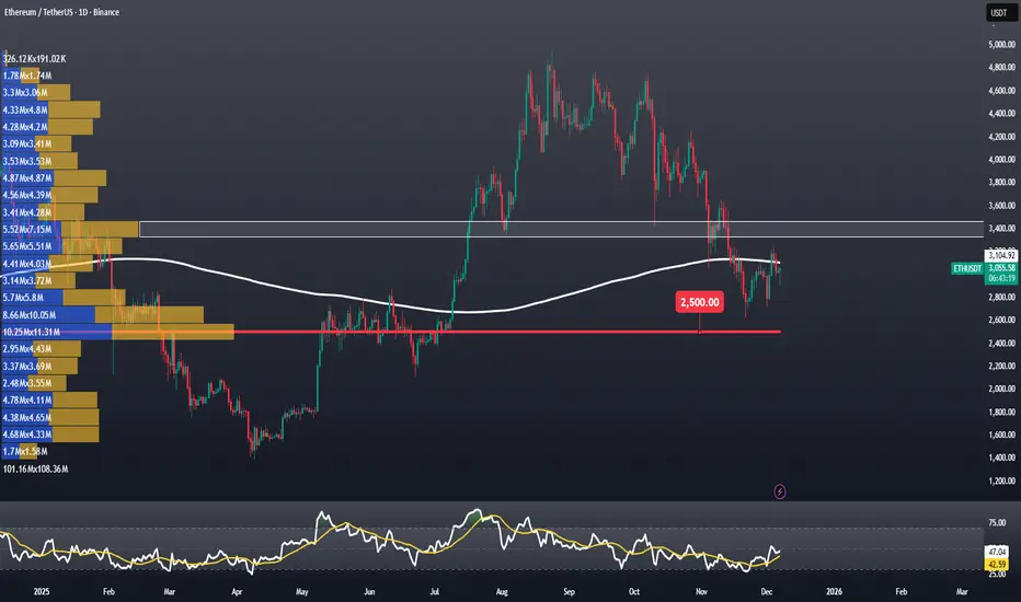
Why Does Ethereum Need a Weekly Close Above $3,100?Why Does Ethereum Need a Weekly Close Above $3,100?
Ethereum is currently trading around $3,035, while the SMA365 sits near $3,100. A weekly close above this level would give ETH investors some breathing room. If ETH can secure a close above the SMA365, we could expect a relief rally toward $3,689, especially considering the uninterrupted decline since the $4,755 top.
On the other hand, the $2,500 zone remains a critical support.
Looking at ETH’s recent price action, this level aligns with a high-volume node on the FRVP, making it a key area of interest. Staying above it supports the bullish scenario — but the fact that ETH hasn’t been able to shift this “high-volume settlement zone” upward for months means it also acts like a magnet.
The white zone on the chart is a strong candidate for the next YTS (New High-Volume Settlement). For ETH to rebuild positive momentum, it needs to trade and settle between $3,350 – $3,450 for a while. In other words, Ethereum must push this liquidity cluster upward by roughly $850–900 (around 38%) — a classic characteristic of bull markets.
In conclusion: purely from a technical perspective, the weekly close at $3,100 is critical.
Above it, the path opens toward $3,600 — below it, there is room to revisit $2,500.
Thank you for reading. If you found this analysis helpful, please consider sharing 🙏
GOLD 1H CHART ROUTE MAP UPDATE & TRADING PLAN FOR THE WEEKHey Everyone,
Please see our 1h chart levels and targets for the coming week, which is still active and in play.
We are seeing price play between two weighted levels with a gap above at 4221 and a gap below at 4169, as support. We will need to see ema5 cross and lock on either weighted level to determine the next range.
We will see levels tested side by side until one of the weighted levels break and lock to confirm direction for the next range.
We will keep the above in mind when taking buys from dips. Our updated levels and weighted levels will allow us to track the movement down and then catch bounces up.
We will continue to buy dips using our support levels taking 20 to 40 pips. As stated before each of our level structures give 20 to 40 pip bounces, which is enough for a nice entry and exit. If you back test the levels we shared every week for the past 24 months, you can see how effectively they were used to trade with or against short/mid term swings and trends.
The swing range give bigger bounces then our weighted levels that's the difference between weighted levels and swing ranges.
BULLISH TARGET
4221
EMA5 CROSS AND LOCK ABOVE 4221 WILL OPEN THE FOLLOWING BULLISH TARGETS
4250
EMA5 CROSS AND LOCK ABOVE 4250 WILL OPEN THE FOLLOWING BULLISH TARGETS
4284
EMA5 CROSS AND LOCK ABOVE 4284 WILL OPEN THE FOLLOWING BULLISH TARGETS
4320
EMA5 CROSS AND LOCK ABOVE 4320 WILL OPEN THE FOLLOWING BULLISH TARGETS
4361
BEARISH TARGETS
4169
EMA5 CROSS AND LOCK BELOW 4169 WILL OPEN THE SWING RANGE
4130
4093
EMA5 CROSS AND LOCK BELOW 4093 WILL OPEN THE SECONDARY SWING RANGE
4049
4015
As always, we will keep you all updated with regular updates throughout the week and how we manage the active ideas and setups. Thank you all for your likes, comments and follows, we really appreciate it!
Mr Gold
GoldViewFX

Santa’s Not the Only One Making a List: How Yours Should LookRemember the Trading Journal article we posted back in January? It’s time to review that.
🎄 The Year-End Ritual Traders Love to Avoid
December is a beautiful time of year — especially if you’re a trader taking stock of a full year of wins, lessons, and the kind of experience you simply can’t get from any textbook.
While most people are making holiday wish lists, you can make something far more valuable: a year-end audit of your own performance.
Before you look into the story of 2026, you should review your story of 2025 — and decide which chapters deserve a sequel.
🧾 1. Start With the Big Picture: Your P&L Story
Traders love to zoom into charts, but this review starts with a wide-angle lens. Open your profit-and-loss statement (the whole thing) and ask yourself what story it tells.
Not: “Did I make money?”
But:
• Where and when did I make money?
• How consistently did I make money?
• Where and when did I lose money?
Was your year a smooth trend or a choppy range?
Did profits arrive steadily in a diversified low-risk manner or in one giant lucky month that’s now carrying the annual narrative on its back?
How many trades on average did you open in any given month? Were you slammed by economic data or actually traded events successfully?
If your P&L looks like Mount Everest followed by a ski slope, that’s a clue. If it looks like a gentle staircase, that’s another.
An honest P&L audit tells you who you actually are as a trader, not who you strive to be.
📆 2. Month-by-Month: Your Market Seasons
Markets have seasons, and so do traders. This is where you break your year into 12 chapters and ask:
• Which months were your strongest?
• Which months were your weakest?
• Did your performance correlate with volatility?
• Did you trade better in calm markets or turbulent ones?
• Did a single macro theme carry your results?
Most traders discover they perform better in certain environments — trending markets, earnings season , AI mania, crypto volatility — and worse in others.
Knowing your seasonality helps you (a) avoid forcing trades in tough conditions and (b) push harder when the market aligns with your natural rhythm.
For example, you don’t trade aggressively in a month where your data says you tend to perform poorly.
📈 3. Where You Actually Traded
Every trader has a version of themselves in their head:
“I trade mostly macro FX,” or “I’m an equities person,” or “I invest in crypto but only real-use cases.”
But your year-end list should reflect actual activity, not self-depiction. Pop open your books and find out:
• Which asset classes did you trade the most?
• Did your biggest wins come from the same place as your biggest losses?
• Did you over-concentrate on a theme (AI leaders)? FX majors? Meme-adjacent microcaps?
• Did diversification help or were you secretly just running one giant tech exposure?
If 80% of your profits came from one market, that’s a strength, but also a dependency. If 80% of your losses came from one market, that’s more of a warning than a lesson.
Knowing where you think and where you sink is the foundation of your 2026 positioning.
💸 4. Identify Your Wins and Pain Points
Every trader has signature wins and signature wounds. Look into yours and try to figure out why they happened.
• Were they disciplined trades?
• Or were they lucky timing in Nvidia NASDAQ:NVDA , Bitcoin BITSTAMP:BTCUSD , or FX:USDJPY ?
• Were they tied to a setup you can reproduce in 2026?
• Or do they fall under “I shouldn’t count on that again”?
Then look at your largest losses:
• Were they concentrated?
• Repeated?
• Emotional?
• Spread across many small trades or a few oversized ones?
Think of your setbacks as valuable inputs for your 2026 strategy.
🧭 5. Turn Insight Into Strategy for 2026
Now comes the true purpose of the list: How will you position for the new year based on what you learned?
Consider:
• Which asset classes earned the right to your attention in 2026?
• Which ones should you scale down or eliminate?
• How concentrated should you allow your positions to get?
• Are you better as a trend trader, a mean-reverter, a news trader?
• Which months or conditions will you push hardest?
• Where will you intentionally step back?
🎁 The Real Gift of the Year Is Reflection
Santa may have a list of who's naughty and nice, but yours is better because it tells you what kind of trader you've become, and what kind you’re aiming to be.
A year-end audit is among the closest things traders have to compounding wisdom.
You can’t control the 2026 market (especially with a new Fed chair stepping in) — but you can control how prepared you are for it.
And that preparation begins with a list only you can make. Not just of trades and profits, but of patterns.
Make your list. Read it twice. Think about it.
And step into 2026 trading like someone who knows themselves.
Off to you : Are you ready to look back into what you did this year and learn the harsh truths and valuable lessons? Share your thoughts in the comments!

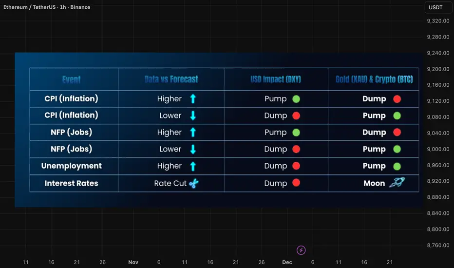
Fundamentals Masterclass: How to Trade CPI, NFP, and FOMCMost traders stare at charts all day, drawing support and resistance, only to get liquidated in seconds when a single news candle hits.
Why? Because Technical Analysis tells you When to enter, but Fundamental Analysis tells you Why the market is moving.
Whether you trade Bitcoin (BTC), Gold (XAUUSD), or Major Pairs, they all bow to one master: The US Economy.
In this guide, we break down the 5 Market Movers that control the charts and how you can trade them without gambling.
1. CPI (Consumer Price Index) – The Inflation Trigger
● What is it? The primary tool Central Banks use to track inflation (the price of goods and services).
● The "Healthy" Zone: The Fed targets 2% to 3% inflation. Anything significantly higher forces them to act.
The Trading Logic:
● High CPI (> Forecast): Inflation is hot. The Fed must raise interest rates to cool it down. Money becomes expensive.
● Low CPI (< Forecast): Inflation is cooling. The Fed might cut rates (Pivot). Money becomes cheap.
Market Reaction:
● Forex: High CPI = Bullish USD (Rates go up).
● Gold & Crypto: High CPI = Bearish (Risk-off assets dump).
● Pro Tip: If CPI comes in lower than expected, expect a violent Bitcoin Pump as
the market prices in a "Fed Pivot."
2. FOMC (Federal Open Market Committee) – The Main Event
● What is it? The meeting where the Federal Reserve decides on Interest Rates. This is the most volatile event of the month.
● Current Context: US Rates are hovering around 5.50%.
The Trading Logic:
● Higher Rates: Investors sell risky assets to buy safe US Bonds. Demand for USD skyrockets.
● Rate Cuts: Borrowing becomes cheap. The "Money Printer" turns on.
Market Reaction:
● Hawkish (Rate Hike/Hold): Liquidity dries up. Crypto & Gold Dump .
● Dovish (Rate Cut): Liquidity flows into high-risk assets. Crypto & Gold Moon
.
● Prop Trader Note: Released usually at 1 1:30 PM IST (2:00 PM EST). Spreads
widen massively. Do not hold tight stops during the speech.
3. NFP (Non-Farm Payroll) – The Volatility King
● What is it? A report showing new jobs added in the US (excluding farmers). It
reveals the true health of the labor market.
The "Bad is Good" Paradox:
Traders often get confused here. Why does "Good News" for the economy cause Bitcoin to dump?
● High NFP (More Jobs): Strong economy = The Fed feels confident to keep rates high. This is Bullish USD, but Bearish for Crypto/Gold.
● Low NFP (Fewer Jobs): Weak economy = The Fed might panic and cut rates to save jobs. This anticipation causes Crypto/Gold to Pump.
Market Reaction:
● Data > Forecast: USD📈 | Gold/BTC📉
● Data < Forecast: USD📉 | Gold/BTC📈
4. Unemployment Claims – The Recession Watch
● What is it? A weekly report showing how many people filed for unemployment benefits (Berojgari) for the first time.
● The Logic: This is the inverse of NFP.
Market Reaction:
● Claims Lower than Forecast: Fewer people are jobless (Strong Economy). Good for USD.
● Claims Higher than Forecast: More people are losing jobs (Weak Economy). Bad for USD -> Good for Crypto/Gold (Investors speculate on a bailout).
● Trading Confluence: If NFP is Strong (High) AND Unemployment Claims are Low, you have a "Double Confluence" for a massive US Dollar Long.
5. GDP (Gross Domestic Product) – The Health Score
● What is it? The total value of all goods and services produced. The ultimate economic scorecard.
● Example: India is currently the 5th largest economy based on GDP, attracting global investment into the Rupee.
The Crypto Nuance:
● High GDP: Economy is expanding. Good for stocks, but risks higher interest rates (Choppy for Crypto).
● Low GDP (Recession Fear): If GDP is too low (Negative), panic sets in. A full-blown recession can cause everything (Stocks, Crypto, and sometimes Gold) to dump initially as investors rush to cash.
● The Sweet Spot: We want a "Soft Landing"—Growth slowing down just enough to cut rates, but not enough to crash the economy.
Summary: The Trader’s Cheat Sheet
Save this table. It tells you exactly how the DXY (Dollar) moves, and how Crypto/Gold react inversely.
Final Advice:
News candles seek liquidity. They often fake out in one direction before ripping in the other.
Don't gamble on the numbers. Wait for the reaction, wait for the spread to normalize, and trade the trend.
Tags:
#Education #FundamentalAnalysis #CryptoTrading #Forex #CPI #NFP #FOMC #Mubite #EconomicCalendar
IBEX 35 Hits Historic LevelIBEX 35 Hits Historic Levels, Facing the Challenge of Winning Back Retail Investors
Ion Jauregui – Analyst at ActivTrades
01/12/2025
The IBEX 35 has officially returned to territory unseen since 2007. The Spanish benchmark is trading at historic highs and has established itself in 2025 as the best-performing stock index in Europe, surprisingly outperforming major U.S. benchmarks. Over the past three years, its returns have doubled the average of Wall Street, driven by a combination of corporate strength and a domestic economy that continues to outpace the eurozone.
In this context, Juan Flames, CEO of BME, sends a clear message: the Spanish market is doing well, but complacency is not an option. “We need to win back retail investors, and for that, we must return to the spirit of the 1990s,” he notes. During that period, 38% of privatizations were financed by small investors, fueling an unprecedented cycle of stock market growth.
A Solid Market… but with Pending Challenges
The IBEX’s strong performance is backed by fundamentals. Spanish companies are contributing decisively: expanding profits and offering a dividend yield of 4.2%, well above the European average. At the same time, Spain’s economy is growing faster than the eurozone in 2024 and is expected to do so again in 2025.
However, as Flames pointed out, Spain still faces structural challenges. More listed companies and deeper markets are needed. After a peak in IPOs in 2020, activity slowed noticeably. BME is now addressing this through reforms inspired by the White Paper, which proposes 56 measures to modernize the capital markets. Key initiatives include:
BME Easy Access, a new segment that simplifies IPO processes after decades of stagnation.
Reduced brokerage fees, encouraging new investors to enter the market.
Spanish traders have long sought these changes, as U.S. markets are often more cost-effective, offering higher daily trading volumes and a wider variety of companies. By reinforcing both capital supply and demand, and focusing on bringing retail investors back to a market reminiscent of the 1990s—where international access was more limited—Spain aligns with the European initiative to create a “pan-European savings and investment account.”
Similar strategies can be seen elsewhere: the London Stock Exchange consolidates trading volumes to prevent dilution into international markets, while emerging U.S. regional exchanges aim to reduce costs for companies compared to major indices like Nasdaq or NYSE. This regionalist approach seems increasingly popular.
Technical Analysis: Impeccably Bullish Trend
Technically, the IBEX 35 shows one of the cleanest uptrends in recent years. Breaking 16,500 points confirmed a new upward leg, projecting the index toward its next major challenge: 17,000 points, now the main psychological and technical resistance.
Meanwhile, moving averages continue to act as dynamic support. Key levels to watch: 16,144 points (50-day moving average) and 15,755.98 points (200-day moving average). With a bullish opening above 16,300, the index appears set to retest the mid-November highs. The RSI currently sits in a neutral zone at 56.61%, while the MACD is recovering into positive territory, with the histogram beginning a bullish phase. The ActivTrades Europe Market Pulse signals market neutrality with a gradual increase in risk, indicating institutional entries ahead of the year-end rally typical for this season.
With banks and energy stocks driving market momentum, the IBEX maintains a structure of higher highs and higher lows, supporting the potential for further upside if immediate resistance is surpassed.
Conclusion
Spain is experiencing an unusually favorable stock market environment. Prices are rising, macroeconomic conditions are supportive, and companies are posting strong figures. Yet the real challenge lies beyond the charts: attracting more companies to list and bringing retail investors back—key elements to consolidate the Spanish market as a genuine alternative for financing and savings.
If this balance is achieved, the outlook for the IBEX 35 could prove even more promising than its historic highs.
*******************************************************************************************
The information provided does not constitute investment research. The material has not been prepared in accordance with the legal requirements designed to promote the independence of investment research and such should be considered a marketing communication.
All information has been prepared by ActivTrades ("AT"). The information does not contain a record of AT's prices, or an offer of or solicitation for a transaction in any financial instrument. No representation or warranty is given as to the accuracy or completeness of this information.
Any material provided does not have regard to the specific investment objective and financial situation of any person who may receive it. Past performance and forecasting are not a synonym of a reliable indicator of future performance. AT provides an execution-only service. Consequently, any person acting on the information provided does so at their own risk. Political risk is unpredictable. Central bank actions can vary. Platform tools do not guarantee success.
