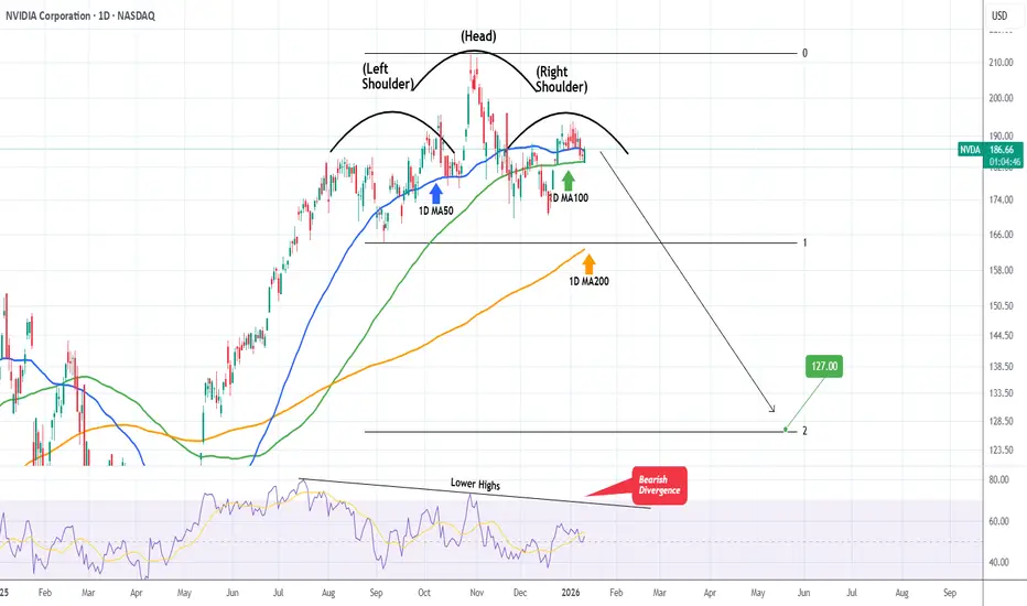
NVIDIA Huge Head & Shoulders forming. $127 technical Target.NVIDIA Corporation (NVDA) is in the process of completing the Right Shoulder of a Head and Shoulders (H&S) pattern, having turned sideways since the October 29 2025 High (ATH).
With the 1D RSI on Lower Highs, i.e. a Bearish Divergence since July 17 2025, it is possible that within a month's time max, the stock will break its Support and the H&S will target its technical extension, the 2.0 Fibonacci at $127.00.
---
** Please LIKE 👍, FOLLOW ✅, SHARE 🙌 and COMMENT ✍ if you enjoy this idea! Also share your ideas and charts in the comments section below! This is best way to keep it relevant, support us, keep the content here free and allow the idea to reach as many people as possible. **
---
💸💸💸💸💸💸
👇 👇 👇 👇 👇 👇
Community ideas
AUDUSD Trend continuation pattern supported at 0.6637The AUDUSD remains in a bullish trend, with recent price action showing signs of a breakout within the broader uptrend.
Support Zone: 0.6637 – a key level from previous consolidation. Price is currently testing or approaching this level.
A bullish rebound from 0.6637 would confirm ongoing upside momentum, with potential targets at:
0.6756 – initial resistance
0.6780 – psychological and structural level
0.6800 – extended resistance on the longer-term chart
Bearish Scenario:
A confirmed break and daily close below 0.6637 would weaken the bullish outlook and suggest deeper downside risk toward:
0.6620 – minor support
0.6600 – stronger support and potential demand zone
Outlook:
Bullish bias remains intact while the AUDUSD holds above 0.6637 A sustained break below this level could shift momentum to the downside in the short term.
This communication is for informational purposes only and should not be viewed as any form of recommendation as to a particular course of action or as investment advice. It is not intended as an offer or solicitation for the purchase or sale of any financial instrument or as an official confirmation of any transaction. Opinions, estimates and assumptions expressed herein are made as of the date of this communication and are subject to change without notice. This communication has been prepared based upon information, including market prices, data and other information, believed to be reliable; however, Trade Nation does not warrant its completeness or accuracy. All market prices and market data contained in or attached to this communication are indicative and subject to change without notice.

Parabolic Moves Don’t Always End in Collapse — Silver ExplainedI’ve seen many analyses from my colleagues where 1980 and 2011 are used not as upside projections, but as collapse templates for silver.
The argument is simple and visually convincing: silver has already gone parabolic, therefore the next chapter must be a collapse similar to those historical episodes.
I understand the logic.
I don’t predict the future, and I can’t categorically deny that such an outcome is possible.
But here’s where I draw a clear line: similar-looking charts do not guarantee similar outcomes, especially when the underlying drivers are fundamentally different.
And in silver’s case, they are different.
Let’s be precise about what 1980 really was (and why it collapsed)
The 1980 silver collapse is often treated as a “natural law of parabolic moves”.
In reality, it was not a natural market outcome.
It was the direct consequence of extreme concentration and leverage, driven by the Hunt brothers.
What made 1980 fragile by design
- The Hunts accumulated an extraordinary share of the global silver supply, both physical and paper.
- They used massive leverage in a relatively small and illiquid market.
- The price did not rise because global demand structurally changed — it rose because supply was artificially constrained.
- Once exchanges changed the rules (margin hikes, liquidation-only trading), the entire structure collapsed under its own weight.
This is critical:
The collapse of 1980 was not caused by silver being “too expensive”.
It was caused by the system forcibly unwinding a concentrated position.
So when someone says “this looks like 1980”, the real question is:
- Where is today’s equivalent of that concentration?
- Who controls 30–40% of deliverable supply?
- What single entity is forced to liquidate?
If that element is missing, then the collapse logic weakens dramatically.
2011: parabolic, yes — structurally unstable, also yes
2011 is a more honest comparison, and this is where many collapse arguments focus.
Silver:
- rallied aggressively,
- became a retail darling,
- and eventually collapsed hard.
But again, the reason it collapsed matters.
Why 2011 unraveled
- The rally was dominated by financial demand, not structural necessity.
- ETFs, leverage, and macro fear created fast money flows.
- When liquidity tightened and risk appetite faded, demand evaporated quickly.
- There was no structural constraint on supply forcing price stability.
In other words:
- 2011 collapsed because demand was reversible.
- Once sentiment flipped, there was nothing underneath to slow the fall.
Now comes the disagreement: why I don’t expect a 1980/2011-style collapse this time
Yes — I fully agree on one thing: extreme volatility is coming, or is already here (yes, more extreme than we've seen!)
Silver doesn’t trend quietly. It never has.
But volatility and collapse are not the same thing.
The key difference today: the type of demand
Today’s silver market is not driven solely by:
- fear,
- speculation,
- or monetary narratives.
A large and growing portion of demand is industrial and strategic:
- electrification,
- energy transition,
- technology infrastructure.
That demand:
- doesn’t disappear overnight,
- doesn’t panic-sell because RSI is overbought,
- and doesn’t care about chart symmetry.
This changes the downside dynamics.
Supply cannot respond the way people assume
Another overlooked point:
- most silver production is a by-product of other metals.
- higher prices do not instantly bring new supply online.
In 1980 and 2011, supply dynamics were not a binding constraint.
Today, they are.
That doesn’t mean price can’t drop — it means drops are more likely to be violent corrections, not structural collapses.
About the “parabolic = must collapse” logic
This is where I respectfully disagree with many analysts.
A parabolic move tells you:
- volatility is increasing,
- positioning is crowded,
- risk management becomes essential.
It does not automatically tell you:
- the entire move must fully retrace,
- or that price discovery was fake.
Markets can:
- correct through time instead of price,
- form wide ranges,
- or retrace partially and rebase.
History offers multiple outcomes, not a single script.
My base case (clear and unemotional)
- Yes, I expect extreme swings.
- Yes, I expect sharp pullbacks that will scare most participants.
- No, I do not see a clear mechanism today for a 1980-style forced collapse.
- And unlike 2011, I don’t believe demand disappears just because momentum cools.
This is not optimism.
It’s structure-based reasoning.
Trading perspective (grounded)
Because I expect volatility:
- I don’t chase vertical candles.
- I respect levels, not narratives.
- I scale, I take partial profits, and I allow room for noise.
- I treat silver as a dangerous instrument, not a lottery ticket.
Being right about direction is useless if volatility kicks you out first.
Final thought
My colleagues may be right — markets can always surprise.
But assuming collapse just because the chart looks familiar is lazy analysis.
1980 collapsed because of forced concentration unwind.
2011 collapsed because of reversible financial demand.
Today, silver is volatile — not hollow.
And that distinction matters more than any historical overlay.
The market will decide.
My job is to respect risk, not marry analogies 🚀
Best of luck!
Mihai Iacob

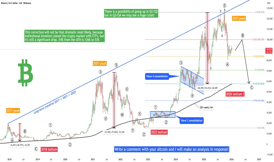
Bitcoin - 2026 roadmap, pump to 100k, then crash to 57k!Is it possible that Bitcoin will go above 100k or 103k in the next weeks/months? And is it possible that Bitcoin will later drop heavily to 57k? Altcoin season during the rise to 103k? I will answer these questions in this post. Write a comment with your altcoin, hit the like button, and I will make an analysis for you in response.
On the chart we can see a long-term linear chart of Bitcoin (2017 - 2026). As we can see, Bitcoin crashed by 85% in 2018 and by 77% in 2022. The next crash is apparently scheduled for 2026 - Bitcoin can drop below 60k to make at least a 54% correction. This correction will not be that dramatic most likely, because institutional investors joined the crypto market with ETFs, but it's still a significant drop. Why below 60k (precisely 57,802)? This is a very significant point of interest for traders/investors for multiple reasons. The first reason is that there is a strong Fibonacci level of 0.618 of the previous bull market. This is the strongest fibo level on the market. The next reason is the 200 weekly moving average. Usually big banks and institutional investors use this specific 200-period to buy and accumulate their assets. They are usually not interested in buying at the peak - they wait for pullbacks.
Now we have to take a look at the Elliott Wave theory, which works on Bitcoin perfectly from my point of view. We already had a big drop from 125k to 81k at the end of 2025. It looks like we can mark this wave as wave (A) or (W). Currently wave (B) or (X) is in progress and this is a bullish corrective wave that can bring the price up to 100k or 103k In this case that would be a perfect 1:1 FIB extension for an ABC correction to 57k. So there is a possibility of going up in Q1/Q2 but in Q3/Q4 we may see a huge crash! Of course this is just a speculation, we have to take all scenarios into consideration. We need to see more data in the coming days and weeks to confirm this scenario. Thank you, and I wish you successful trades!
Gold Strengthens as Geopolitical Risk IncreasesGold Strengthens as Geopolitical Risk Increases
Gold continues to respect a bullish market structure, with price developing a clear impulsive sequence followed by shallow corrective waves. The recent pullback found support near the 4,400 zone (wave iv), and price is now pushing higher again, confirming buyers’ control.
The bullish scenario remains intact. A clean continuation higher could first target the resistance zone 4,548.
A breakthrough at the top of the structure 4548 should push GOLD easily to 4,600. If momentum remains strong, the next major upside target is located near 4,650.
On the fundamental side, gold is also benefiting from rising geopolitical uncertainty. Recent geopolitical tensions fueled by Trump’s rhetoric and positioning regarding Greenland have added another layer of risk sentiment to global markets.
Any escalation or uncertainty in U.S.–European relations tends to support safe-haven assets such as gold, reinforcing the bullish technical outlook.
You may find more details in the chart!
Thank you and Good Luck!
PS: Please support with a like or comment if you find this analysis useful for your trading day
Previous Analysis:

Stocks Shake as Prosecutors Go After Fed Boss Powell. Now What?Wall Street went into the weekend riding record highs — and came back to something that felt more like a political thriller than a macro update.
US stock futures slipped after news broke that the Department of Justice has opened a criminal investigation into Federal Reserve Chair Jerome Powell, sharply escalating President Donald Trump’s long-running standoff with the central bank.
Early Monday morning, Dow DJ:DJI futures fell 200 points , while S&P 500 futures SP:SPX dropped 0.5% and Nasdaq NASDAQ:IXIC futures slid as much as 1% as traders trimmed risk and tried to digest a scenario that few had on their morning to-do list: the Fed chair facing potential indictment.
It’s not every Monday you wake up wondering whether the world’s most powerful central banker might be spending more time with lawyers than economists.
🎥 Powell Goes on Camera — and Draws a Line
In an unusual move for a Fed Chair, Powell took to video Sunday evening to confirm that federal prosecutors had issued grand jury subpoenas and were weighing criminal charges related to his June testimony before the Senate Banking Committee about the $2.5 billion renovation of the Fed’s headquarters.
Powell didn’t mince words. “This is not about the renovation,” he said.
“This is about whether the Fed will be able to continue to set interest rates based on evidence and economic conditions — or whether monetary policy will be directed by political pressure.” Powell’s term is set to expire in May.
🐴 Trump Enters, Stage Right
President Trump denied any involvement in the probe — but didn’t miss the chance to throw a few verbal jabs.
“I don’t know anything about it,” he told NBC News. “But he’s certainly not very good at the Fed, and he’s not very good at building buildings.”
This comes after months of Trump calling Powell a “stubborn mule” and a “major loser” for refusing to slash interest rates faster.
Markets are now left to navigate a delicate question: What happens when a sitting Fed chair is legally threatened by a White House that wants lower rates?
🏅 Gold Does What Gold Does Best
The answer, at least initially, was written in shiny metal.
Gold OANDA:XAUUSD surged to a record $4,600 per ounce in Asia, up as much as 2%, before settling slightly lower. Bullion tends to pop when central bank independence appears under threat, and this episode checks that box in bold red ink.
When traders worry that politics might start steering monetary policy, they reach for the oldest hedge in the book.
📈 Stocks Were at Record Highs
The irony here is that this political drama arrives at a time when markets have been in remarkably good shape.
The S&P 500 and Dow Jones both closed Friday at all-time highs, capping a winning week. The S&P gained more than 1%, while the Dow and Nasdaq posted even stronger gains.
Throughout 2025, markets largely ignored Trump’s attempts to jawbone the Fed as Powell cut rates three times anyway. Inflation stabilized. Growth held up. Investors shrugged and kept buying.
🧭 Why This Matters More Than One Man
If investors start to believe that US monetary policy could be influenced by political threats, the risk premium on everything from Treasuries to tech stocks shifts.
That’s why gold jumped. That’s why futures dipped. And that’s why forex markets are quietly paying attention with the US dollar on the defensive.
A politicized central bank is a different animal — and not one markets are used to feeding.
📊 Meanwhile, Earnings
Amid all the legal and political noise, something very normal is about to happen: earnings season kicks off this week.
JPMorgan NYSE:JPM , Bank of America NYSE:BA , Morgan Stanley NYSE:MS , and Goldman Sachs NYSE:GS are all set to report, offering the first hard look at consumer spending, deal flow, and trading activity for the past quarter.
Those results may do more to stabilize or unsettle markets than any headline. If the banks deliver solid numbers, investors may decide that politics is background noise — unless there’s a new escalation.
🧠 The Takeaway
Powell’s legal drama has introduced a new variable into an otherwise optimistic setup: strong earnings, falling inflation, and record-high stocks are joined by a political spectacle.
Whether this becomes a lasting shock or a brief tremor depends on how the story evolves. Traders right now are doing what they always do in moments like this: trimming risk, buying a little protection, and waiting for clarity.
Off to you : Where do you see this whole thing headed? Share your views in the comments!

A letter to myself. (Buy the dip)This is phase one of a global technological financial system. If our parents even parked a fraction of their cash here 10–20 years ago the long-term payoff would have been nice, but they didn't and it's okay because they didn't know. We now have the privilege of choosing to contribute to our financial future in ways that were previously out of reach for everyday people because we couldn't even fathom the future the internet is today.
This data from the adoption curve theory further supports that we're adopting this cryptocurrency.
With clearer signals from regulators and pro-crypto movements gaining traction in U.S. political leadership, confidence and liquidity have been rising. Under the current administration, regulatory clarity and initiatives like a strategic Bitcoin/Digital Asset stockpile have helped sentiment in crypto. We're currently at a 3.12T marketcap (2026JAN11)
Regardless of sentiment. Here's the play:
🔄 Elliott Wave Structure — Strength in #'s
We’re observing a 1–5 multi-year impulse wave, often followed by an A-B-C corrective phase:
Impulse (1–5) = trend direction (up)
ABC Correction = pullback phase after a trend leg before continuation
A = first leg down
B = bounce / retrace up
C = final leg down completing correction
Right now, we’re in an ABC retracement within a larger uptrend — meaning the market is consolidating against the bull trend. This correction doesn’t invalidate the uptrend until key Elliott rules are broken. We're also approaching the 200MA which is (rolling) key support resistance to keep an eye on. That’s why we plan to DCA (dollar-cost average) — buying strength and weakness — to build positions regardless of short-term noise. This sets us up for a disciplined exit strategy when the next upward leg resumes.
It's an election year, so this is a key fundamental day that will affect market prices.
Don't forget, this is early innings in a new global financial network. When
BTC
goes up we see the altcoin market react.
(The Money Flow Cycle)
Large Caps
Mid Caps
Small Caps
Micro Caps
Long-term participation with risk management beats short-term guessing.
The next big move up rewards the prepared, not the reactive. Park into mid caps / small caps at your own risk.
I personally are heavy VeChain (#VET) (#VECHAIN) simply because of the fact that it's an L1 that has been around YOY through bull/bear markets, has great partnerships, geared towards a sustainable future, and it's pennies on the dollar. With a higher risk will come a higher reward and im willing to wait for the delay of PA that seems to occur YOY since observing BTC since 2019.
Remember to DYOR don't investing anything you're not willing to lose and always remember.
"Time in the market, beats timing the market."
- Isaiah

Chart Patterns ranked by reliability (1-8)Chart Patterns as a Strategy (Not a System)
In the world of technical analysis, chart patterns are often marketed as stand-alone trading systems. In reality, their real edge comes from probabilistic structure recognition, not prediction.
The key insight from my large-sample testing (10 years, 200,000+ patterns (Futures, FX)) is this:
Patterns don’t predict direction — they quantify structural bias once price has already revealed intent.
That distinction is what separates profitable traders from pattern collectors.
How These Patterns Were Tested (Why the Stats Matter)
All patterns discussed below were:
Only counted once fully completed
Required confirmed breaks of structure (trendline, neckline, or support/resistance)
Measured using objective projection rules, not discretionary targets
TP Rule: Full Head and Shoulder Height, using the Head distance and the right shoulder as the SL.
Full Height of triangles, and a full height for flags as well.
Twice the height of the Channel as TP, and Time TP for Channels, for half of the duration of the it.
Rectangles were Full Box Width as TP, and a time-based TP of 1/4 the Length.
It could be trailed further, but some such as Rectangle TP made great mean-reversion trade.
This removes hindsight bias — a major flaw in most pattern discussions.
Continuation Patterns (Trend Context Is Mandatory).
#8. Bull & Bear Flags (~67%) (Alt. Name: Cups, Volatility Contraction Pattern)
Occur after near-vertical impulse moves, typically the 50 EMA can filter the direction.
Represent temporary pauses, not reversals.
Best when:
Flag is tight
Forms near the extreme of the impulse
Volume contracts during consolidation
Professional takeaway:
Flags are trend health checks, not entries. If a flag fails, momentum is likely exhausted.
#7. Ascending & Descending Triangles (~73%)
Market compresses against a hard level
One side shows aggression, the other absorption
Breakout confirms institutional imbalance
Use them to answer:
“Is price being accumulated or distributed?”
#6. Ascending & Descending Channels (~73%) (Alt. Name: Cups & Handle)
Wide consolidations between parallel trendlines
Stronger than flags due to time + participation
Breakouts often lead to measured trend continuation
Key insight:
Channels are delayed continuation, not indecision.
Reversal Patterns (Confirmation Is Everything)
The Joker: Double Tops & Bottoms (75–79%)
Require structural failure
Completion only occurs after neckline break
Bottoms outperform tops statistically (markets rise faster than they fall)
⚠️ Common mistake:
Anticipating the second top/bottom instead of waiting for confirmation.
The Queen: Triple Tops & Bottoms (77–79%)
Stronger due to repeated rejection
Represent exhaustion of dominant participants
Interpretation:
The market tried three times — and failed.
The King: Rectangle Patterns (~78–80%)
Flat consolidation after a trend, more than 3 touches top and bottom.
Essentially failed reversal attempts.
Breakouts often trap traders positioned against the trend, it's best to enter on retest of breakout or earlier at the Bear-Bull Midline of the Box.
Critical lesson:
Most “double tops” fail — and turn into rectangles.
The Ace: Head & Shoulders (~83%)
Why it works so well:
Clear distribution → failure → confirmation
Captures institutional exit mechanics
Neckline break aligns with order-flow imbalance
Both regular and inverted versions are the most reliable classical patterns when properly confirmed.
⚠️ Common mistake: It's easy to mistake a Head and Shoulders with another pattern like a Double or Triple Bottom if it's neckline is not broken well.
The Trap Pattern: Pennants (~55%)
Despite being taught alongside flags:
Pennants break against trend too often
Over-compression increases randomness
Lack clear structural dominance, Pivot HL are spots where trader's should sell.
Professional rule:
If it looks too tight, it’s probably a coin flip.
It's better to target Equal High and Lows to the left as TP.
How Professionals Actually Use Chart Patterns
We don’t trade patterns — we trade what they imply.
Patterns help answer:
Is the market accepting or rejecting price?
Are participants trapped or in control?
Is this continuation, transition, or reversal?
They work best when combined with:
Market structure (HH/HL, LH/LL)
Time-of-day context
Volume or order-flow
Higher-timeframe bias
Final Truth About Pattern Accuracy
Pattern Type Role Best Use
Flags / Channels Continuation Trend validation
Triangles Pressure build Breakout bias
Double / Triple Reversal Failure detection
Rectangles Continuation Trap identification
Head & Shoulders Reversal Distribution confirmation
Pennants ❌ Avoid

Meta Is Down Nearly 20% Since August. Here's What Its Chart Says"Magnificent Seven" stock Meta Platforms NASDAQ:META has fallen nearly 20% since hitting an all-time high in August, and has also trailed the S&P 500 SP:SPX in various timeframes from three months to one year. Let's see what its chart and fundamental analysis can show us.
Meta's Fundamental Analysis
Meta has been struggling of late, with some on Wall Street wondering if the company -- which owns Facebook and Instagram -- got ahead of itself as far as capex spending on artificial intelligence is concerned.
For instance, word emerged last week META is paying more than $2 billion to acquire Manus, a Singapore-headquartered AI start-up.
Manus specializes in autonomous AI systems that reason, make decisions and execute multi-step tasks with minimal oversight for small- to medium-sized businesses.
The Wall Street Journal reported that the start-up was headed into a fundraising round hoping to value the company at roughly $2 billion when Meta made contact.
The purchase came about a month ahead of META's Q4 earnings, which Wall Street expects the tech giant to report in late January.
Analysts' consensus estimates call at last check for the tech giant to report $8.17 of GAAP earnings per share on $58.3 billion of revenue.
That would represent a 1.9% gain from the year-ago period's $8.02 in EPS, as well as a 20.5% y/y improvement on Q4 2024's $48.4 billion of revenue.
Meanwhile, 27 of the 40 sell-side analysts that I can find that cover META have increased their Q4 earnings estimates since the period began, while just 10 have cut their numbers. (Three have made no changes.)
Meta's Technical Analysis
Now let's check out META's chart going back some six months and running through last Tuesday afternoon (Dec. 30):
Readers will see that since early August, META has been developing a very large pennant formation, marked with the two diagonal black lines above. Closing pennants often produce a significant move, although they don't indicate in advance whether the move will be up or down.
Meanwhile, there seems to be some negativity in this chart ... or does there?
On one hand, Meta's 50-day Simple Moving Average (or "SMA," denoted by a blue line above) crossed below the stock's 200-day SMA (the red line) in mid-December. That's a so-called "death cross," which is traditionally a bearish technical sign.
However, that signal's bearishness is greatly diminished if the 200-day SMA is rising at the time of the cross, as is the case here.
Similarly, Meta's 21-day Exponential Moving Average (or "EMA," marked with a green line) has caught up to the stock's 50-day SMA. That's traditionally a short-term bullish signal used by swing traders.
Additionally, Meta's Relative Strength Index (the gray line at the chart's top) is better than neutral and has been rising.
At the same time, the stock's daily Moving Average Convergence divergence indicator (or "MACD," marked with black and gold lines and blue bars at the chart's bottom) looks well positioned.
For example, the histogram of the 9-day EMA (the blue bars) has been in positive territory since Thanksgiving. That's a short-term bullish signal.
On top of that, Meta's 12-day EMA (the black line) and 26-day EMA (the gold line) are both above zero, with the 12-day EMA above the 26-day EMA. All of that makes for a medium-term bullish signal.
There's also more positivity if we look at Meta's chart going back to mid-September:
Here, we see a cup-with-handle pattern with a $676 apparent pivot vs. the $658.79 that META ended at on Monday. That's a bullish set-up.
True, the stock has had trouble taking that pivot, as it's running close to that all-important 200-day SMA (again, marked with a red line above).
However, notice the unfilled gap that Meta created in late October (marked with the orange oval at the chart's center).
Now, technical analysts know that unfilled gaps don't always have to fill, but they typically do so eventually. META needs to trade at $751.67 or better to fill that gap -- again, compared to the $658.79 the stock closed at on Monday. So, this is another bullish signal.
An Options Option
A bullish options trader might use a "buy-write" strategy in this scenario. That's where the trader buys the stock, but also sells an out-of-the-money covered call to drive down his or her net basis to something well below a key level such as the 50-day SMA.
Here's an example:
-- Long 100 shares of META at or close to Friday's $650.40 finish
-- Short one META $675 call with a Jan. 30 expiration (i.e., after the next expected earnings report) for a credit of about $17.10.
Net Basis: $633.30.
This trader wants to be long META, but is willing to risk having their shares called away in order to lower the person's net basis to well below META's current market.
If META trades below $675 at expiration, the person will still own 100 shares of stock at a $633.10 net basis.
And if META trades at or above $675 at expiration, the trader will have sold his or her equity stake through assignment on the short call at $675, for a $41.90-per-share net profit.
(Moomoo Technologies Inc. Markets Commentator Stephen "Sarge" Guilfoyle had no position in META at the time of writing this column.)
This article discusses technical analysis, other approaches, including fundamental analysis, may offer very different views. The examples provided are for illustrative purposes only and are not intended to be reflective of the results you can expect to achieve. Specific security charts used are for illustrative purposes only and are not a recommendation, offer to sell, or a solicitation of an offer to buy any security. Past investment performance does not indicate or guarantee future success. Returns will vary, and all investments carry risks, including loss of principal. This content is also not a research report and is not intended to serve as the basis for any investment decision. The information contained in this article does not purport to be a complete description of the securities, markets, or developments referred to in this material. Moomoo and its affiliates make no representation or warranty as to the article's adequacy, completeness, accuracy or timeliness for any particular purpose of the above content. Furthermore, there is no guarantee that any statements, estimates, price targets, opinions or forecasts provided herein will prove to be correct.
Options trading is risky and not appropriate for everyone. Read the Options Disclosure Document ( j.moomoo.com ) before trading. Options are complex and you may quickly lose the entire investment. Customers should consider their investment objectives and risks carefully before investing in options. Because of the importance of tax considerations to all options transactions, the customer considering options should consult their tax advisor as to how taxes affect the outcome of each options strategy. Supporting documents for any claims will be furnished upon request.
Options trading subject to eligibility requirements. Strategies available will depend on options level approved.
Maximum potential loss and profit for options are calculated based on the single leg or an entire multi-leg trade remaining intact until expiration with no option contracts being exercised or assigned. These figures do not account for a portion of a multi-leg strategy being changed or removed or the trader assuming a short or long position in the underlying stock at or before expiration. Therefore, it is possible to lose more than the theoretical max loss of a strategy.
Moomoo is a financial information and trading app offered by Moomoo Technologies Inc. In the U.S., investment products and services on Moomoo are offered by Moomoo Financial Inc., Member FINRA/SIPC.
TradingView is an independent third party not affiliated with Moomoo Financial Inc., Moomoo Technologies Inc., or its affiliates. Moomoo Financial Inc. and its affiliates do not endorse, represent or warrant the completeness and accuracy of the data and information available on the TradingView platform and are not responsible for any services provided by the third-party platform.

Developing A Trading Philosophy: Experimenting With IndicatorsIn our last video we were talking about the concept of the causes and effect on price action. What causes price to move in a certain direction vs. what the effects of the price action.
We came to the conclusion, that indicators are not causes of price action, but they are a different way of looking at the price. Therefore, price action dictates what happens to the indicator.
On the other hand things like market structure elements, supply and demand areas, order block, order flows, imbalances (Fair Value Gaps), etc.. are examples of price action causes.
In this video we are showing our experiment on using a playbook that depends totally on indicators which are, as we said, price action effects, not causes.
The experiment was positive. The annual return was crazy. Crazy when we think of it in terms of investment. This video shows a total annual return of more than 54%. I am not sure what business brings such net returns.
Still we need to look at some of the hidden teachings within this experiment. This such as the necessity of a static stop loss vs. a stop loss based change of story.
Another concept that came out of this experiment which is the difference in returns with higher timeframes over lower timeframes. The weekly time frame brought in around 40% of the total 54%, while daily was responsible for only 14% of those returns.
Next week we will be moving this experiment to a Demo Account. Last week the experiment was made using the "Replay" feature in TradingView with the period between 1st of Jan 2025 and end of 2025. Additionally, we will be experimenting on "Replay" adding market structure and SMC elements to the play book and see the effect on the total performance.
Those experiments are vey useful to me to arrive at developing my trading philosophy and my general trading strategy. It will definitely play a big role in facilitating the development of an exact playbook. I hope that as much as what I am doing is beneficial to me, it is also beneficial to the trading community.
The Investor

Challenges of Fading and OverextensionIntroduction
Fading is a strategy where a position is taken against the prevailing move, based on the expectation that it is overextended and likely to reverse. While mean reversion is a valid market phenomenon, some methods are built on incomplete beliefs about how markets operate.
From Normal to Deviation
Markets can be evaluated relative to their recent or average behavior. Price movement within these bounds is considered normal, while a notable move beyond them is referred to as a deviation. This is interpreted as an overextension, where indicators tend to show overbought or oversold values.
However, overextension does not necessarily imply that exhaustion is present. It simply marks a departure from normal behavior. Whether this leads to reversal or continued movement depends on broader market context.
Markets also tend to exhibit volatility clustering; periods of high volatility are followed by further volatility, and calm periods tend to persist. In other words, a strong move often leads to another. This challenges a common bias that an extended move must suspend or reverse.
The Limitations of Indicators
Indicators can show when price has moved outside a reference point. For example, oscillators, boundaries, or momentum values may signal overbought or oversold conditions. However, these readings are not signals on their own. The broader context matters more and determines whether the move is likely to reverse or continue.
In this chart, price moves outside the upper envelope on two separate occasions, each showing a deviation from recent average behavior. In the first case, the move results in a successful reversion. In the second, price remains extended above the band for several weeks, maintaining persistent momentum. Both instances show similar values, but the outcomes were different. This illustrates that tools should not be interpreted in isolation.
In this chart, RSI reaches overbought levels on two separate occasions. In the first case, the overextension is followed with a mean reversion. In the second, the same condition marks the beginning of a strong upward momentum move. Both events show similar indicator values, but the results were different. This reinforces that identical values can lead to different outcomes depending on the context and underlying structure.
Low Volatile Trends
Low volatility trends present recurring challenges and are worth consideration. These environments are characterized by price moving along structural boundaries with minimal retracement or mean reversion. The absence of counter-movement makes them difficult to fade, as directional drift may persist longer than expected. Attempts to fade these trends or build positions over time can introduce notable risk and limited potential, as reversion remains uncertain. A better approach is to wait for a sharp reversal or the formation of a new structure before considering any setup.
The Risk in Fading Systems
Fading can produce high win rates in range-bound or indecisive markets. Positions tend to be averaged down as price extends further, based on the expectation of a return to the mean. This approach can be effective over a series of trades, but its success depends on eventual reversion.
The risk emerges in less frequent but severe scenarios where momentum persists and price continues to expand beyond expectations. These low-probability but high-impact outcomes tend to be overlooked, but when they occur the consequences can be severe without proper risk control.
This simulation models a high win-rate fading strategy using an initial account size of $100,000. Each trade targets a gain of 0.5% of the account, or $500 based on the starting balance, and the win rate is set at 91.20%. These values are intended to simulate frequent small wins with the assumption that losses will be infrequent.
Losses in this case are set to 5% of the account size, or $5,000, to represent situations where a trader continues to average into a losing position until a maximum loss threshold is reached. In real conditions, some traders may exceed this amount, either deliberately through increased exposure or due to loss of control.
Across 50 simulation runs of 1,000 trades each, the average final balance was $118,109. The best case ended at $240,858, while the worst case dropped to $47,090. The average maximum drawdown was over 43%, and the worst drawdown reached nearly 70%. Half of all simulations finished below the starting balance. These results illustrate that while most trades may perform as expected, rare but oversized losses can and do occur. Despite a strong win rate, the long-term outcome becomes increasingly dependent on avoiding a handful of catastrophic trades.
Strategies like this often appear stable because of their high success rate, which can create a false sense of security. This perceived consistency can lead to increased confidence, relaxed risk limits, or more aggressive sizing. However, the simulation makes clear that even a few failed trades are enough to reverse months of profits or endanger the entire account. Without strict risk control and structural awareness, the strategy becomes vulnerable to failure with little warning and limited opportunity to recover.
Fading as a Valid Approach
Fading strategies are not inherently wrong. In fact, a lot of profitable and well-developed systems are built on the concept of fading strength or weakness. The concepts explored, such as excursion from the mean, structural failure, or climactic behavior, can all serve as valid references.
The problem arises when a move is assumed to have extended too far and must reverse, without clear reference and in opposition to strong momentum. This, combined with poor risk management, can have notable consequences. Therefore, it is essential to have a proper understanding of market structure and disciplined risk control.
Trend Context and Deviation
For traders who prefer to align with the prevailing trend, an overextension can be evaluated as a potential momentum move. In such cases, one approach is to wait for price to pause or pullback, then enter on continuation. This process can be repeated as long as the trend remains intact. A full reversal should not be considered until there is evidence of structural failure, such as a trend break followed by momentum developing in the opposite direction.
Indicators that show overbought or oversold can be helpful in these events. Their purpose would not be to predict reversion, but to serve as a filter that helps avoid continuation entries when price is extended. This can reduce the risk of entries near potential exhaustion, which is a reasonable practice.
This example shows a case where entries are withheld while price is above the upper envelope, which helps to not chase the move. This illustrates how overbought conditions can serve as a simple filter. Note, towards the end price continued even further, which is to be expected at times. Therefore the purpose is not to predict the reversion but to avoid entries at overextended levels without a pause or pullback.

How to Trade with Volume Profile in TradingView Master Volume Profile using TradingView's powerful charting tools in this step-by-step tutorial from Optimus Futures.
Volume Profile is an advanced charting indicator that helps traders identify key support and resistance levels, areas of price acceptance, and potential breakout zones by showing where trading activity is concentrated at different price levels.
What You'll Learn:
Understanding Volume Profile as a price-based volume tool that displays trading activity horizontally across price levels
How the Point of Control (POC) represents the price level with the highest traded volume
How the Value Area encompasses approximately 70% of all traded volume, bounded by the Value Area High (VAH) and Value Area Low (VAL)
Why High Volume Nodes signal areas of price acceptance and potential support or resistance
Why Low Volume Nodes signal areas of price rejection where markets tend to move quickly
Recognizing when price trades above or below the previous session's Value Area for directional bias
Why these levels aren't automatic buy or sell triggers, and how to confirm them with other tools like traditional support/resistance or trend analysis
Identifying the "low volume node breakout," a setup where price accelerates through thin areas
Spotting potential mean-reversion trades when price returns to the POC after an extended move
How to add Volume Profile tools on TradingView via the drawing tools panel
Understanding Fixed Range, Anchored, and Session Volume Profile options and when to use each
Practical examples using futures charts
Applying Volume Profile across daily, weekly, and intraday timeframes for market structure analysis and trade planning
Learn more about futures trading with TradingView:
optimusfutures.com
Disclaimer
There is a substantial risk of loss in futures trading. Past performance is not indicative of future results. Please trade only with risk capital. We are not responsible for any third-party links, comments, or content shared on TradingView. Any opinions, links, or messages posted by users on TradingView do not represent our views or recommendations. Please exercise your own judgment and due diligence when engaging with any external content or user commentary.
This video represents the opinion of Optimus Futures and is intended for educational purposes only. Chart interpretations are presented solely to illustrate objective technical concepts and should not be viewed as predictive of future market behavior. In our opinion, charts are analytical tools — not forecasting instruments.

NFLX: Massive Head-Shoulder-Formation!Hello There,
welcome to my new analysis about the Netflix stock (NFLX). Recently, I spotted major underlying factors that will be highly determining for the whole upcoming price action. The stock already dumped heavily bearishly towards the downside, almost declining over $150 B in market cap. Such a major pullback is in most cases not followed by an immediate market recovery. Most of the time, such a determining price action is likely to move on forward in the direction it came from.
When looking at the chart, we can see that Netflix is about to complete this massive head-and-shoulders formation. The left shoulder as well as the head of the formation have already been completed. Netflix has this main descending trendline within the whole structure, which serves as a major resistance. Especially, when Netflix moves into this area again, it will highly likely be the origin of massive bearishness and a pullback towards the downside.
This implies that the right shoulder of the whole formation will complete once Netflix pulls back from the descending resistance line towards the downside. Once this happens and Netflix breaks down below the neckline of the head-and-shoulders formation, this will be the origin of the whole bearish continuation setup as it is marked within my chart. This setup will be the perfect entry zone for a potential entry on the short side.
Once the whole formation has been completed, the target area of 60 will be activated. Especially when there is a breakdown with high bearish volatility, this will be the origin of a massive bearish continuation. It will be interesting to watch how Netflix completes this whole formation and continues to reach the target zones. Once the targets are reached, there could be a continuation towards the downside if bearish volatility is high enough.
There are also many fundamental factors that make Netflix a bearish stock. One of them is that Netflix as a company faces major critique because of its $72B Warner Bros. deal. Members of Congress call it an "antitrust nightmare". They also define it as a bad business move. Such actions are likely to attract more and more bearish volume moving into the market. As massive bearish deal structures are likely to increase such dynamics.
With this being said, it is great to consider the important trades upcoming.
We will watch out for the main market evolutions.
Thank you very much for watching!

Where Is Oil Heading To ? - /CL Analysis 1) Technical Perspective: Support & Resistance
~$65 was a support zone earlier (2021–2024). In 2025–26, that $65 area now often acts as resistance. Prices have come down toward $55
2) Fundamental Drivers Behind the Downtrend
Oil has been in a multi-year decline from the highs seen in 2022 after the Russia–Ukraine war spike. A combination of oversupply and weaker demand has kept price pressure on:
• 2025 saw a large annual price drop due to persistent oversupply and slow demand.
• EIA and IEA reports project global oil supply continuing to exceed demand into 2026.
This structural oversupply (positive global inventories) pushes the short-term bias lower unless demand surprises on the upside.
3) Geopolitical Drivers — Including Venezuela
Recent news confirms that geopolitics remain a key wild card: The U.S. has taken actions around Venezuelan oil assets and plans to export Venezuelan crude, which could add supply and weigh on prices, especially if revitalisation occurs. Oil prices did tick up short-term on inventory draws and Venezuela focus, but long-term gains from Venezuelan production may be limited because infrastructure will take years to rebuild. Geopolitical tensions can spike oil temporarily, but unless supply physically tightens, the structure stays bearish.
4) OPEC / OPEC+ Decisions
OPEC’s recent behaviour has been a big driver:
In 2025, OPEC+ unwound production cuts, which contributed to oversupply and lower prices.
For 2026: The OPEC+ view has shifted toward equilibrium, but global supply growth still challenges prices. If OPEC+ cuts output further or extends cuts, prices could find stronger support around current levels ($55–$65). If OPEC+ maintains or increases production while demand stays soft, that supports a drop toward $45–$50. So OPEC policy is one of the most important catalysts, it fundamentally shifts supply.
5) Demand Risks & Macro Conditions
Global demand remains under pressure: Chinese economic weakness and slower global growth reduce oil demand. And EIA forecasts oversupply growth in 2026.
Lower demand growth + abundant supply = structural downside risk.
6) Link to US Dollar, Inflation & Rates
Higher real rates / stronger USD → oil tends to weaken:
Oil is USD-denominated. A stronger dollar makes oil more expensive for holders of other currencies. Tight monetary policy (higher rates) can slow economic growth and demand for oil.
Lower real rates / weaker USD → oil tends to strengthen: Cheaper USD can support crude prices if demand fundamentals improve.
Right now, with US economic strength and mixed inflation data elsewhere, it’s not certain the Fed will aggressively cut. If inflation re-accelerates and the Fed resists rate cuts or even raises, that could strengthen the USD and pressure oil lower.
However, if the Fed eases later, weaker real rates could help commodities broadly, but oil’s supply/demand story still matters more.
Disclaimer:
This analysis is for informational and educational purposes only and does not constitute financial advice, investment recommendation, or an offer to buy or sell any securities. Asset prices, valuations, and performance metrics are subject to change and may be outdated. Always conduct your own due diligence and consult with a licensed financial advisor before making investment decisions. The information presented may contain inaccuracies and should not be solely relied upon for financial decisions. I am not a licensed financial advisor or professional trader. I am not personally liable for your own losses; this is not financial advice.

Breakout Candles Decoded a Complete AnatomyHello traders, This is mine first educational idea of 2026, and I wanted to start the year by sharing a concept that looks simple on charts but is deeply misunderstood in real trading and why every breakout is meant to be chased some are meant to be trusted, some avoided, and some waited upon and why Some Breakouts Fly and others fail? Let's decode that!
So most traders focus on whether a breakout happened.
Professional traders focus on how the breakout happened ?
In this publication we’ll break down three very common breakout candle behaviors near resistance, what they actually indicate, and how you can align your entries with probability instead of emotion.
First, a Quick Truth About Breakouts-:
A horizontal resistance level is not broken by price alone.
It is broken by acceptance.
Acceptance means?
* Price spends time above the level
* Market participants agree on higher value
* Pullbacks hold above the level
With that in mind, let’s decode the candles!
Type 1: The Ideal / Balanced Breakout Candle
Structure-:
Breaks above resistance
Candle body is clean and balanced
Close is comfortably above the level
No extreme extension
What it tells us?
This is a sign of healthy participation, not panic buying. Buyers are stepping in gradually, allowing price to build acceptance above resistance.
High probability outcome-:
Continuation without deep pullback
Why this works?
Late sellers get trapped, No urgency from buyers (no FOMO), Institutions are comfortable holding above the level and This is the breakout most traders should look to trade.
Type 2: Weak Breakout / Overlapping Candle (Fakeout Zone)
Structure:
Price crosses resistance but struggles
Candle overlaps the level heavily
Wicks on both sides
Close is near the level, not above it
What it tells us?
This shows indecision and lack of acceptance and The market tested higher prices but failed to attract enough commitment.
High probability outcome-:
False breakout (fakeout)
Range continuation or reversal
Why this fails?
Buyers lack conviction, Sellers are still active at resistance, Breakout traders get trapped quickly and The best trade here is often NO trade here.
Type 3: Powerful Impulsive Breakout Candle (Retest Candidate)
Structure:
Large, wide-range candle
Strong momentum through resistance
Little to no overlap with the level
Often accompanied by volume expansion
What it tells us?
This is a momentum breakout, driven by urgency. Stops get triggered, breakout traders pile in, and price moves fast and the common mistake most traders chase this candle.
High probability outcome-:
Pullback / retest of the breakout level
Re-accumulation before continuation
Why retests happen?
Early buyers book partial profits, Late buyers get trapped, Smart money looks for cheaper re-entry and The best trade is usually on the retest, not the breakout candle itself.
The Key Insight (Most Important Part)
The strongest-looking breakout candle is not always the best entry.
Moderate, well-accepted breakouts- smooth continuation
Weak breakouts- fakeouts
Very strong breakouts- retests first
Understanding this single idea can:
Reduce FOMO trades
Improve entry timing
Improve risk–reward dramatically
When Trade? acceptance breakouts immediately.
When Avoid? overlapping breakouts.
When Wait for? retest after impulsive breakouts.
Final Thoughts-:Charts speak a language, Candles are words and structure is the grammar.
Once you stop chasing every breakout and start reading the story behind the candle, your trading automatically becomes calmer, cleaner, and more consistent.
Adding some chart examples mates, hope this may help to understand the shared concept more better-:
Type One Breakout:
Type Two Breakout:
Type Three Breakout:
Hope this idea added value to your trading. Wishing you all clarity, discipline, and consistency in the markets ahead.
Happy Trading
Regards- Amit.

Dollar Off to Weak Start After Worst Year Since 2017. Now What?The US dollar rang in 2026 without much enthusiasm. No fireworks. No flex. Just a quiet shuffle out of the gate that felt eerily familiar to anyone who shoved cash in FX markets last year.
After logging its worst annual performance since 2017, the greenback has started the new year on the back foot — and traders are wondering whether this is merely a breather or the beginning of something more structural.
If currencies had personalities, the dollar currently looks like it stayed up too late in 2025 and is still reaching for its first coffee. After all, the US currency was the worst performer of all major currency indices last year, according to the currency index performance table .
💵 The Euro Holds the Line at $1.17
Front and center in the dollar’s early-2026 wobble is the euro, which has done a solid job containing the greenback’s attempts to regain swagger. The FX:EURUSD briefly dipped toward $1.1670, only to bounce smartly after running into two major moving averages — the kind of technical speed bump that gets traders’ attention.
The result? The euro stabilized near $1.17, flat on the year and comfortably above levels that once seemed ambitious.
📉 A Brutal Year in the Rearview Mirror
Let’s rewind.
In 2025, the dollar index TVC:DXY fell roughly 10% against a basket of major currencies, its steepest drop in nearly a decade. The early damage came fast and loud, triggered by President Donald Trump’s aggressive tariff campaign back in April, which rattled global markets and reignited concerns about US growth and trade stability.
At one point, the dollar was lower by 15%, before clawing back some ground. But the recovery never quite stuck.
What really kept the pressure on was the Federal Reserve’s pivot back to rate cuts in September, which undermined one of the dollar’s most reliable supports: yield advantage.
🏦 Rate Cuts Change the FX Equation
Currencies love interest rate differentials. They’re boring, mathematical, and extremely powerful.
As the Fed moved toward easing — and signaled more to come — that differential began to shrink. The market is now pricing in two to three quarter-point cuts by the end of 2026, a meaningful shift for a currency that spent years riding the “higher for longer” narrative.
Across the water, the picture looks different. ECB President Christine Lagarde recently reminded markets that “all options should remain on the table,” even as the central bank held rates steady and raised growth and inflation forecasts.
TLDR: Europe isn’t in a rush (or under pressure) to cut.
📈 Why Europe (and the UK) Are Benefiting
The euro was the biggest gainer among major currencies in 2025, rising nearly 14% to levels last seen in 2021. Wall Street banks now expect it to climb further — toward $1.20 by the end of 2026.
Sterling isn’t far behind. Analysts see the FX:GBPUSD rising from around $1.33 to $1.36, helped by relatively sticky inflation and fewer expectations for aggressive easing from the Bank of England.
👔 Politics Enter the FX Chat
Another wildcard looms over 2026: the next Fed chair.
Markets are keenly aware that President Trump’s eventual pick to succeed Jay Powell could influence the dollar’s trajectory. If investors believe the next chair will be more receptive to White House pressure for deeper rate cuts, the greenback could face additional headwinds.
Powell’s term ends in May, FYI.
🤖 Dollar Bulls Still Have a Case
What about the bull case? Dollar bulls’ argument rests on one powerful theme: AI-driven growth. The US economy continues to benefit from massive investment in artificial intelligence, data centers, and advanced manufacturing — sectors where America remains the global leader.
If that growth keeps the US economy outperforming Europe, the Fed may find it harder to cut aggressively, putting a floor under the dollar. In other words, the greenback’s obituary may be a bit premature.
🧭 So What Now?
Anyway, the dollar enters 2026 without its usual moat — pressured by rate expectations, policy divergence, and lingering doubts about its haven status, especially in the wake of gold OANDA:XAUUSD shattering records .
That doesn’t mean a straight-line decline. FX markets rarely move that neatly. But it does suggest that rallies may be sold rather than chased, and that traders are increasingly comfortable exploring alternatives.
Off to you : Where do you see the dollar heading next? Ready to buy high and sell low, or what? Share your views in the comments!

Gold - Control vs Patience… Who Wins Next?Gold hasn’t done anything crazy lately, and that’s exactly the point.
Zooming out, the structure is still bullish. Every dip so far has been met with buyers, and the market keeps printing higher highs and higher lows.
Right now, price is sitting inside what I like to call a decision zone. This is where the market usually pauses, shakes out impatient traders, and shows its real intention.
As long as we’re holding above this green zone, bulls are still in control. This looks more like a pause or reload than a reversal.
That said, if price loses this area and starts accepting below it, then the story changes... and a deeper correction would be on the table.
What do you think? Will Gold reload and continue higher, or is this where control shifts? 🤔
⚠️ Disclaimer: This is not financial advice. Always do your own research and manage risk properly.
📚 Stick to your trading plan regarding entries, risk, and management.
Good luck! 🍀
All Strategies Are Good; If Managed Properly!
~Richard Nasr

SUI is on the verge of another rally (4H)From the point where we marked the green arrow on the chart, a bullish phase has started on SUI. This area acted as a key reaction zone where buyers stepped in decisively, shifting market sentiment from corrective to bullish.
Based on the current price structure, it appears that we are developing an ABC corrective pattern. In this structure, Wave B has formed as a triangle, which is a common consolidation pattern before continuation. The triangle suggests decreasing volatility and balance between buyers and sellers before the next impulsive move.
At the moment, price action indicates that we are still inside Wave B, with one final sub-wave remaining wave “e” of the triangle. Once this last leg of the triangle is completed, the corrective phase should be fully exhausted.
After the completion of this final wave, the market is expected to resume its bullish move in the form of Wave C, which typically unfolds as a strong impulsive rally. This next move should bring expansion in both momentum and volume compared to the corrective structure we are currently seeing.
To manage risk and execution efficiently, two entry zones have been clearly marked on the chart, and positions should be built using a DCA (Dollar-Cost Averaging) approach rather than a single entry. This allows better positioning in case of short-term volatility during the end of Wave B.
The projected targets for Wave C are also outlined on the chart, based on classical Elliott Wave projections and prior market structure. These levels represent logical areas where partial or full profit-taking can be considered.
⚠️ Invalidation:
This analysis will be invalidated if a candle closes below the marked invalidation level. A confirmed close below that level would indicate that the current wave structure is no longer valid and that the market may be transitioning into a different scenario.
As always, this setup is based on technical structure and probability, not certainty. Proper risk management is essential.
If you have a coin or altcoin you want analyzed, first hit the like button and then comment its name so I can review it for you.
This is not a trade setup, as it has no precise stop-loss, stop, or target. I do not publish my trade setups here.

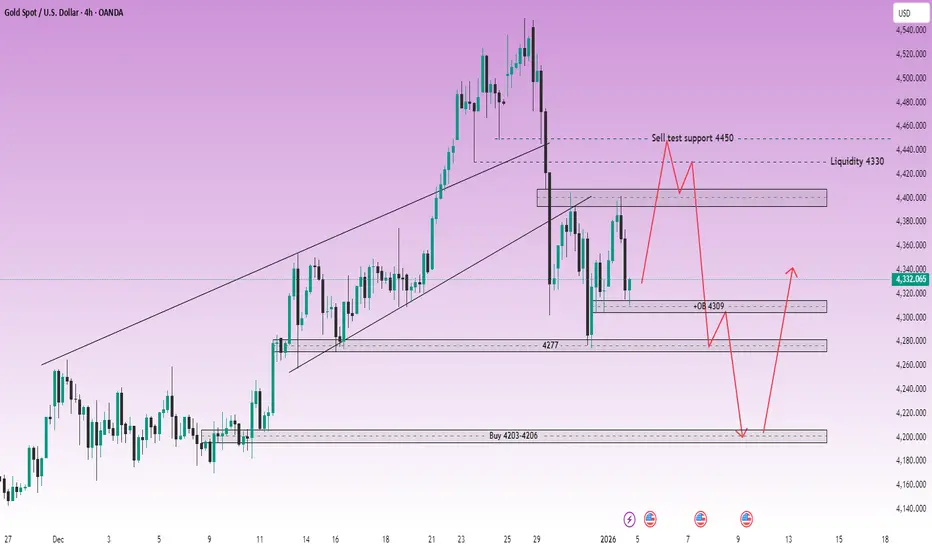
XAUUSD (H4) – Monday SetupGeopolitical shock risk, gold may spike | Trade liquidity and reaction zones only
Quick summary
News around Trump’s claim that Maduro has been detained, plus Venezuela’s response (they don’t know his and his wife’s whereabouts and are demanding proof of life), raises geopolitical uncertainty sharply. For gold, that’s a classic catalyst for a gap/spike at Monday open.
So my rule for Monday: no FOMO, only trade liquidity zones and confirmed reactions on the chart.
1) Macro context: Why gold can surge on Monday
Rising geopolitical tension often drives flows into safe-haven assets like gold.
When facts are unclear and tensions escalate, the market can open with:
✅ sharp spikes, ✅ liquidity sweeps, ✅ wider spreads.
➡️ Best approach: wait for price to hit levels, then trade the reaction — not the headline.
2) Technical view (H4 – based on your chart)
Gold is currently moving inside a larger structure after a heavy move, and your chart highlights the key zones clearly:
Key zones
Sell test support 4450 (pullback area where price may get sold)
Liquidity 4330 (major liquidity magnet)
OB 4309 (order block / short-term reaction zone)
Support 4277 (intermediate support)
Buy zone 4203–4206 (deep support / swing buy area)
3) Monday trading scenarios (Liam style: trade the level)
Scenario A (priority): Spike up → SELL around 4450
✅ If gold pumps on the headline at the open:
Sell around 4450 (sell-test zone)
SL: above the most recent swing high (refine on lower TF)
TP1: 4330
TP2: 4309
TP3: 4277
Logic: Headline-driven opens often spike to sweep buy-side liquidity first, then rotate back into value/liquidity.
Scenario B: Sweep down → BUY at liquidity zones
✅ If price gets pulled down first:
Buy around 4330 (Liquidity)
Buy confirmation at 4309 (OB)
SL (guide): below 4300
TP: 4380 → 4450 (scale out)
Logic: 4330 is a major liquidity magnet and often produces a sharp reaction bounce.
Scenario C (worst-case dump): BUY the deep support 4203–4206
✅ If volatility is extreme and price flushes:
Buy: 4203 – 4206
SL: 4195
TP: 4277 → 4330
Logic: This is a deep swing-buy area if the market does a hard liquidity reset.
4) Key notes for a headline-driven Monday open
Avoid trading the first 5–10 minutes if spreads widen.
Only enter once price hits the level and shows a clear reaction (rejection / engulf / MSS on M15).
Reduce size — geopolitical opens can whip hard.
Do you think Monday’s move sweeps up into 4450 first, or drops straight into 4330 liquidity?
ETHBTC W Pattern Makes the Case for a Macro Bull MarketIt seems pretty clear to me that ETHBTC is in a multi year W pattern. The higher low on the W, with hidden bullish divergence helps confirm the pattern, as does the recent price action.
From April to May of 2025 price consolidated in a low and then surged to a local high in August when it the orange 0.382 fib level
Since then price has been cooling off to the 200SMA. I kind of feel bad for people that were expecting a death cross, because it very likely that will not be happening any time soon.
Over the next several years ETHBTC is going to chop up. Its going to stall and retrace at fib levels, previous resistance, etc. But the bias is upward.
Total2/Bitcoin
I am also very optimistic on crypto because Total2/Bitcoin is in an ascending triangle formation, also supported by hidden bullish divergence
A daily chart shows a clear break of downward sloping resistance, a breakout and a retest of the trendline as support. We are seeing price going up again after a golden cross a few months ago. Very little chance of bear market in my assessment
Others/Total3
Looks very tempting. Consolidating. About to break out. Impulse up. Probably going to stall at the 0.382 Retrace level. Time will tell. All of the speculative small caps are going to go crazy if Others/Total3 starts to barrel upward to the 1.618. If that happens we are all so pre-rich right now its crazy.
What I am doing
I've stayed biased bull. I bought dips that kept on dipping, and then I bought again. And again when it dipped further. I worked like a dog to get through the holidays so I wouldn't have to cash any out and instead still have money to buy crypto, on top of buying gifts for love ones.
I am going to buy even more.

BTC/Gold A Simple Signal That Has Worked Only 4 Times in HistoryThe BTC/XAU (monthly) chart has produced only four clear local bottom signals throughout its entire history.
This is a deliberately simple, noise-free setup. No indicators overload, no short-term speculation—just relative strength between Bitcoin and gold.
Each of these historical bottom zones marked periods where Bitcoin stopped underperforming gold and began a new phase of relative outperformance. In other words, these were moments when risk appetite slowly rotated back from a defensive asset (gold) into a risk asset (Bitcoin).
What makes this signal powerful is its rarity.
It doesn’t trigger often—but when it does, it tends to coincide with major regime shifts, not short-term trades.
The current level once again sits near a historically significant zone.
Whether this becomes another confirmed bottom will be decided by time and follow-through, but historically, this is where long-term investors start paying attention—not chasing price, but watching the ratio.

Gold Bullish Outlook | Dollar Weakness & Geopolitical Risks!Hey Traders,
In the coming week, we are closely monitoring XAUUSD (Gold) for a potential buying opportunity around the 4,280 zone. Gold remains in a strong bullish trend and is currently undergoing a healthy corrective pullback, approaching a key trendline confluence and 4,280 support & resistance zone, which could act as a high-probability demand area.
From a macro perspective, the recent weakness in the US Dollar continues to support upside momentum in Gold. Additionally, last night’s escalation of US tensions with Venezuela has increased geopolitical uncertainty, further boosting safe-haven demand for Gold, which strengthens the bullish bias.
As always, wait for confirmation and manage risk accordingly.
Trade safe,
Joe.

Head and Shoulders PatternHead & Shoulders Patterns
Classic Reversal Structures Every Trader Should Know
1. Head & Shoulders (Bearish Reversal)
The Head & Shoulders pattern is a bearish reversal formation that typically appears after an established uptrend. It signals a possible shift from bullish to bearish market conditions.
This structure consists of three swing highs:
• Left Shoulder – first peak
• Head – highest peak
• Right Shoulder – final peak, similar in height to the left shoulder
Identification Rules
• Left Shoulder < Head > Right Shoulder
• Left Shoulder ≈ Right Shoulder (symmetry improves reliability)
Volume ideally declines as the pattern forms, showing weakening buying pressure.
Between the peaks are two pullbacks (swing lows). Connecting these lows forms the neckline. A confirmed break below the neckline completes the pattern and signals bearish continuation.
2. Inverse Head & Shoulders (Bullish Reversal)
The Inverse Head & Shoulders is the bullish counterpart and typically forms after a downtrend. Instead of peaks, the pattern is made of three troughs:
• Left Shoulder – first low
• Head – lowest point
• Right Shoulder – higher low, similar to the left shoulder
Identification Rules
• Left Shoulder > Head < Right Shoulder
• Left Shoulder ≈ Right Shoulder (symmetry improves reliability)
Volume often contracts during formation and may expand on the neckline breakout.
The highs between the troughs form the neckline. A break above the neckline confirms the bullish reversal.
3. Complex Head & Shoulders Variations
Complex variations follow the same logic as standard H&S patterns but include:
• Multiple shoulders on one or both sides
• More than one head
Despite the added structure, these patterns still rely on:
• Symmetry
• Clear neckline definition
• Breakout confirmation
Traders should treat them the same way as standard formations, but with extra patience.
4. Measurement Rule (Profit Targets)
Standard Head & Shoulders (Bearish)
• Measure the vertical distance from the head to the neckline
• Subtract that distance from the neckline breakout level
• This projects a downside target
Inverse Head & Shoulders (Bullish)
This is very simple. It’s exactly the same as the above Standard Head & Shoulders (Bearish), but inverted. Same concept. Just upside down.
** Tip **
When multiple heads exist, use the most extreme head (highest for bearish, lowest for bullish) for measurement.
Final Notes for Traders
Head & Shoulders patterns remain effective because they visually represent trend exhaustion and shifting market psychology.
When trading these patterns, always emphasize:
• Structure first
• Confirmation second
• Risk management always
