Accumulation for S&P500Hi traders,
Last week SPX500USD started a move up, but this doesn't look impulsive.
So I think this could be a bigger Triangle pattern (red wave 4).
In that case next week we could see a correction down and after that an impulsive upmove.
Let's see what the market does and react.
Trade idea: Wait for an impulsive wave up and a correction down. After a change in orderflow to bullish on a lower timeframe you could trade longs.
This shared post is only my point of view on what could be the next move in this pair based on my technical analysis.
But I react and trade on what I see in the chart, not what I've predicted or expect.
Manage your emotions, trade your edge!
Eduwave
Community ideas

NZDUSD H4 | Bearish Reaction Off Overlap ResistanceMomentum: Bearish
Price is currently below the ichimoku cloud.
Sell entry: 0.59987
- Overlap resistance
- 50% Fib retracement
Stop Loss: 0.60466
- Swing high resistance
Take Profit: 0.59499
- Swing low support
High Risk Investment Warning
Stratos Markets Limited (fxcm.com/uk), Stratos Europe Ltd (fxcm.com/eu):
CFDs are complex instruments and come with a high risk of losing money rapidly due to leverage. 69% of retail investor accounts lose money when trading CFDs with this provider. You should consider whether you understand how CFDs work and whether you can afford to take the high risk of losing your money.
Stratos Global LLC (fxcm.com/en): Losses can exceed deposits.
Please be advised that the information presented on TradingView is provided to FXCM (‘Company’, ‘we’) by a third-party provider (‘TFA Global Pte Ltd’). Please be reminded that you are solely responsible for the trading decisions on your account. Any information and/or content is intended entirely for research, educational and informational purposes only and does not constitute investment or consultation advice or investment strategy. The information is not tailored to the investment needs of any specific person and therefore does not involve a consideration of any of the investment objectives, financial situation or needs of any viewer that may receive it. Past performance is not a reliable indicator of future results. Actual results may differ materially from those anticipated in forward-looking or past performance statements. We assume no liability as to the accuracy or completeness of any of the information and/or content provided herein and the Company cannot be held responsible for any omission, mistake nor for any loss or damage including without limitation to any loss of profit which may arise from reliance on any information supplied by TFA Global Pte Ltd.
Stratos Trading Pty. Limited (fxcm.com/au):
Trading FX/CFDs carries significant risks. FXCM AU (AFSL 309763), please read the Financial Services Guide, Product Disclosure Statement, Target Market Determination and Terms of Business at fxcm.com/au

Silver - Huge demand and support from buyers!We are looking at the usual suspect that a lot of Investors have followed recently - Silver!
Currently the outlook continues to be in favor for the price increasing, based on the enormeous demand that we see for it's usage in teh A.I sector. Additionaly we have seen the past 6-8 months how Silver became up-bar as a Safe Heaven alongside Gold, the general interest coming from the biggest world Investors has given Silver the chance to reach an ATH of 122$ earlier in January.
After an enormous liquidation coming from the big players and the huge correction from 122$ level all the way down to the 65$-70$ levels ,we saw the hunger from the Buyers continuing to push the price of Silver up has not stopped.
So far we are looking into the confirmed fact of the U.S. GDP missing it's sought after expectation, and the whole fiasco surrounding Donald Trump and his tarriffs being rejected by the goverment, of which his immidiete responce was to impose new 15% tarriffs on ALL countries doing trade with the U.S. has pushed Silver passed it's resistance level.
We are looking for a sustained movement above the resistance area of 80$-84$ mark.
We are entering at 84.500
Target 1: 91.00$
Target 2: 96.00$
If bull flag formulates and pushes the level to the 96.00$ Price tag we would revisit this and give our feed back and analysis for the upcoming 100$ levels and above.
SL: zone 81 - this would enter below the Resistance area and push us to the support zone of 75$-80$ area
Please do share with me your ideas and thoughts in the comment section about the price action around Silver!
As always my friends happy trading!

Bullish bounce off?EUR/USD has bounced off the support level, which is an overlap support, and could potentially rise from this level to our take profit.
Entry: 1.1738
Why we like it:
There is an overlap support level.
Stop loss: 1.1674
Why we like it:
There is an overlap support level that aligns with the 78.6% Fibonacci projection.
Take profit: 1.1838
Why we like it:
There is an overlap resistance that aligns with the 50% Fibonacci retracement.
Enjoying your TradingView experience? Review us!
Please be advised that the information presented on TradingView is provided to Vantage (‘Vantage Global Limited’, ‘we’) by a third-party provider (‘Everest Fortune Group’). Please be reminded that you are solely responsible for the trading decisions on your account. There is a very high degree of risk involved in trading. Any information and/or content is intended entirely for research, educational and informational purposes only and does not constitute investment or consultation advice or investment strategy. The information is not tailored to the investment needs of any specific person and therefore does not involve a consideration of any of the investment objectives, financial situation or needs of any viewer that may receive it. Kindly also note that past performance is not a reliable indicator of future results. Actual results may differ materially from those anticipated in forward-looking or past performance statements. We assume no liability as to the accuracy or completeness of any of the information and/or content provided herein and the Company cannot be held responsible for any omission, mistake nor for any loss or damage including without limitation to any loss of profit which may arise from reliance on any information supplied by Everest Fortune Group.

Everyone Uses VWAP WrongAfter RSI produced nothing and the Turn of the Month effect produced something, the obvious next question was VWAP. We received enough requests to examine it that ignoring them felt irresponsible. The Volume Weighted Average Price occupies a peculiar position in trading culture. Institutional desks treat it as the yardstick against which execution quality is measured. Retail traders treat it as a crystal ball. One side built a trillion-dollar execution infrastructure around it. The other side draws lines through it on a chart and expects it to tell them where price is going.
We tested this properly. Nearly six million parameter combinations across ten distinct VWAP strategies and four timeframes, put through the same statistical framework we used for RSI and the Turn of the Month. The results surprised us. VWAP generates more Bonferroni significant results than any indicator we have tested, with over 150,000 configurations surviving the strictest correction. Mean reversion short signals produce an average edge of 0.89 percentage points, roughly six times typical transaction costs. That makes VWAP the first indicator in our series to show statistically robust and economically meaningful edge. The catch: this edge concentrates in a single strategy type. The most popular retail approach, the crossover, produces exactly zero significant results. Eighty percent of the strategies retail traders actually use either do nothing or actively lose money. VWAP has real predictive value, but almost nobody is using it correctly.
Abstract
We examine ten common VWAP trading strategies across 34 asset timeframe combinations spanning four timeframes from 15 minute to daily intervals. Testing 5,833,435 parameter configurations including mean reversion, trend following, crossover, bounce, breakout, slope momentum, volume confirmation, reversal, distance percentile, and multi VWAP confluence strategies, we find 150,546 results that survive Bonferroni correction. This far exceeds the zero significant results from our RSI studies and substantially exceeds the 21 significant results from our Turn of the Month analysis. Averaging across all ten strategies, including those with negative edge, produces a misleading aggregate of negative 0.12 percentage points for long signals and positive 0.21 percentage points for short signals. The meaningful finding lies in the decomposition. Mean reversion emerges as the dominant strategy, generating 100,765 Bonferroni significant tests with short signal edge of 0.89 percentage points, roughly six times round-trip transaction costs. Distance percentile provides a complementary signal with 0.33 percentage points short edge. The popular crossover strategy produces exactly zero Bonferroni significant results. We conclude that VWAP contains genuine predictive information concentrated in mean reversion dynamics, representing the strongest statistical edge documented in our indicator series.
1. Introduction
The Volume Weighted Average Price was introduced by Berkowitz, Logue, and Noser (1988) as a benchmark for measuring institutional execution quality. Their insight was elegant: if an institution executes trades throughout the day at prices that average to the VWAP, they have achieved fair execution relative to the day's volume distribution. Trades executed below VWAP represent good buys; trades above VWAP represent poor buys.
This benchmark quickly became the standard for institutional performance measurement. Madhavan (2002) documented that VWAP benchmarking had become ubiquitous among pension funds and asset managers by the early 2000s. The logic is compelling: VWAP represents the average price paid by all market participants weighted by their trading volume. Matching VWAP means achieving market average execution.
Retail trading culture took this execution benchmark and turned it into something the designers never intended. Online forums and trading education present VWAP as a predictive indicator. Traders draw conclusions when price crosses above VWAP, treating such crossovers as bullish signals. They interpret price below VWAP as bearish. Some build elaborate strategies around VWAP bands, treating standard deviation envelopes as support and resistance levels. It is as if someone took a thermometer and started using it to forecast the weather.
The academic literature wants nothing to do with VWAP as a predictive tool. Almgren and Chriss (2001) developed optimal execution algorithms that use VWAP as a target, not as a signal. Kissell and Glantz (2003) documented VWAP's role in measuring transaction costs without once suggesting predictive value. Somewhere between the academic consensus and the YouTube tutorials, the truth had to be hiding. That gap motivated this study.
2. What VWAP actually measures
Understanding why institutional traders use VWAP requires examining what the calculation captures. VWAP equals the cumulative sum of price times volume divided by cumulative volume. Mathematically:
VWAP = Sum of (Price times Volume) / Sum of Volume
This formula produces the volume weighted average price from market open to the current time. The calculation resets daily for standard VWAP, though anchored variants use different starting points.
The institutional interpretation is straightforward. Large orders cannot execute instantly without moving prices adversely. A pension fund buying one million shares must spread purchases across the day to minimize market impact. If the fund's average execution price matches VWAP, they paid the same average price as all other buyers that day. They achieved fair execution.
Biais, Glosten, and Spatt (2005) explained why VWAP benchmarking dominates institutional trading. First, VWAP is observable and verifiable. Clients can independently calculate it from public data. Second, VWAP is difficult for execution brokers to manipulate. Third, VWAP represents a reasonable estimate of execution quality absent specific information about optimal timing.
The retail interpretation differs fundamentally. When retail traders treat price below VWAP as oversold or price above VWAP as overbought, they assume mean reversion toward the average. When they treat VWAP crossovers as trend signals, they assume momentum continuation. These assumptions transform a benchmark into an indicator with predictive claims.
3. How professionals actually use VWAP
Institutional VWAP usage falls into two categories: execution benchmarking and algorithmic trading.
For execution benchmarking, institutions compare their actual execution prices against VWAP to measure broker performance. A broker who consistently executes above VWAP for buy orders is underperforming. Perold (1988) formalized this comparison as implementation shortfall, measuring the gap between paper portfolio returns and actual portfolio returns after transaction costs.
For algorithmic trading, VWAP serves as an execution target rather than a signal. VWAP algorithms, documented extensively by Johnson (2010), attempt to execute large orders at prices matching or beating VWAP. The algorithm does not predict price direction. Instead, it times order slices to match historical intraday volume patterns, executing more shares during high volume periods when market impact is lower.
Harris (2003) emphasized a distinction that retail traders consistently miss: institutional VWAP strategies are execution strategies, not alpha strategies. Nobody on an institutional desk is staring at a VWAP crossover waiting for a buy signal. They already know what they want to buy. VWAP algorithms simply execute that decision at the best average price possible. The institution decided to trade based on fundamental analysis or portfolio rebalancing needs. VWAP is the delivery mechanism, not the decision.
4. Common VWAP trading strategies
Retail trading education promotes numerous VWAP strategies that treat the benchmark as a predictive indicator. We tested ten of the most commonly promoted approaches, covering essentially every VWAP strategy that has a name and a following.
The crossover strategy interprets price crossing above VWAP as a buy signal and price crossing below as a sell signal. Proponents argue that such crossovers indicate momentum shifts. When price moves above the volume weighted average, bulls have taken control.
The mean reversion strategy interprets price far below VWAP as oversold and price far above as overbought. Traders construct bands at various standard deviations from VWAP, treating these bands as support and resistance.
The bounce strategy treats VWAP itself as support or resistance. When price approaches VWAP from below and bounces higher, traders interpret this as confirmation of bullish sentiment.
The trend following strategy uses VWAP as a filter. Traders only take long positions when price exceeds VWAP and only take short positions when price falls below.
The breakout strategy looks for price breaking through VWAP deviation bands with momentum, expecting continuation in the breakout direction.
The slope momentum strategy examines whether VWAP itself is rising or falling, using the slope as a trend indicator combined with price position relative to VWAP.
The volume confirmation strategy requires high volume to confirm VWAP crossover signals, filtering out low conviction moves.
The reversal strategy looks for price that has been on one side of VWAP for multiple consecutive periods before crossing to the other side.
The distance percentile strategy uses rolling percentiles of the distance between price and VWAP to identify extreme readings.
The multi VWAP strategy uses confluence between short period and long period VWAP calculations to confirm signals.
Most of these strategies have no theoretical basis in the market microstructure literature. The exception is mean reversion: price reverting toward the volume-weighted average is consistent with microstructure theory, where temporary deviations from equilibrium create opportunities that informed participants exploit. The rest amount to post hoc pattern recognition applied to a tool that was built for an entirely different purpose. Nobody at Goldman Sachs is watching VWAP crossovers.
5. Data and methodology
5.1 Asset universe
We constructed a comprehensive universe spanning 50 assets across multiple categories, ultimately loading 34 asset timeframe combinations with sufficient data quality.
United States equities included SPY, QQQ, IWM, DIA, VOO, VTI, and MDY, providing exposure across market capitalizations from the S&P 500 to small caps.
International equities included EFA, EEM, VWO, VEA, and IEFA, covering both developed and emerging markets.
Sector ETFs included XLF, XLK, XLE, XLV, XLI, XLY, XLP, XLU, XLB, and XLRE, spanning all major market sectors.
Commodities included GLD, SLV, USO, UNG, DBA, and DBB, covering precious metals, energy, and agricultural commodities.
Fixed income included TLT, IEF, LQD, HYG, AGG, and BND, spanning government and corporate bonds across durations.
Volatility and leveraged products included VXX, UVXY, TQQQ, SQQQ, SPXL, and SPXS.
Individual stocks included AAPL, MSFT, GOOGL, AMZN, NVDA, META, TSLA, JPM, V, JNJ, UNH, and XOM.
5.2 Timeframe analysis
Unlike our previous studies that examined only daily data, this analysis spans four distinct timeframes to test whether VWAP edge varies with trading horizon.
Daily data provided approximately 5,000 bars per asset, covering roughly 20 years of market history.
Four hour data provided approximately 3,000 to 3,200 bars per asset.
Thirty minute data provided approximately 5,000 bars per asset.
Fifteen minute data provided approximately 5,000 bars per asset.
This multi-timeframe approach lets us answer a question that matters for implementation: does VWAP edge survive when you zoom in, or does it evaporate into noise at higher frequencies?
5.3 VWAP calculation
We calculated rolling VWAP using the standard formula with variable lookback periods ranging from 1 to 100 periods. Single period VWAP uses only current bar data. Multi period VWAP accumulates price times volume over the specified window.
For strategies requiring deviation bands, we calculated rolling standard deviations of the deviation between price and VWAP. Band multipliers ranged from 0.25 to 6.0 standard deviations.
For slope based strategies, we calculated the percentage change in VWAP over periods ranging from 2 to 20 bars.
5.4 Strategy definitions
We tested ten strategies representing common retail VWAP applications. Each strategy generates both long and short signals, tested independently.
Crossover: Long when price crosses above VWAP. Short when price crosses below.
Mean reversion: Long when price falls below VWAP minus n standard deviations. Short when price rises above VWAP plus n standard deviations.
Trend following: Long when price exceeds VWAP. Short when price falls below VWAP.
Bounce: Long when price touches VWAP from above and closes higher. Short for the inverse.
Breakout: Long when price breaks above the upper VWAP band. Short when price breaks below the lower band.
Slope momentum: Long when VWAP slope is positive and price exceeds VWAP. Short for the inverse.
Volume confirmation: Long on VWAP crossover with above average volume. Short for the inverse.
Reversal: Long after consecutive periods below VWAP followed by a cross above. Short for the inverse.
Distance percentile: Long when the price to VWAP distance reaches a historically extreme low percentile. Short for high percentiles.
Multi VWAP: Long when price exceeds both short and long period VWAP with short VWAP above long VWAP. Short for the inverse.
5.5 Parameter grid
We tested 100 VWAP periods from 1 to 100, 24 deviation multipliers from 0.25 to 6.0, 22 holding periods from 1 to 90 bars, 7 tolerance values for bounce detection, 7 slope periods, 7 volume multipliers, 9 consecutive period counts, 5 percentile thresholds, and 5 long period values for multi VWAP. This produced 5,833,435 valid tests after filtering for minimum signal counts.
5.6 Statistical framework
We measure edge as the difference between signal returns and baseline returns over the same holding period. Statistical significance is assessed using Welch's t-test for unequal variances. Given 5,833,435 tests, the Bonferroni corrected significance threshold at alpha equals 0.05 is 8.57 times ten to the negative ninth power. To put that in perspective: a result has to be so unlikely under the null hypothesis that it would occur by chance less than once in a hundred million tries. Anything that survives this filter is not noise.
6. Results
6.1 Aggregate findings
Figure 1 condenses the entire analysis into seven panels, and the picture it paints is unambiguous. The top row shows edge distribution by strategy, timeframe, and asset category. Mean reversion dominates with the widest positive distribution, particularly on the short side. Four hour data displays the strongest edge across timeframes, and US equities show the most pronounced effects by category.
The middle row displays significance rates. Mean reversion achieves nearly 30 percent nominal significance for long signals and over 43 percent for short signals. Crossover achieves only 4.7 percent for long and 4.0 percent for short, falling below the 5 percent expected by pure chance. Four hour and daily data show higher significance rates than intraday timeframes. Among asset categories, leveraged products and US large caps lead.
The bottom panel presents the p-value distribution, showing a sharp concentration at low values with a clear departure from the uniform distribution expected under the null hypothesis. This confirms genuine statistical signal exists in the data.
Figure 2 provides the complete numerical summary. Mean reversion stands out with 26,787 long and 73,978 short Bonferroni significant results, short edge of +0.894 percentage points, and a 43.3 percent nominal significance rate on the short side. Crossover shows zero Bonferroni significant results from 74,800 tests. Slope momentum and breakout show significant negative edge, confirming that reversing these strategies would produce positive returns.
6.2 Statistical significance
Figure 3 shows the p-value distributions for long and short signals separately. Under the null hypothesis of no predictive power, p-values would distribute uniformly. Instead, both distributions show massive concentration at low values, with 21.2 percent of long signals and 23.0 percent of short signals achieving nominal significance at p less than 0.05. This four-fold excess over the expected five percent rate is visible as the sharp spike at the left edge of both histograms.
Of 5,833,435 total tests, 1,150,654 long signals and 1,255,438 short signals achieved nominal significance. More importantly, 52,239 long signal tests and 98,307 short signal tests survived Bonferroni correction. This total of 150,546 Bonferroni significant results far exceeds zero from our 26 million RSI tests and dramatically exceeds the 21 significant results from our Turn of the Month study.
Figure 4 breaks down significance by strategy. The left panel shows nominal significance rates: mean reversion leads at 43.3 percent on the short side, followed by distance percentile, slope momentum, and multi-VWAP, all well above the 5 percent threshold marked by the dashed line. Crossover sits at 4.0 percent, indistinguishable from chance. The right panel shows Bonferroni significant counts in absolute terms. Mean reversion dominates overwhelmingly with over 73,000 short signal results surviving the strictest correction. The concentration is clear: statistical significance in VWAP trading is almost entirely a mean reversion phenomenon.
6.3 Results by strategy
Figure 5 shows violin plots of the edge distribution for all ten strategies, split by long and short signals. Each violin represents the full distribution of edge values across all parameter combinations for that strategy. Mean reversion (yellow) shows the widest positive distribution, with the entire interquartile range above zero on the short side. Distance percentile (orange) shows a similar but narrower positive distribution. Crossover (teal, center) is compressed tightly around zero. Breakout, slope momentum, and trend following show distributions shifted into negative territory, indicating systematic value destruction.
Mean reversion accounts for the overwhelming majority of significant results. Of 1,678,467 mean reversion tests, 26,787 long signals and 73,978 short signals achieved Bonferroni significance. The mean edge equals positive 0.26 percentage points for long signals and positive 0.89 percentage points for short signals. This short signal edge of nearly one percentage point represents the strongest effect we have documented in any VWAP strategy.
Distance percentile produced 7,659 Bonferroni significant results with mean long edge of 0.10 percentage points and short edge of 0.33 percentage points. This strategy uses rolling percentiles rather than fixed standard deviation bands, potentially adapting better to changing volatility regimes.
Bounce produced 5,935 Bonferroni significant results, but the edge is trivially small: 0.02 percentage points for long signals and negative 0.06 for short signals. Statistically significant and economically meaningless. The idea that VWAP acts as support or resistance has a grain of truth in it, but the grain is too small to build a trading strategy on.
Slope momentum produced 31,546 Bonferroni significant results, but in the wrong direction. The long edge is negative 0.45 percentage points and the short edge negative 0.20 percentage points. This is interesting precisely because the negative edge is itself statistically significant. The strategy reliably loses money, which means the reverse reliably makes money. Going short when VWAP slope is positive and price is above VWAP, the exact opposite of what the strategy prescribes, would capture this effect. A strategy that consistently fails is almost as useful as one that consistently succeeds, provided you have the data to prove it fails.
Multi VWAP confluence produced 734 Bonferroni significant results, also with negative edge. Stacking two broken signals on top of each other does not produce a working one.
Trend following produced 2,304 Bonferroni significant results with negative edge of 0.30 percentage points for long signals. Staying long when price exceeds VWAP produces worse returns than random entry. The simplest possible VWAP strategy, "buy when price is above VWAP, sell when below," actively destroys value.
Breakout produced 1,500 Bonferroni significant results concentrated in long signals, but with negative edge of 0.54 percentage points. Breaking through VWAP bands predicts subsequent reversal, not continuation. This reinforces the mean reversion thesis: extreme moves away from VWAP tend to reverse, and strategies that bet on continuation systematically lose to those that bet against it.
Volume confirmation produced 55 Bonferroni significant results from 427,319 tests. The intuition that adding a volume filter to a crossover signal might help sounds reasonable. The data says it does almost nothing. You cannot fix a broken signal by confirming it more confidently.
Reversal produced 48 Bonferroni significant results from 671,697 tests. Waiting for price to spend multiple consecutive bars on one side of VWAP before crossing does not create edge. Patience alone is not a strategy.
Crossover produced exactly zero Bonferroni significant results from 74,800 tests. Not one. The most popular VWAP strategy in retail trading education, the one featured in every introductory course and every YouTube tutorial, has no statistical support whatsoever. Seventy-five thousand attempts to find a configuration that works, and every single one came up empty.
6.4 Results by timeframe
Figure 6 presents heatmaps and bar charts comparing results across timeframes. The top-left heatmap shows long edge by strategy and timeframe: mean reversion (green) stands out on the four hour timeframe. The top-right heatmap shows short edge, where mean reversion on four hour data shows the deepest green, indicating the strongest positive edge. The bottom-left bar chart shows significance rates by timeframe, with four hour data achieving the highest rates for both long and short signals. The bottom-right panel shows maximum edge by timeframe: four hour short signals reach nearly 90 percentage points in their best configurations, far exceeding all other timeframes.
Figure 7 provides additional timeframe detail. The top-left panel isolates mean edge by timeframe, making visible that four hour short edge of 0.73 percentage points dwarfs all other timeframe-direction combinations. The top-right panel shows significance rates exceed 20 percent for four hour and daily data across both signal directions. The bottom-left panel shows Bonferroni significant counts: daily short signals lead in absolute count due to larger sample size, while four hour data leads in both long and short concentration. The bottom-right panel shows the distribution of tests across timeframes, confirming that daily data has the largest sample.
Four hour data shows the strongest effects with mean short edge of positive 0.73 percentage points, nearly four times the daily edge. This likely reflects institutional trading rhythms that operate on multi-hour horizons, where VWAP algorithms accumulate positions and create the supply-demand imbalances that drive mean reversion.
Daily data shows moderate effects with mean short edge of positive 0.08 percentage points.
Thirty minute and fifteen minute data show the weakest effects, with edges near zero. The answer to the timeframe question is clear: VWAP edge does not survive the zoom. Below the four hour horizon, noise overwhelms signal and there is nothing left to trade.
6.5 Strategy deep dive
Figure 8 presents a four-panel deep dive. The top row shows violin plots for all ten strategies split into two groups. Mean reversion (yellow, far right of top-left panel) shows the widest positive distribution with median clearly above zero. Crossover (teal) compresses tightly around zero. Slope momentum (brown, top-right panel) and trend following (teal) show distributions shifted below zero.
The bottom-left panel shows Bonferroni significant counts by strategy, making the dominance of mean reversion unmistakable: its short signal bar towers over all other strategies combined. The bottom-right panel shows edge by holding period. Short signal edge (red) increases monotonically with holding period, reaching 0.4 percentage points at 90 bars. Long signal edge (teal) turns increasingly negative at longer horizons. This asymmetry is consistent with mean reversion: shorting overextended moves above VWAP captures a reversion that grows with time, while buying below VWAP shows weaker and inconsistent recovery.
Figure 9 shows edge distributions by asset category. On the long side, sector ETFs and leveraged products display the widest spread, while bonds and commodities show narrow distributions near zero. On the short side, leveraged products and volatility instruments show the widest positive distributions, followed by US large caps and sector ETFs. This pattern is consistent with mean reversion being strongest in assets with higher volatility and institutional participation.
Figure 10 isolates the holding period effect, and the result is surprisingly clean. The left panel shows mean short edge increasing steadily from near zero at one bar holding to approximately 0.4 percentage points at 90 bars, while mean long edge declines symmetrically into negative territory. The right panel shows significance rates following the same monotonic pattern: both long and short significance rates rise with holding period, reaching above 30 percent at 90 bars. This kills the scalping narrative. VWAP mean reversion is not a quick-in-quick-out trade. The effect strengthens the longer you hold, which is good news for implementation because longer holds reduce the relative impact of transaction costs and make the strategy more forgiving of imperfect execution.
6.6 Parameter sensitivity
Figure 11 maps the interaction between VWAP period, holding period, strategy, and timeframe. The top row shows heatmaps of edge as a function of VWAP lookback period (x-axis) and holding period (y-axis). For long signals (top-left), the map is dominated by red (negative edge), especially at longer VWAP periods and holding periods. For short signals (top-right), a broad region of green (positive edge) appears at VWAP periods above 20 combined with holding periods above 10, indicating that longer lookback and longer holds concentrate the strongest short edge.
The bottom row shows strategy-by-timeframe heatmaps. Mean reversion shows consistent green (positive edge) across four hour and daily timeframes on both long and short sides. Slope momentum and breakout show deep red across most timeframes. The pattern is stable: strategy selection matters far more than timeframe selection, and mean reversion is the only strategy that produces green across multiple timeframes.
6.7 Best configurations
Figure 12 lists the top 15 configurations ranked by statistical significance (lowest p-value, regardless of edge direction). All 15 are mean reversion strategies, but they tell two very different stories.
The single most significant result is EFA (developed international equities) on the daily timeframe with VWAP period 48 and holding period 90. Its short signal edge is negative 6.073 percentage points with a p-value of 2.15e-67. This is not a mean reversion success. It is a mean reversion failure of extraordinary statistical clarity. When mean reversion says "short EFA," the ETF proceeds to rise substantially above baseline. The pattern is anti-mean-reversion: developed international equities on this configuration exhibit momentum rather than reversion around VWAP. The flip side is that taking the opposite position, going long when mean reversion says short, would capture the 6.073 percentage point edge.
The remaining 14 configurations are all UVXY (volatility) on the four hour timeframe, and they split into two patterns. Twelve of them use holding periods of 30 bars with VWAP periods between 64 and 78, producing short edges between 23 and 25 percentage points. These are mean reversion successes: UVXY spikes above VWAP, and the short signal correctly predicts reversion. Two use holding periods of 90 bars with VWAP periods 41 and 44, showing long signal edge of negative 25 and negative 24.6 percentage points respectively, with the short side insignificant. These are mean reversion failures on the long side: when UVXY drops below VWAP, mean reversion says "buy," but UVXY continues to fall. This is consistent with the structural decay in volatility products. UVXY reverts aggressively after upward spikes (short mean reversion works) but does not revert after drops (long mean reversion fails because the decay is permanent, not temporary).
The absolute edge magnitudes in UVXY are outsized and not representative of what equity traders should expect. But the pattern is instructive: mean reversion captures real structural dynamics, and those dynamics differ by direction and by asset class.
7. Economic significance and practical considerations
Statistical significance is necessary but not sufficient. A pattern can be real and still worthless if transaction costs eat it alive. So the question that actually matters: does this edge survive contact with reality?
7.1 Edge versus costs
Mean reversion short signals average 0.89 percentage points of edge. Round-trip transaction costs for liquid ETFs run 0.10 to 0.15 percentage points. That leaves net edge of roughly 0.74 to 0.79 percentage points per trade, a ratio of approximately 6:1 between gross edge and costs. For comparison, most academic studies consider a 2:1 ratio tradeable. At 6:1, you can be wrong about your cost estimates by a factor of three and still make money. The 0.89 figure is an average across all mean reversion configurations. The best parameter combinations produce considerably higher edge, while suboptimal configurations produce less. Selecting robust parameters within the significant region makes the difference between a strategy that works and a strategy that almost works.
7.2 Timeframe considerations
Four hour data shows the strongest edge, but the available 4H history is shorter than daily data: roughly 3,000 bars versus 5,000 daily bars spanning approximately two decades. Depending on session length and data source, 3,000 four-hour bars cover roughly two to seven years. That is enough to be interesting but not enough to confirm the effect persists across all market regimes. Still, the 4H edge of 0.73 percentage points on the short side is nearly four times the daily edge. The most plausible explanation is that VWAP dynamics operate on multi-hour institutional trading rhythms that daily data partially obscures.
Fifteen minute data shows essentially zero edge. If your plan was to trade VWAP mean reversion on five or fifteen minute charts to generate more signals, the data says no. The signal-to-noise ratio deteriorates completely at these frequencies. There is nothing there.
7.3 Strategy selection matters
Of ten strategies tested, two show consistent positive edge (mean reversion and distance percentile), and three more carry significant negative edge that can be exploited by taking the opposite position (slope momentum, breakout, trend following). A trader selecting among popular VWAP strategies without this analysis has a high probability of choosing an approach with zero or negative edge.
Crossover, the most commonly taught VWAP strategy, produces exactly zero significant results. Not borderline insignificant. Not "needs more data." Zero. A trader who learned VWAP exclusively from retail education would almost certainly choose one of the eight strategies that produce zero or negative edge, and walk past the one strategy that actually works.
8. Why VWAP mean reversion works and what limits it
8.1 The microstructure explanation
Over 150,000 Bonferroni significant results leave no room for debate: price behavior relative to VWAP is not random. Price that deviates far from VWAP tends to revert. The mechanism is straightforward. VWAP represents where the volume actually traded. When price drifts far above that level, it means recent trades occurred at prices that most of the day's volume did not support. The imbalance is inherently temporary. Liquidity providers, institutional algorithms, and informed traders all have incentives to push price back toward the volume-weighted equilibrium. This is not a behavioral anomaly. It is supply and demand doing what supply and demand does.
With mean reversion short edge of 0.89 percentage points against transaction costs of 0.10 to 0.15 percentage points, the edge is not merely statistical. It is economically significant for traders who isolate the correct strategy and parameters.
8.2 Why the edge persists
In the framework of Fama (1970), markets are efficient when prices reflect all available information. A persistent, exploitable pattern in VWAP mean reversion would seem to contradict this. Grossman and Stiglitz (1980) resolved the apparent paradox: markets reach an equilibrium where certain patterns persist because exploitation is costly, and not everyone is trying to exploit the same thing. VWAP mean reversion likely survives for a beautifully ironic reason. The institutions whose algorithms create the mean-reverting dynamics are not trying to profit from them. They are trying to match the average price. The reversion is a side effect of their execution, not their objective. They will keep generating this pattern as long as VWAP benchmarking remains the standard, which is to say, indefinitely.
On the other side, the retail community overwhelmingly uses the wrong VWAP strategies. Crossover, trend following, and breakout dominate retail education, and all three show zero or negative edge. The people who could compete for this edge are busy losing money on crossover signals instead.
8.3 Capacity and scaling constraints
The practical limit is not costs but capacity. Extreme VWAP deviations, by definition, occur infrequently. You cannot sit on a billion dollars waiting for SPY to trade two standard deviations from VWAP and expect that to keep you busy. Scaling this strategy to meaningful capital requires trading across many assets simultaneously and accepting that any single asset produces sparse signals. This natural capacity constraint is probably part of why the edge remains available. The arbitrage capital that typically compresses anomalies cannot concentrate here in sufficient size to eliminate it.
9. Comparison with RSI and Turn of the Month
Three studies, 32 million tests, three indicators. The scoreboard:
RSI: zero Bonferroni significant results from 26 million tests. Twenty-six million attempts to find a configuration where RSI predicts anything, and every single one failed. The most popular technical indicator in existence is a random number generator with a pretty chart.
VWAP: 150,546 Bonferroni significant results from 5.8 million tests. Mean reversion short signals deliver 0.89 percentage points of edge, roughly six times transaction costs. Not borderline. Not "promising." Statistically overwhelming.
Turn of the Month: 21 Bonferroni significant results from 385 tests. A small test universe but a real anomaly driven by institutional payment cycles.
The pattern is worth noting. Indicators built from price alone, like RSI, contain nothing. RSI takes price, puts it through a formula, and hands you back the same information in a different wrapper. Indicators that incorporate volume, like VWAP, tap into market microstructure and carry genuine information about who is trading and at what price. Calendar anomalies reflect institutional flow patterns. The common thread between VWAP and Turn of the Month: both trace back to identifiable economic mechanisms. RSI traces back to nothing.
10. Implications for traders
10.1 For institutional traders
Nothing in this analysis suggests changing institutional practice. VWAP remains the right execution benchmark, and the data confirms that it represents fair value for trading periods. What the data does add is an insight about timing. The strong mean reversion results suggest that institutional execution algorithms themselves contribute to the mean-reverting dynamics around VWAP. There is a feedback loop: institutional trading creates the pattern, and understanding it may improve execution. Initiating large orders during periods of extreme VWAP deviation, when mean reversion pressure is highest, could reduce effective implementation shortfall.
10.2 For systematic strategy developers
VWAP mean reversion on the short side represents the strongest edge documented in our indicator series. The data points toward several development paths:
Focus on mean reversion short signals on four hour and daily timeframes across US large cap equities. This combination concentrates the highest significance rates and edge magnitudes. Distance percentile provides a complementary signal that adapts to changing volatility regimes.
Strategies with significant negative edge, specifically slope momentum, breakout, and trend following, can be reversed. Their negative edge is statistically significant, meaning the opposite position carries positive edge. A contrarian breakout strategy, fading moves through VWAP bands rather than following them, is supported by the data.
Consider combining VWAP mean reversion with the Turn of the Month effect documented in our previous study. The two signals operate on different mechanisms, VWAP on microstructure dynamics and Turn of the Month on institutional flow cycles, and their combination could improve both signal density and diversification.
A portfolio approach across multiple liquid ETFs increases signal frequency and reduces the variance inherent in any single asset. The data shows consistent effects across US equity ETFs, providing a natural universe for diversification.
Position sizing should reflect deviation magnitude. Larger deviations from VWAP produce stronger mean reversion and higher edge per trade, while smaller deviations carry weaker signals that may not justify transaction costs.
10.3 For retail traders
If you are using VWAP crossovers, stop. We tested 74,800 configurations and found zero significant results. Not "few." Zero. The strategy you learned from that YouTube tutorial is statistically indistinguishable from flipping a coin, except the coin does not charge you transaction costs.
VWAP mean reversion on the short side with four hour or daily data is the only approach the data supports. Beyond that, use VWAP the way institutions do: as a benchmark. If you decide to buy a stock for fundamental reasons, compare your execution price to VWAP afterward. It will not tell you what to buy. It will tell you whether you bought it well.
10.4 For trading educators
Stop teaching VWAP crossover as a trading strategy. Zero significant results from nearly 75,000 tests should end that conversation. If you want to teach VWAP honestly, teach mean reversion with proper context about the microstructure dynamics that drive it. Explain why VWAP exists as an execution benchmark, how institutional algorithms create predictable supply-demand dynamics around it, and why betting against extreme deviations works while betting on crossovers does not. The data is unambiguous. The curriculum should be too.
11. Limitations
No study is complete without an honest accounting of what it did not test and what could change the conclusions.
First, we tested only four timeframes. Tick level data or other intervals might show different results.
Second, our analysis assumes execution at bar close prices. Real trading involves execution at varying prices within bars.
Third, we did not test combinations of VWAP with other indicators. Some traders use VWAP as a filter in conjunction with other signals.
Fourth, transaction cost estimates reflect current market conditions. Historical periods with wider spreads would have more strongly eliminated the observed edge.
Fifth, we did not test anchored VWAP starting from specific events like earnings or gap openings. These variants might behave differently than rolling VWAP.
Sixth, we tested each strategy in isolation. Combining mean reversion with filters such as volume confirmation, volatility regimes, or the Turn of the Month effect could improve both hit rate and edge magnitude. These combinations represent natural next steps for strategy development.
Seventh, position sizing was not modeled. Scaling position size with deviation magnitude, where larger VWAP deviations receive larger allocations, could substantially improve risk-adjusted returns given the non-linear relationship between deviation and subsequent mean reversion.
12. Conclusion
Nearly six million parameter combinations. Ten strategy types. Four timeframes. Thirty-four asset-timeframe combinations. This is, to our knowledge, the largest quantitative analysis of VWAP trading strategies ever conducted.
The headline result: VWAP is the strongest indicator we have tested. Mean reversion generates over 100,000 Bonferroni significant results with short signal edge of 0.89 percentage points, roughly six times typical transaction costs. This is not a signal emerging tentatively from the noise. It is a robust statistical effect with a clear microstructure explanation: institutional execution around VWAP creates predictable mean-reverting price behavior, and that behavior is exploitable.
The data also makes it clear which strategies do not work. Crossover, the most widely taught VWAP approach, produces exactly zero Bonferroni significant results. Breakout, trend following, and slope momentum all show significant negative edge, meaning they systematically destroy value. Out of ten tested strategies, two generate consistent positive edge (mean reversion and distance percentile), and three more can be reversed to extract positive signals. The remaining five contribute nothing.
The practical path forward is narrow but well-lit. VWAP mean reversion on the short side, focused on four hour and daily timeframes across liquid US equity ETFs, represents a genuine foundation for systematic strategy development. Distance percentile provides a complementary signal. Diversification across multiple assets addresses the capacity problem inherent in trading sparse signals.
Berkowitz, Logue, and Noser built VWAP as a benchmark in 1988. They intended it to measure execution quality, not to predict price. Our analysis of six million tests shows it does both. You just need to know which strategy to apply, and the data is extremely specific about which one that is.
References
Almgren, R. and Chriss, N. (2001). Optimal execution of portfolio transactions. Journal of Risk, 3(2).
Berkowitz, S.A., Logue, D.E. and Noser, E.A. (1988). The total cost of transactions on the NYSE. Journal of Finance, 43(1).
Biais, B., Glosten, L. and Spatt, C. (2005). Market microstructure: A survey of microfoundations, empirical results, and policy implications. Journal of Financial Markets, 8(2).
Fama, E.F. (1970). Efficient capital markets: A review of theory and empirical work. Journal of Finance, 25(2).
Grossman, S.J. and Stiglitz, J.E. (1980). On the impossibility of informationally efficient markets. American Economic Review, 70(3).
Harris, L. (2003). Trading and exchanges: Market microstructure for practitioners. Oxford University Press.
Johnson, B. (2010). Algorithmic trading and DMA: An introduction to direct access trading strategies. 4Myeloma Press.
Kissell, R. and Glantz, M. (2003). Optimal trading strategies: Quantitative approaches for managing market impact and trading risk. AMACOM.
Madhavan, A. (2002). VWAP strategies. Trading, 2002(1).
Perold, A.F. (1988). The implementation shortfall: Paper versus reality. Journal of Portfolio Management, 14(3).

Supply & Demand TradingSupply and Demand is one of the most powerful price-based concepts in trading.
Unlike indicators, supply and demand focuses purely on price imbalances — areas where aggressive buying or selling overwhelmed the market.
At its core, price moves because of imbalance. When aggressive buyers step in, price rallies. When aggressive sellers step in, price drops. The areas where that imbalance originates are what we call supply and demand zones.
These zones are not random boxes. They represent areas where large orders entered the market.
1. What Is a Supply or Demand Zone?
A Supply Zone is an area where sellers overwhelmed buyers and forced price down.
A Demand Zone is an area where buyers overwhelmed sellers and pushed price up.
You’ll usually see:
• A short consolidation
• Followed by a strong, impulsive move away
The move away is what matters. That’s the footprint. Institutions don’t get fully filled in one shot. When price comes back, it often reacts again.
That reaction is your opportunity.
2. How Zones Actually Form
High-quality zones usually form like this:
• Price pauses briefly
• Large orders enter
• Market explodes away
• Structure gets broken
That break of structure is important. It tells you the imbalance wasn’t small — it shifted control.
Don’t obsess over drawing perfect rectangles. Focus on what actually matters:
• Strong, impulsive departure
• Clean, decisive candles
• Minimal overlap or chop
• Clear directional intent
Structure tells the story — not the box.
3. The Types You’ll See
You’ll hear terms like:
• Rally Base Rally (RBR)
• Drop Base Rally (DBR)
• Drop Base Drop (DBD)
• Rally Base Drop (RBD)
Don’t get caught up in the acronyms.
Just understand:
Base = where orders were absorbed (consolidation)
Rally = where control shifted (price aggressively pushing higher/lower)
That’s it.
4. Two Possible Entries
I use two different ways to approach supply and demand. There is multiple other ways you can do this, but this is just what I do.
1. Proactive (Limit) Entry — Anticipation
This is positioning at the zone before the market confirms. You are betting on the imbalance holding.
Requirements before I consider this:
• The zone is fresh (never revisited)
• Strong, explosive departure
• Clear break of structure from the zone
• Higher timeframe bias aligned
• Obvious opposing liquidity or target
Why this works:
Institutions rarely get fully filled in one move. When price returns, unfilled orders often remain.
This gives the best R:R — but less confirmation.
You’re getting paid for being early.
2. Reactive (Confirmation) Entry — Validation
This is the higher-probability approach.
Instead of assuming the zone will hold, I wait for proof.
The sequence I want to see:
• Price trades into supply or demand
• Momentum slows or compresses
• Internal structure begins shifting
• A minor high/low gets broken
• I enter on the pullback or continuation
Price taps supply → forms a lower high → breaks a minor low → I enter short.
This reduces R:R slightly but dramatically increases accuracy.
You’re getting paid for patience.
5. Stop Loss Placement
Keep it simple.
Supply → stop above the zone.
Demand → stop below the zone.
(image is just an example of where the that stop loss needs to be)
If the zone gets fully violated, you’re wrong. No ego. No hoping.
Invalidation is part of the game.
!!!!!DONT GO CHANGING YOUR STRATEGY BECAUSE YOU LOST ONE TRADE!!!!!
6. Targets
I usually target:
• Opposing zones
• Liquidity highs/lows
• Previous structure points
Scaling out works well:
TP1 at 1R
TP2 at opposing zone
Leave a runner if structure continues
Let the market pay you in stages.
7. Multi-Timeframe Is Everything
An important part of making this even stronger is by stacking timeframes.
Example:
Daily demand
1-4H retrace
5-15M confirmation
30S-3M price entry
That alignment increases probability.
Higher timeframe gives direction.
Lower timeframe gives precision.
8. Common Mistakes I See
• Drawing zones everywhere
• Trading heavily tested levels
• Ignoring structure
• Entering mid-range
• Trading against higher timeframe bias
Fresh zones are stronger.
Zones that caused structure breaks are stronger.
Zones in premium/discount matter.
9. Advanced Layering
If you want to refine this further:
• Look for liquidity sweeps into zones
• Watch for fair value gaps (FVG) inside the zone
• Refine entries on lower timeframes
• Pay attention to where retail stops are likely resting (big one)
The best setups often look like this:
Liquidity sweep → tap into zone → structure shift → expansion
10. The Psychology Behind It
Supply and demand works because:
• Retail traders chase breakouts
• Institutions accumulate in consolidation
• Stops cluster at obvious highs and lows
• Imbalance creates movement
You’re not predicting the future. You’re reacting to where real money already stepped in.
Final Thoughts
Supply & Demand isn’t about drawing boxes and hoping.
It’s about understanding:
Where control shifted
Where orders entered
Where risk is clearly defined
If you focus on this, you’ll be ahead of 90% of traders.
— Taylor DeMario — The Crafted Trader

On Balance Volume (OBV) in CryptoSup traders 😎
If price tells the story, on balance volume tells you who’s actually behind it. The OBV indicator is one of those old-school tools that never really left the game. Markets don’t move just because candles look nice — they move because of volume pressure, and OBV helps you see where that pressure is building before everyone else notices.
At its core, OBV is just cumulative volume.
🟢 Green close? Volume gets added.
🔴 Red close? Volume gets subtracted.
Sounds simple — and that’s the whole point. The idea is that volume behavior often shows intent before price fully reacts.
In crypto, where moves can come out of nowhere, tracking crypto OBV helps you figure out whether big players are quietly loading or slowly heading for the exit.
🕵️♂️ Reading the OBV Trend Like a Trader
First thing traders look at: the OBV trend. If price is chopping sideways but OBV keeps climbing, someone’s buying under the radar. That’s classic stealth accumulation and a good example of real OBV dynamics forming before a move.
Flip the situation, and it’s just as useful — price pumping while OBV fades usually means the rally might be running on borrowed energy. When you look at an OBV chart crypto, treat it like a reality check. Comparing OBV vs price is where things get interesting, especially when divergences show up.
⚙️ OBV Patterns, Peaks, and Cycles
Experienced traders don’t just watch direction — they watch structure. A clean OBV pattern, repeated OBV peaks, or rising OBV lows can tell you a lot about who’s actually in control. Over time, you start seeing familiar OBV cycles — accumulation, expansion, exhaustion — playing out again and again.
This is where volume interpretation turns into feel. OBV doesn’t predict the future; it shows whether the market is backing the move or just faking confidence. Think of it as reading the crowd’s body language instead of listening to the noise.
💡 OBV can also be viewed alongside other tools for additional context.
Some traders combine it with moving averages, RSI, or market structure analysis to better understand momentum and volume behavior. It can be applied across different timeframes too — higher timeframes may reveal broader OBV trend direction, while lower ones can highlight shorter-term shifts in volume pressure. The key idea is that OBV doesn’t have to stand alone; it can be used as part of a wider volume interpretation framework.
⚡Why OBV Still Works in Crypto
Some traders ignore OBV because it’s old-school. That’s missing the point. The logic behind OBV history still works because trader psychology hasn’t changed. Fear, greed, and FOMO still drive markets, and volume still exposes intent.
Looking at OBV historical zones can help you spot areas where serious buying or selling happened before. And in crypto — where fakeouts are almost a daily event — OBV helps separate hype from real conviction.
🧠 Final Take
The beauty of on balance volume is its simplicity. No complicated formulas, no flashy signals — just raw insight into volume pressure and market intent. Traders use it to confirm breakouts, spot divergences, and understand the story behind price action. In crypto, where noise is everywhere, OBV helps you tune into the signal.
This is educational content, not trading advice — always think for yourself and trade based on your own analysis.

Market 'Spring': Profit from Pre-Impulse Compression (Guide)Today’s pattern is the "Triangle," one of the most powerful consolidation patterns, showing us where the market gathers strength for the next impulse.
➡️ What is it and what does it look like?
The price stops making wide swings and begins to fluctuate within an increasingly narrower range, forming a triangle shape. Its sides are formed by two converging trend lines:
▪️The upper line (resistance) — connects successively lower highs.
▪️The lower line (support) — connects successively higher lows.
These lines converge at one point — the apex. Depending on the slope of the lines, there are three main types, but their trading logic is the same.
➡️ Market Logic: What does the compression mean?
A triangle represents a battle and accumulation. Buyers and sellers temporarily find equilibrium, but with each oscillation, their strength weakens, and the amplitude decreases. This creates a "spring" effect: the longer the compression, the more powerful the subsequent breakout from the pattern can be. The direction of the breakout will show which side (bulls or bears) ultimately overpowered the other.
➡️ Key Identification Rules:
▪️Minimum of 4 touch points: at least two touches on the upper line and two on the lower line.
▪️Converging channel: The fluctuation amplitude is clearly decreasing.
▪️Decreasing volume inside the triangle and a sharp increase in volume at the breakout moment is a crucial confirmation signal.
▪️The breakout usually occurs BEFORE reaching the apex. The closer to the apex, the weaker the movement's potential.
➡️ Trading Plan: How to trade the triangle?
Do NOT trade inside (too choppy). Wait for the breakout.
▪️Entry Signal: A candle closes outside one of the triangle's lines (usually in the direction of the previous trend).
▪️More reliable entry: A retest of the broken line (resistance becomes support on an upside breakout, and vice versa).
▪️Stop-Loss: Place it behind the opposite line of the triangle or behind the nearest local extreme within the pattern.
▪️Target (Take Profit): The classic technical target is equal to the height of the triangle's base (at its widest part), projected from the breakout point in the direction of the movement.
➡️ Key Takeaways:
▪️Essence: A pattern of consolidation and continuation (less commonly, reversal). It is neutral by itself.
▪️Main Rule: Trade only after a breakout, confirmed by volume.
▪️Target: ≈ height of the base.
React if you found this material useful. Next, we can break down the differences between Ascending, Descending, and Symmetrical triangles — let me know.
💡 My Strategy:
When the price approaches a potential entry point, I follow a clear algorithm. No pending orders — only alerts for the approach and manual control.
➡️ Here's what I do at that moment:
▪️I look at the RSI (5 min). If the indicator is in the oversold zone, it's a signal to pay attention. If not — I skip it and wait further.
▪️I draw a trend line on the RSI itself along the local "HIGHS" (or lows, depending on the trade direction).
▪️I wait for a breakout of this trend line. Once the line is broken, I bring in the rest of my arsenal.
➡️ I check a combination of indicators:
▪️At least two oscillators have changed color to green/red.
▪️Whales have exited their sells/buys.
▪️A buyer/seller impulse has appeared.
▪️If a Pump/Dump signal was received earlier, that's a huge positive factor for me.
➡️ Why is this important?
RSI gives me the first signal, but I only make a decision based on a confluence of factors. RSI without confirmation leads to a false entry. RSI + oscillators + whales + impulse = 95% probability that the trade will be profitable.
It is this comprehensive approach that allows me to enter at the moment of maximum momentum, catch the best price, and trade with the most favorable leverage.
Those who have been with me for a while have seen the results and the win rate. I recommend you adopt this approach! 🎯
Profit to everyone! 🚀

Bitcoin - Volatility-Contraction - Trade-OpportunityThis is the current range of accumulation.
You have to consider 2 things;
1- Latest expansion move was a down move. 79.000$ to 59.000$, so the upmove can be a retracement until proven otherwise.
2- We are stuck in this range for a while and it's completely normal after a couple of expansion. You can expect next week's trump talk or Initial Jobless Claims to change this but they might not.
What to expect?
1- Volume Starts Concentrating
-You’ll see volume building inside a tight price area
- A clear High Volume Node (HVN) forms
Market is accepting value there = balance phase
This is energy building, not direction yet.
Another Scenario
- If The Point of Control (POC) keeps getting revisited
1- Price rotates around it
2- Breakouts fail until one side absorbs enough liquidity
3- If price cannot leave value, expect continuation of compression.
What to watch = LVN Creation
If breakout starts:
Price moves quickly through Low Volume Nodes (LVNs)
That’s imbalance = auction leaving value
Clean breakout = fast move through low-volume area
Fake breakout = immediate return back to POC

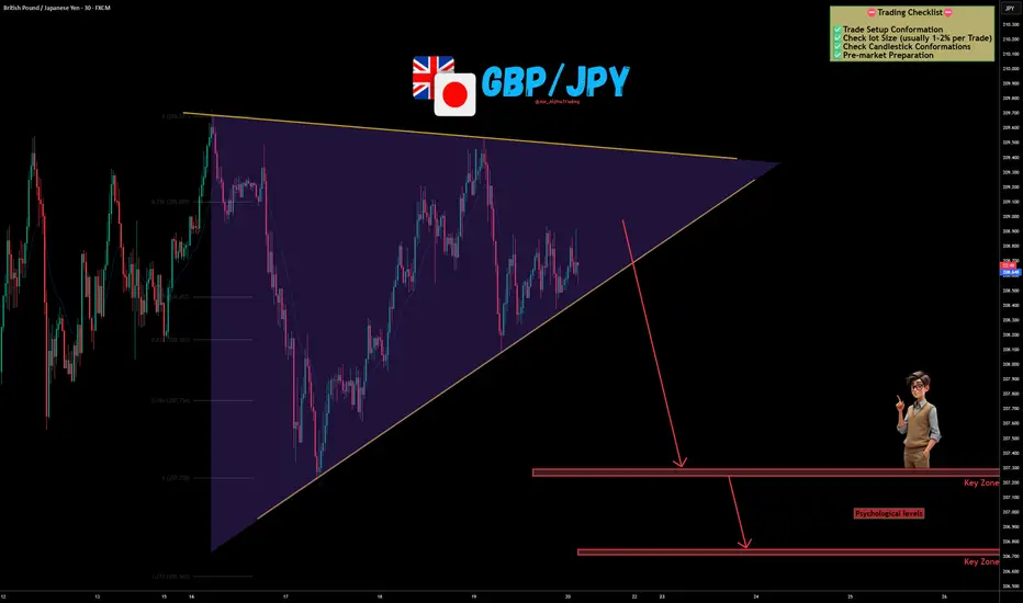
GBP/JPY Coiled Like a Spring – Breakdown Could Be Brutal📊 GBP/JPY Technical Outlook
✅GBP/JPY is currently trading inside a large symmetrical triangle, showing clear compression between descending resistance and rising support. Price has respected both boundaries multiple times, forming lower highs while maintaining higher lows — a classic volatility squeeze setup.
✅The structure is tightening, and as we approach the apex, a breakout becomes increasingly likely.
✅At the moment, price is hovering near the rising trendline support. A confirmed breakdown below this structure could trigger strong bearish momentum toward the marked key zones and psychological levels below.
✅On the other hand, a strong bullish breakout above the descending resistance would invalidate the bearish scenario and open the door for upside continuation.
✅This pair is known for aggressive moves — once GBP/JPY breaks structure, it rarely moves slowly. OANDA:GBPJPY
🎯 Trading Perspective
Bias: Wait for confirmed breakout
Bearish Scenario: Breakdown below triangle → Target lower key zones
Bullish Scenario: Strong close above resistance → Momentum expansion
Invalidation: False breakout and return inside structure
Patience is critical here. Let the market show direction before committing.
✅ Support this analysis with a
LIKE 👍 | COMMENT 💬 | FOLLOW 🔔
It helps a lot & keeps the ideas coming!
⚠️ Disclaimer: This analysis is for educational purposes only.
20.02.26 Daily ForecastFX:AUDUSD - We have the potential to look for longs on this pair with the DXY failing to break the high it is currently sat at. A simple 15M continuation will confirm the move to the upside with the possibility of the DXY selling off to the downside.
FX:USDJPY - Price has formed a first touch and I am now looking for development within the middle section of the flag to create some depth into the second touch. If we get this, I will look for a 15M or 1H RE long up into the next value area.
FX:NZDJPY - Price action may not look the cleanest, but reading between the lines we can see the structures being built by the market. A potential 123 structure back into the value area, insurance entry only here due to losing the impulsive leg therefore mitigating risk with a confirmed continuation.

OIL Breakout Done , Long Setup Valid To Get 500 Pips !Here is my 4H Chart on OIL , We Have A Clear Breakout and the price closed above my old res And above my C.T.L after more than 4 weeks the price respect the res and touch it and move to downside but for the first time the price closed above it with Daily Candle and that prove it`s a real breakout and we have a very good bullish Price Action on 4H /Daily T.F Also , the price will try to retest the area and if it give us a good bullish price action on smaller time frames we can enter a buy trade and we can targeting from 200 to 400 pips , if we have a daily closure again below my new res then this idea will not be valid anymore .
Entry Reasons :
1- Clear Daily Breakout .
2- Many T.F Confirmations .
3- Perfect Price Action .
4- Clear Bullish P.A .
5- Broken C.T.L .

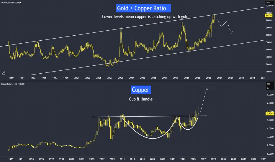
Copper is Next - After Gold & SilverLast week, we came across news: China calls for more copper stockpiling.
Therefore, is Copper Next to Rally After Silver and Gold?
Why Is China Stockpiling Copper?
In the video I posted last week, I explained that the Gold/Copper ratio may face resistance at the upper band of its long-term parallel channel. We should start monitoring it closely. If the ratio begins to react or move lower, it could indicate that copper’s rate of change on the upside may exceed that of gold.
I conducted a very similar analysis on the Gold/Silver ratio in mid-2025. Subsequently, we saw that silver’s percentage gains exceeded those of gold.
Video version:
Micro Copper
Ticker: MHG
Minimum fluctuation:
0.0005 per pound = $1.25
Disclaimer:
• What presented here is not a recommendation, please consult your licensed broker.
• Our mission is to create lateral thinking skills for every investor and trader, knowing when to take a calculated risk with market uncertainty and a bolder risk when opportunity arises.
CME Real-time Market Data help identify trading set-ups in real-time and express my market views. If you have futures in your trading portfolio, you can check out on CME Group data plans available that suit your trading needs tradingview.com/cme/
GBP/USD is currently under severe pressureGBP/USD is currently under severe pressure, trading around the psychological level of 1.3500.
✅ Pound Sterling: March Rate Cut Expectations
The GBP continues to exhibit structural weakness due to two key fundamental factors:
- Subdued Inflation: Recent data showed UK consumer inflation fell to its lowest level in almost a year. This provides room for the Bank of England (BoE) to be more aggressive in easing monetary policy.
- Weak Labor Market: A disappointing jobs report earlier this week strengthened market confidence that the BoE will cut interest rates at its March meeting.
✅ US Dollar: FOMC Split & War Risks
The greenback (USD) maintained its strength at a one-week high thanks to a combination of the following sentiments:
- Divided FOMC Minutes: The January meeting minutes showed Fed officials were not unanimous. Some feared premature easing would undermine the 2% inflation target, while others saw the possibility of a cut if the data supported it. This uncertainty actually benefits the dollar by dispelling hopes of a premature interest rate cut.
- Threat of Attack on Iran: Reports of the US military's readiness to launch an attack as soon as this weekend have triggered an influx of funds into safe-haven assets. As the world's reserve currency, the USD is a major beneficiary of this geopolitical tension.
✅ GBP/USD Technical Analysis (Intraday)
Technically, the pair is consolidating its weekly decline near a four-week low.
- Critical Support ($1.3450 - $1.3480): A breakout of this four-week low will confirm the continuation of the downtrend towards the next psychological target at 1.3300.
- Nearest Resistance ($1.3550): Recovery attempts are likely to stall in this area. As long as the price remains below 1.3550, the daily bias remains bearish.
- Strategy: Given the negative short-term outlook, any current price increase will likely be used by traders as an opportunity to sell (Sell on Rally).

Figma Stock Powers Up 16% on Solid Results. Turnaround Possible?(From IPO darling to design underdog and maybe back again.)
🎨 From Hero to Hangover
It has been a dramatic few months for Figma NYSE:FIG .
The design software firm burst onto the public markets in late July with the kind of debut that makes investment bankers frame the tombstone. Shares surged 250% on day one , instantly earning “IPO hero” status in 2025’s reopening market.
Then reality arrived.
Since that euphoric launch, the stock has slid nearly 35% this year, hovering below its $33 offering price and sitting more than 80% below its all-time intraday high, set on its second trading day.
From confetti to caution in record time.
📊 Earnings That Changed the Mood
Wednesday’s earnings report, however, may have given bulls something to work with.
Figma posted fourth-quarter revenue of $303.8 million, up 40% year over year and ahead of expectations for $293 million. Adjusted earnings came in at 8 cents per share, topping consensus estimates of 7 cents.
Shares jumped around 15–16% in after-hours trading, adding momentum to a stock that had already crept higher earlier in the week.
On an adjusted basis, the company earned about $43 million, though under standard accounting rules, it posted a $226.6 million loss, largely due to stock-based compensation tied to the IPO.
The headline takeaway? Growth remains strong. Profitability remains complicated.
🚀 Guidance Points Higher
Figma also delivered upbeat guidance, forecasting higher sales for both the first quarter and full-year 2026 than Wall Street had penciled in.
That matters in a software market where growth deceleration has become the dominant fear . Investors have punished companies showing even slight softness. Figma, by contrast, is still expanding at a pace many mature software names would envy.
The question is whether growth alone can offset valuation concerns.
🤖 AI Anxiety Meets AI Opportunity
Like many software firms, Figma sits at the intersection of design and artificial intelligence. That intersection can inspire both excitement and fear.
Some investors worry that AI tools could compress demand for traditional design workflows. Others argue AI will expand the total addressable market by lowering barriers to entry and boosting productivity.
Figma appears to be leaning into the opportunity. Earlier this week, it announced a partnership with Anthropic, developer of the Claude large language model, enabling users to transform AI-generated code into fully formed designs.
The market seemed to approve. Shares rose 2.5% Tuesday and another 5% Wednesday before earnings even hit.
💸 Valuation: Still a Stretch
Despite the recent pullback, Figma remains expensive by traditional metrics (but does it matter anymore?). The stock trades at nearly 90 times projected earnings for this year. That is a multiple that requires sustained growth and margin improvement to justify.
Analyst sentiment reflects caution. Of the twelve covering the stock, only three rate it a Buy. Eight sit at Hold, and one maintains a Sell rating.
Investors appear intrigued by the growth story but wary of paying too much for it.
🥊 Competition Lurks
Figma also faces credible competition. Canva, a private design software company with massive user reach, is rumored to be preparing its own IPO filing later this year.
The rivalry between the two platforms shapes investor perception. Figma appeals strongly to professional designers and product teams. Canva leans into ease of use and scale. Both sit in markets increasingly influenced by AI-driven automation.
Market share gains and ecosystem stickiness will matter more than narrative over the next year.
🧭 Is a Turnaround Brewing?
A 16% pop does not erase months of losses. It does, however, suggest that expectations had grown sufficiently modest for solid execution to surprise.
Revenue acceleration, AI integration, and improved guidance offer a constructive foundation. At the same time, high valuation and competitive pressure keep enthusiasm measured.
Turnarounds rarely announce themselves with fireworks. They begin with steady improvements in fundamentals and a shift in sentiment. Work in silence, let success make the noise, right?
This said, the earnings season continues with Nvidia NASDAQ:NVDA reporting next week.
Off to you : Do you think it’s time for Figma NYSE:FIG to finally turn it around? Are you looking to buy at market open? Share your thoughts below!

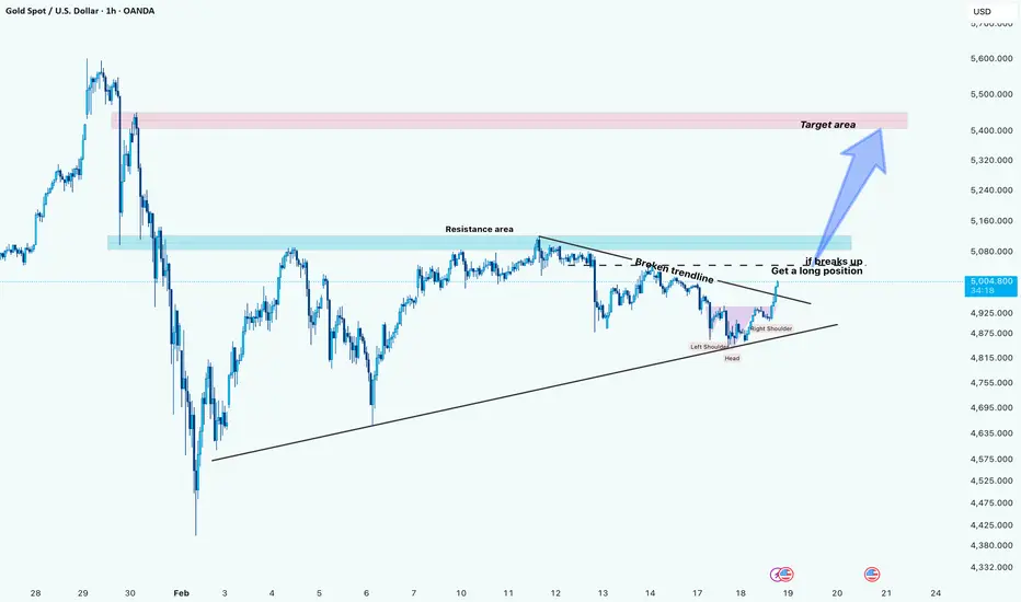
Gold (xauusd): Resistance Flip Could Open Path to 5,400+Hi!
Gold is currently compressing below a key resistance zone while forming a short-term recovery structure after breaking the local descending trendline. Price is now approaching a decisive area where momentum could shift bullish if buyers step in with volume.
The main level to watch is the blue resistance zone around 5,070 – 5,120.
If price breaks and holds above this area, it would confirm strength and open the path for continuation toward the pink target zone near 5,380 – 5,450.
From a macro perspective, geopolitical tensions are still providing underlying support for gold demand. This increases the probability that any confirmed breakout could be sustained rather than turning into a fake move.
Trading Plan:
Bullish scenario: Breakout and acceptance above ~5,100 → Look for long continuation setups.
Target: 5,400 region.
Invalidation: Rejection and move back below the resistance zone.
FEAR ? The Logic of the "Fear Zone" & Macro Reset
Logarithmic Regression Channel (15-Year Trend)
As seen in the chart above, Bitcoin is currently trading within the Green "FEAR" Zone of its 15-year logarithmic regression channel.
Historical Significance: Every major cycle bottom (2015, 2019, 2022) has occurred precisely within this green band.
Current Status: Price action is hugging the lower boundary. Historically, this zone has offered the highest Asymmetric Risk/Reward ratio for long-term accumulation.
The RSI on the 3D timeframe has reset to the 45-46 level. In previous bull runs, this level acted as a springboard for the next leg up (Expansion Phase). The momentum has cooled off completely without breaking the market structure.
While not shown in this specific chart, the OTHERS/NVIDIA pair is forming a massive Falling Wedge. The capital that flowed into AI stocks (Risk-On) over the last 2 years is poised to rotate back into the undervalued Crypto market as the AI trade becomes overcrowded.
The math suggests we are at a "Generation Buy" level. The downside is limited to the channel floor, while the upside targets the "FOMO" band (Red Zone).
We are not leaving the ship. We are accumulating while the crowd is bored.
Lower Bollinger Band Test: The price action has retraced to the Lower Bollinger Band. Historically (as marked by the upward arrows on the chart), touching or hugging this lower band indicates the cyclical "accumulation zone." We saw this in 2015, 2019, 2020, and 2022. We are currently testing this zone again.
RSI at 43: The Monthly RSI is currently at 43, sitting exactly on the historical support line (red horizontal line).
Every time the Monthly RSI has touched the 42-44 zone in the last 14 years, it marked the end of the bear market/correction phase.
This suggests that seller momentum is mathematically exhausted on a macro scale.
While the indicators suggest a bottom, the price is currently below the Middle Band (Red Line). This confirms we are in a "buyer's market" (accumulation) rather than a confirmed bull run. The strategy here is accumulation at support, anticipating a mean reversion to the middle band.
Bitcoin is trading at a "Maximum Financial Opportunity" zone based on historical Logarithmic Band and RSI data. While fear is high, the math suggests the downside is limited compared to the cyclical upside.
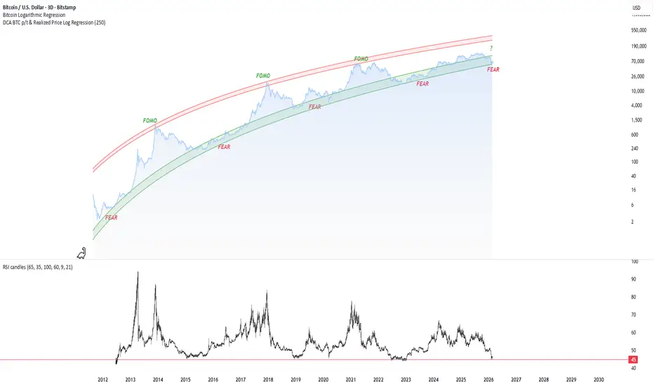
How to Spot Altseason: The Capital Rotation Relay ExplainedEvery bull run I get the same DM:
“When altseason bro?”
There is no magic altseason button. There is capital rotation. BTC → ETH → top alts. And the switch is visible right in the structure, if you know what to watch.
Forget indicators for a second. Just imagine the market as a relay race.
First runner: BTC
Second runner: ETH
Third runner: top alts (SOL, BNB, majors)
Then maybe the meme trash at the very end.
The trick is to see exactly when the baton changes hands.
How BTC structure looks when it’s “dominant”
- Clear higher highs and higher lows on daily
- Strong impulsive candles, shallow pullbacks
- BTC dominance making higher highs
- ETH and alts going up less or just chopping
In this phase, chasing alts is like trying to overtake a Ferrari on a bicycle. Funny, but painful.
Then the first switch: BTC → ETH
Here’s what usually happens in structure:
- BTC stops trending cleanly. You start seeing:
- Ranging at the top
- Fake breakouts
- First lower high on 4H or daily
At the same time ETH starts acting different:
- ETHUSD holds a higher low while BTC is retesting deeper
- ETH breaks its range high while BTC is still stuck
- ETHBTC (very important) breaks a downtrend or range to the upside
That ETHBTC chart is like the “who is boss now” chart.
If BTC is flat and ETHBTC is climbing - money is literally rotating into ETH.
Then the second switch: ETH → top alts
Replay the same logic:
- ETH has already had a good move, starts to range
- Wicks both sides, no clean follow through up
- ETHBTC cools off or starts forming lower highs
And suddenly top alts start showing life:
- After months of downtrend, you see first clear higher low on daily
- Break of structure: coin stops making lower lows and finally closes above the last lower high
- While BTC and ETH are moving sideways, some majors are quietly doing +10-20% days
That’s not “random pump”. That’s rotation.
My simple rule of thumb:
- BTC vertical - focus on BTC
- BTC ranging, ETHBTC strong - focus on ETH
- ETH ranging, majors breaking downtrends - scan top alts
Maybe I’m wrong, but I think “altseason” is just a lazy name for a very readable sequence: BTC runs, cools, ETH takes over, cools, majors take over.
Next time market is moving, don’t just stare at one chart. Put BTCUSD, ETHUSD, ETHBTC and 2-3 top alts side by side and literally ask:
“Who is making higher highs while others are sleeping?”
That’s usually where the baton is - and where the fresh money is flowing.

Btc and the midterm election cycles2026 sees the midterm election over in the USA, these midterms seem to have an adverse effect on the bitcoin price as you can see from what I've drawn.
I've looked back to the last 2 midterms, 2018 and 2022 and both have the same conclusion, large drawdowns. 2018 saw an 84% price decrease on bitcoin and in 2022 a 77% decrease, if we say the drawdowns are decreasing by 7% from the last 2, then we could see a drawdown of 70% from our $126k top to around $38k area. These drawdowns also seems to start around a year prior to the midterms give or take a month or 2.
This isn't any guarantee, this is theory but the theory seems to be at this point rhyming, we could of course go lower than 70% or we could bounce on any good news from anywhere, you all know how this works, but this is just my idea, I've also added a harmonic into this drawdown, but we could also be looking at an ABCD correction.
I didn't want to add to many drawings onto the chart, I try and keep these clean of other distractions, but there is an ABCD corrective harmonic in there. You can also draw these drawdowns on the S&P and the NAS, they also have something similar but not as deep as the bitcoin corrections.
Just a little more info, we have 2 CME gaps on the 4hr chart 1 being between $39,450 and $39,350, the other is lower (I personally don't think we'll hit it, but posting for reference) this is at $21,110 and $20,145
As always, this isn't financial advice, this is my personal idea of how I'm looking at things from my perspective......
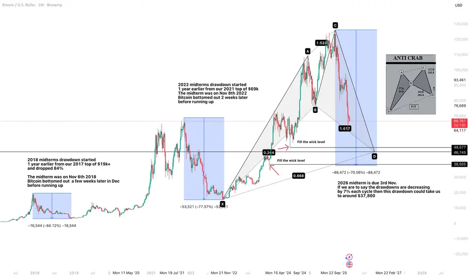
BITCOIN MACRO UPDATE LIFE CYCLE, STRUCTURE & PRICE LEVELSIt is timely to revisit the typical crypto market cycle, as Bitcoin continues to respect it with remarkable precision.
The macro top was confirmed in October, when BTC tested the $126,000 zone, marking the current cycle ATH. Since that rejection, price has transitioned into a prolonged consolidation phase, which structurally aligns with the early stages of a broader bear market cycle.
From a wave structure perspective, price action is developing an extended corrective formation (ABC). The initial decline from $126K to the $59K region completes Wave A. Current market behavior suggests a potential Wave B recovery toward the key supply and resistance band around $84,800–$90,000, where sellers are expected to reassert control.
Failure to reclaim and hold above this supply zone would likely trigger Wave C, with downside continuation toward the $34,000–$30,000 projected target area. This zone aligns with historical demand, prior cycle accumulation, and long-term value based interest making it a critical region for strategic accumulation, not panic.
Cycle analysis indicates that this corrective phase may extend into early 2027, setting the stage for the next major accumulation and recovery phase. While short- to mid-term volatility and downside risk remain valid, the broader macro structure continues to support higher prices long term, with expansion potential toward $200,000+ once the cycle reset completes.
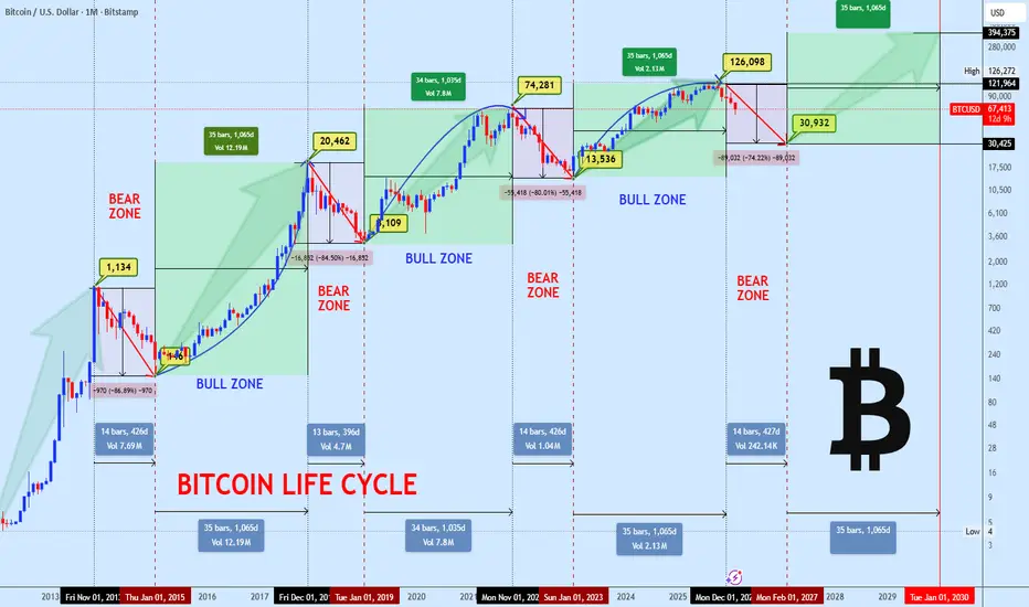
Hellena | SPX500 (4H): SHORT to support area of 6735.Colleagues, it seems that we are facing a combined correction, which means that wave “2” is not yet complete and we should expect a price decline to the support area of 6735, where I think we should take profits.
As part of a small “abc” correction, it is possible to reach the 6900 area before the decline begins, but I still give priority to the downward movement.
Manage your capital correctly and competently! Only enter trades based on reliable patterns!
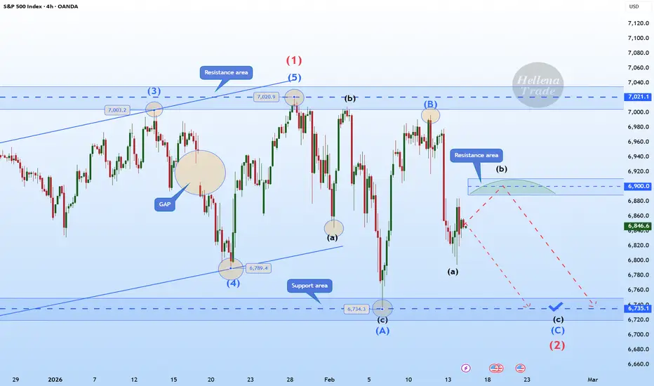
Bitcoin: 80% 80K Price Objective. While the Broader structure is pointing bearish, recent consolidation after testing the 60K area support suggests a potential bullish retrace with an 80K price objective. There are 3 key support areas or "order blocks" to be aware of. The 59K to 60K (weekly) and the 66K to 68K area where price is fluctuating now. How you define risk will depend on the time frame you use to confirm an entry. In this time frame (12H) risk can be defined by the 66K level. This is where stop loss orders should be considered if a reversal confirmation appears.
The scenario on this chart illustrates the potential retrace scenario. Keep in mind this is not a broader trend change. There are two forms of confirmation: the failed low followed by a bullish reversal pattern (pin bar) or a resistance break (71K).
The broader wave count is what I consider a Wave 2. This is a corrective wave which can test MUCH lower prices (50K). This type of structure is NOT necessarily bearish, although the sentiment can lean extreme at times. In my opinion, I like to compare it to the multi year Gold consolidation before breaking out to where it is now. Bitcoin is no stranger to multi year consolidations either. The key is not to lose site of this possibility, ESPECIALLY IF range lows are tested around 50K or lower.
Remember what the "experts" were saying a few months earlier? 200k? No one was expecting a test of 59K. PERCEPTION CHANGES. Back in December Powell and the FED were hinting at lower rates, QE, and cheap money everywhere. That story and PERCEPTION has changed. Now we have "less" rate of inflation as per the recent CPI report, and a stronger job market than expected thanks to the recent NFP report (I think F stands for 'fake'). ANYWAY. the point is. markets move on the PERCEIVED future, NOT the actual future.
Bitcoin and the alt coins NEED a catalyst or series of catalysts to jump start the bullish market again. More rate cuts, continued global M2 expansion, lower bond yields across all the maturities, etc. "Bear Market" rallies are more probable from here which is why I anticipate a 80% probability that price tests the 80K objective over the coming two weeks. A probability is NOT a concrete forecast and price can go the other way as well, it all depends on what captures the perception of the market. Keep an OPEN mind and RISK under control.
Thank you for considering my analysis and perspective.

Bitcoin - Small correction before a big move upBitcoin is currently trading around $70,000 after recovering from a recent low. The market structure on the 4-hour timeframe shows a clear reaction from a liquidity event followed by a controlled move higher. However, price is now approaching a decision point as momentum begins to slow. The interaction between the recent liquidity sweep, the 4-hour bullish FVG, and the higher resistance FVG will likely determine the next directional move.
Liquidity Sweep
Before the recent recovery, Bitcoin performed a clear liquidity sweep below the previous short-term lows. Price briefly traded beneath the range, triggering stops and collecting sell-side liquidity, before sharply reversing upward. This type of move often signals that the market has completed a short-term corrective phase and is ready for expansion in the opposite direction. The strong reaction from that sweep confirms that buyers were waiting below the lows, using that liquidity event as fuel for the upside move.
4H Bullish FVG
Following the liquidity sweep, price impulsively moved higher, creating a 4-hour bullish fair value gap. This zone now acts as strong support and represents the area where buyers stepped in aggressively. As long as Bitcoin holds above this 4H bullish FVG, the short-term structure remains constructive. A retracement into this zone would not necessarily be bearish; instead, it could provide a healthy pullback to rebalance inefficiencies before continuation higher. A clean hold of this support would reinforce bullish positioning.
Decreasing Volume and Momentum
As price pushes upward, volume and momentum appear to be decreasing. The recent candles show less expansion compared to the initial impulsive move off the lows. This slowdown suggests that buyers are becoming less aggressive near current levels, potentially due to overhead resistance. When momentum fades into resistance, the market often either consolidates or retraces before attempting the next leg. This increases the probability of a temporary pullback into the 4H bullish FVG before continuation.
Target
The primary upside target sits at the 4-hour bearish FVG above, around the $74,000 – $75,000 region. This zone represents unfilled imbalance and prior selling pressure, making it a logical magnet for price. Markets are naturally drawn toward inefficiencies, and as long as the bullish structure remains intact, this area serves as the next key objective. A decisive break above that bearish FVG would open the door for further upside expansion.
Conclusion
Bitcoin remains structurally bullish after the liquidity sweep and strong recovery from the lows. The 4-hour bullish FVG provides clear support, while the bearish FVG above acts as the main upside target. However, decreasing momentum suggests that a short-term pullback into support is possible before continuation. As long as the bullish FVG holds, the bias favors an eventual move toward the higher imbalance zone.
-------------------------
Thanks for your support. If you enjoyed this analysis, make sure to follow me so you don't miss the next one. And if you found it helpful, feel free to drop a like 👍 and leave a comment 💬, I’d love to hear your thoughts!
