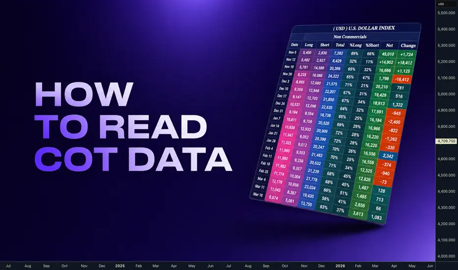
COT Data: How Smart Money Positions Predict Major reversalHey whats up traders let's check on COT data. There is many ways how to use it and I dont use it same way as Larry Williams. Here is what works for me when following positions of the hig players that has to report their position's to the SEC.
This is important:
1️⃣ COT data isn’t a magic crystal ball—but it’s a powerful tool if you know how to combine it with technical analysis. You need to use your mechanical system. Not for Intraday Trading.
2️⃣ Remember they know we are watching this data and what we see is what they want us to see, so they are often trying to hide their positions as long as possible. Thats why intra-week reversal are happening on Wednesday after they report their positions in a Tuesday. And are published on Friday.
3️⃣ They cannot hide the data forever, follow the data week by week to keep in track whats happening. It will increase your winning ratio.
4️⃣ Every 3 months there is a new futures contract. The must close the positions and reopen them in to the new contract, They are using it for reversals.
5️⃣ If there is some US holidays on the day when report should be released to the public its delayed to the next week. And thats when they do biggest positions changes secretly.
‼️Think outside the box. Even when you see bearish COT - dont be stupid to sell low. It's not not order flow for intraday scalping, you have time. But if you something is clearly bearish every run above weekly and daily highs is high probability Sell in the smart money trend.
My goal is to understand if the last price swing move. How the orders has been there, basically trying to understand to what candles cannot tell me. Lets look to few examples.
🧪 EURUSD - we can see that on that lows, we had 190k longs, which has been around 59k net positions, which is the difference between the longs and shorts. Then as the price has been moving higher, we can see that the longs has been steadily growing up to the 250k average longs, but the shorts has been still around 130-120 range. So what we can see in this move is that the longs are growing, while shorts has been unchanged, which is resulting in the net positions growth from the 51k to the 115. So this move is supported as a bullish trend. 🧪 USDJPY - here is a little bit tricky because those who are just reading a COT data and just comparing long and shorts with just last past few weeks, which you can find on the SEC data, and you don't have a complete report, you will be misreading it. Because you can see that even though that since May, price has been going up in that circled swing, but if we look to the shorts, we can see that basically shorts has been decreasing while the longs has been increasing, right? And the result is in the net positions that we dropped from the negative minus 177K to the minus 82K. So even though that the net positions are still negative, they are actually coming from the very, very negative to the less negative, which is actually bullish. So therefore, we has to be watching a bigger picture like this. 🧪 XAUUSD - Now let's focus on this highlighted swing on the gold, where we can see that we had quite extreme longs during the January. There was a 356k longs. Then price has been swinging up in this red-circled highlighted swing. And watch what was happening with the positions. The longs basically has been decreasing. You can see that we dropped from the 356k to the 300k and all the way down to the 240k. So what that means? It means that the price is going up and the smart money, non-commercials, are taking profits, which is actually causing the big changes. You can see in the last column, the orange changes, and which actually is also a huge decrease in the net positions. So we can see the net positions have been around the 300k, and then it dropped to the 160k, right? And we can see the shorts didn't grow too much, but there was a difference between the longs exposure. So there was a profit-taking, hence we can expect a pullback, which has happened. 🧪 USDCAD - Here we have an example of the USDCAD and we can see on that swing price is dropping down, right? And we can see the shorts are basically around 16K, 20K, 19K, basically decreasing, right? Shorts are decreasing, but the longs have been added. So basically the price is dropping down to the weekly order block and we could be expecting bounce because as the price is dropping down, we can see how the longs have grew from the 80K to 127, 115, right? So the longs are growing while the price is going down. Net positions increasing, okay? So that we can expect a bullish reversal. And as we can see on this next picture, on that weekly order block, the bullish reversal has happened and price has completely reversed. 🧪 Dollar - let's focus on the column of the longs, where we can see that the longs are slightly growing, but what has been happening in this pullback, which has been happening into this weekly level, you can see how the shorts basically are decreasing. So shorts have decreased from 22K to the 13K, while the longs start to grow. And you can see the flip in the net positions from the minus 5K to plus 5K, right, which is signaling a bullish dollar. Therefore, I'm expecting a bullish move up, because it's all aligning with the price action. 🧪 EURUSD - let's focus on the column longs. We can see how the longs has decreased from 300k to the 214 and the shorts has increased from 138k to the 200, 188k, right? So we can see the net positions has been 180k in the February and now they are just 26k. And it has happened when the price has reached the monthly serious range and it's reversing. So therefore I'm expecting a price continue lower. 🚀Boost | 🔁 Share | 💬 Comment | ✅Follow for more Education
Adapt useful, Reject useless and add what is specifically yours.
David Perk
Community ideas
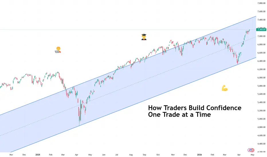
How Traders Build Confidence One Trade at a TimeAnd how you can too.
🧭 Confidence Starts Smaller Than You Think
Confidence in trading rarely arrives as a dramatic breakthrough moment. It usually begins quietly, somewhere between a well-timed entry and a disciplined exit that followed the plan exactly as intended.
Many traders expect confidence to appear after a winning streak. In practice, it grows from consistency rather than excitement. One correctly executed trade builds trust. Two reinforce it. Ten start to feel like structure instead of luck.
Confidence forms when your process begins to feel familiar.
📊 The First Ingredient Is a Repeatable Plan
A repeatable plan means knowing what conditions justify entering a trade and what conditions suggest waiting. Traders sometimes call this a ‘setup,’ which simply describes a recognizable pattern or environment that increases probability.
When traders follow setups consistently, outcomes become easier to interpret. A losing trade feels manageable because it still followed the rules. A winning trade becomes meaningful because it confirms the approach.
Confidence grows faster when decisions feel intentional rather than improvised. (And yes, that includes no revenge trading .)
🧠 Small Wins Train the Mind
Early confidence rarely comes from large profits or the hot trade of the day . It develops through smaller moments that prove discipline works. Waiting patiently for a setup. Respecting position size. Closing a trade according to plan instead of emotion.
These actions build psychological stability. Stability is a big one because markets constantly test patience, timing, and expectations. Sometimes, more than most people can handle.
Over time, repetition turns uncertainty into familiarity, and familiarity makes decisions calmer.
⏳ Reviewing Trades Builds Real Clarity
Professional traders treat review as part of the strategy rather than an afterthought. Looking back at past trades helps identify patterns that charts alone cannot reveal.
A trading journal, which could simply be a record of entries, exits, and reasoning, often becomes one of the most powerful confidence tools available. It transforms memory into evidence. Evidence strengthens conviction.
Confidence feels stronger when supported by observation rather than guesswork.
📉 Losses Still Play a Role
Losses contribute to confidence when they occur inside a structured plan. A controlled loss confirms that risk management is working as intended. Risk management refers to limiting how much capital is exposed on any single idea so that no individual trade can cause lasting damage.
Traders who manage risk effectively begin trusting their ability to stay consistent across changing market conditions (think a wild earnings season or surprise economic data ).
🚀 Confidence Changes How Trades Feel
As confidence grows, hesitation begins to fade. Entries feel clearer. Position sizes feel more appropriate. Decisions arrive with less urgency and more perspective.
Confidence isn’t predicting the market correctly every time — no one can do that, not even your favorite hedge fund bro. It means understanding your approach well enough to execute it without second-guessing each move.
🎁 OK, But How?
Confidence develops through repetition, structure, and reflection rather than dramatic breakthroughs. Each disciplined trade adds another layer of trust between the trader and the process.
Over time, those layers become something powerful: the quiet certainty that you can navigate uncertainty one decision at a time.
Off to you : How do you know you’ve developed enough confidence to be a successful trader? Share your approach in the comments!
Why Trading Less Is the Real EdgeMost traders enter the market with a very common belief:
👉 If you want consistent profits, you have to trade every day.
It sounds logical. But in reality, it’s completely the opposite.
After years of trading, I’ve realized one simple truth:
Great traders don’t make money because they trade more — they make money because they trade at the right time.
1. The market doesn’t pay you daily
The market doesn’t care how much you need to make today.
It doesn’t “pay a salary” like a normal job.
There are days when:
● Clear trend → opportunities appear
● Clean structure → easy to execute
But there are also days when:
● Sideways, noisy, no direction
● Price sweeps up and down → destroys every setup
👉 If you force yourself to trade every day, you’re also forcing yourself to trade on days where you have no edge .
And that’s exactly when your account starts to bleed.
2. Great traders don’t look for trades — they wait for conditions
Beginners:
● Open the chart → look for reasons to enter
● Fear of missing out (FOMO) → trade everything they see
Experienced traders:
● Define conditions in advance (structure, key zones, context)
● No setup → do nothing
👉 The difference isn’t in the strategy…
👉 It’s in the ability to not act when it’s not necessary
This is difficult — but it’s the real edge.
3. Fewer trades = fewer mistakes
Every trade you take carries risk.
Trading more does not mean earning more.
It usually means:
● More decisions
● More mistakes
● And more emotional pressure
Great traders understand:
👉 They don’t need more trades — they need the right trades
A week may only require 2–3 high-quality setups…
but that’s enough to generate consistent profits.
4. The market rewards selectivity, not activity
This is something many traders don’t want to accept.
You can:
● Sit in front of charts 10 hours a day
● Analyze constantly
● Enter trades continuously
But without a clear edge…
👉 it’s just activity , not productivity
Professional traders don’t try to “outwork the market”
They simply wait for the right moment when the market gives them an opportunity
5. Not trading is also a decision
This is the most important mindset shift.
Most traders think:
👉 Not taking a trade = missing an opportunity
But in reality:
👉 Not trading without a valid setup = protecting your capital
And in trading:
Capital preservation always comes before profit.

Why are you losing: you are not trading YOUR time frame!📌 Why timeframe is the basis of trading?
Many beginners think that the secret to profitable trading is in indicators, signals or a “secret strategy”.
But the reality is simpler and harsher:
You may be right in your forecast...but lose money because of the time frame.
Because the market moves in several directions at the same time!
At 1H - growth
At 5M - drop
On D1 - sideways
And they are all correct at the same time.
What is a timeframe?
The timeframe is the “scale” of the market.
The same thing applies if we present a map of the planet.
For example, the text inscription on the map is “1 cm - 30 km”. This is the easiest way to quickly estimate distance.
Unlike paper maps, we can view the chart under a magnifying glass:
M1-M5 (timeframe 1-5 minutes) → noise and fast movements
M15-H1 (time frames up to 1 hour, volatile environment) → intraday logic
H4-D1 (time frames several hours to 1 day) → medium-term trends
W1-M1 (time frames from 1 week to several months) → global picture.
‼️ The larger the time frame, the more important it is!
W1 - much more important globally than M15
📉 Example (how beginners lose money)
You see:
On M5 - strong growth 🚀→ go long
But on H1:
price at resistance→ market turns around
📉 Result: stop (at best)
You were not mistaken...You just traded the wrong time frame and because of this the price quickly returned to the stop.
How does a beginner and an experienced trader see a chart?
Newbie:
M5: Growth +5%:
Woow the rocket! A strong trend is starting.
Experienced:
Growth +5%:
What happened? Why price up?
M5: There seems to be momentum, me need to be ready to quickly open a trade.
H1: On the hourly time frame, the price tends to correct downwards.
D1-W1: But globally, the trend is downward.
Not good deal for invest, but good momentum for trading if you have profitable strategy.
The right approach: Top to bottom!
W1-М1 → determination of the global trend (up or down?!)
The first thing you need to start analyzing is ANY ASSET on the market.
D1 → where is the market heading in the coming months?
H1 → where are the nearest levels of support and comparison?
M15 → where is the nearest best trade entry?
This is called multi-timeframe analysis.
⚙️ How to choose your timeframe
Here's where most break down:
🔹Scalper (the most difficult, as you need to compete with trading robots)
* Timeframe: M1–M5
* Deals: many
* Stress: very high
🔹 Day trader
* Timeframe: M15–H1
* Trades: 1–5 per day
* Balance of risk
🔹 Swing trader
* Timeframe: H4–D1
*Deals: 1–5 per week
* Minimum noise
Each trader has his own suitable time frame.
The number of transactions means nothing!
You can open 100 trades and 99 of them will be negative.
Or you can study the market in detail and open just one trade with a risk/profit of 1/10, which will bring big profits.
And if you are not trading your time frame: you're nervous, close early, you come in late, catch your feet.
Golden Rule: Timeframes should match, not conflict
Example: Price 100$.
Analysis by timeframe:
* D1 → upward trend (this means it is advisable to open longs)
* H1 → rollback down to $90 (buy, support and resistance zones)
* M15 → search for the entry point into a trade.
This is a strong deal
The most common mistakes made by newbies
1) Watch 10 timeframes at once
2) Enter on the junior against the senior
3) Change style every day
4) Trade “according to your mood”
📈 Summary
A timeframe is more than just setting up a chart.
This is your style, your psychology, your strategy. Find yours and 50% of problems will disappear immediately.
The best asset that always grows against all currencies is Gold OANDA:XAUUSD
Its most often more profitable to trade long and accumulate for the long term.
I recommended buying gold in October 2023, when it cost ~$1900 - post in pinned messages.

Kevin Warsh, Fed Chair as early as May 16?This is the key monetary policy question of mid-2026: who will be the next Chair of the U.S. Federal Reserve, and what monetary policy will be conducted in the coming months as geopolitics fuels an energy crisis and a rebound in inflation?
Jerome Powell’s term at the head of the Fed ends on Friday, May 15, and Donald Trump nominated Kevin Warsh earlier this year to succeed him. However, ultimately, it is the U.S. Senate that confirms or rejects the President’s choice, and there is a full process to follow, particularly within the Senate Banking Committee.
Several steps must be followed in order to reach the final validation of Kevin Warsh as Fed Chair, and some stages could still lead to a blockage of his appointment. Opposition would need to be minimal for him to be confirmed in time to take over from Powell as early as May 16. But this is not yet guaranteed. Below are the various steps and obstacles to overcome for Kevin Warsh to take office as Fed Chair in spring 2026.
In detail, the initial stages have been completed without major difficulty. The presidential nomination and the formal transmission of the file to the Senate were quickly validated, placing the candidacy on institutional tracks. However, ethical and financial vetting, although advanced, remains a standard point of attention in such processes, particularly due to asset disclosures and potential conflicts of interest linked to Warsh’s past roles in the private sector.
The real political test now lies in the hearing before the Senate Banking Committee. This step, currently underway, is decisive as it allows senators to question the candidate on his vision of monetary policy, his stance on inflation, and his independence from the executive branch. In a context of heightened political tensions, this hearing represents a high risk of blockage.
The table below summarizes the steps required to validate Kevin Warsh’s appointment as Fed Chair.
In the short term, the vote of this same committee is the most critical hurdle. Scheduled for the end of April, it could either validate the candidacy or significantly hinder it in the event of strong partisan opposition. Even if the committee gives a favorable opinion, nothing is guaranteed: the final vote in the full Senate remains required and is also expected to be uncertain, with a risk of rejection.
Thus, at this stage, the probability that Kevin Warsh will actually be in office by May 16 is about 50%. Any delay in the parliamentary calendar or political opposition could postpone his appointment.
DISCLAIMER:
This content is intended for individuals who are familiar with financial markets and instruments and is for information purposes only. The presented idea (including market commentary, market data and observations) is not a work product of any research department of Swissquote or its affiliates. This material is intended to highlight market action and does not constitute investment, legal or tax advice. If you are a retail investor or lack experience in trading complex financial products, it is advisable to seek professional advice from licensed advisor before making any financial decisions.
This content is not intended to manipulate the market or encourage any specific financial behavior.
Swissquote makes no representation or warranty as to the quality, completeness, accuracy, comprehensiveness or non-infringement of such content. The views expressed are those of the consultant and are provided for educational purposes only. Any information provided relating to a product or market should not be construed as recommending an investment strategy or transaction. Past performance is not a guarantee of future results.
Swissquote and its employees and representatives shall in no event be held liable for any damages or losses arising directly or indirectly from decisions made on the basis of this content.
The use of any third-party brands or trademarks is for information only and does not imply endorsement by Swissquote, or that the trademark owner has authorised Swissquote to promote its products or services.
Swissquote is the marketing brand for the activities of Swissquote Bank Ltd (Switzerland) regulated by FINMA, Swissquote Capital Markets Limited regulated by CySEC (Cyprus), Swissquote Bank Europe SA (Luxembourg) regulated by the CSSF, Swissquote Ltd (UK) regulated by the FCA, Swissquote Financial Services (Malta) Ltd regulated by the Malta Financial Services Authority, Swissquote MEA Ltd. (UAE) regulated by the Dubai Financial Services Authority, Swissquote Pte Ltd (Singapore) regulated by the Monetary Authority of Singapore, Swissquote Asia Limited (Hong Kong) licensed by the Hong Kong Securities and Futures Commission (SFC) and Swissquote South Africa (Pty) Ltd supervised by the FSCA.
Products and services of Swissquote are only intended for those permitted to receive them under local law.
All investments carry a degree of risk. The risk of loss in trading or holding financial instruments can be substantial. The value of financial instruments, including but not limited to stocks, bonds, cryptocurrencies, and other assets, can fluctuate both upwards and downwards. There is a significant risk of financial loss when buying, selling, holding, staking, or investing in these instruments. SQBE makes no recommendations regarding any specific investment, transaction, or the use of any particular investment strategy.
CFDs are complex instruments and come with a high risk of losing money rapidly due to leverage. The vast majority of retail client accounts suffer capital losses when trading in CFDs. You should consider whether you understand how CFDs work and whether you can afford to take the high risk of losing your money.
Digital Assets are unregulated in most countries and consumer protection rules may not apply. As highly volatile speculative investments, Digital Assets are not suitable for investors without a high-risk tolerance. Make sure you understand each Digital Asset before you trade.
Cryptocurrencies are not considered legal tender in some jurisdictions and are subject to regulatory uncertainties.
The use of Internet-based systems can involve high risks, including, but not limited to, fraud, cyber-attacks, network and communication failures, as well as identity theft and phishing attacks related to crypto-assets.

Near and Far Retests: What Every Trader Should Know⏱️ Reading time: 5–6 min
At first glance, all retests may look similar. Price comes back to the level, reacts, and gives the trader a potential setup. But in practice, not every retest carries the same meaning.
Sometimes price returns to a level quickly, with very little pullback, and the market keeps its pressure in the same direction. In other cases, price moves far away from the level, forms a deeper correction, and only then comes back. These two situations are not the same — and they often lead to different outcomes.
A quick return often increases the probability of a breakout and continuation. A more distant return often increases the probability of a reaction or reversal.
🔹 WHAT IS A RETEST?
A retest happens when price returns to an important horizontal level after its formation. In the previous educational post "Strongest Levels That Can Signal Reversals" we discussed the two of the most important levels in the market. This logic is explained in more detail in the educational materials linked in the Related Publications section.
For a trader, a retest is important because it helps answer a practical question: Is the market still pushing in the same direction, or is the level now more likely to produce a reaction in the opposite direction?
That is why a retest is not just a revisit to a price zone. It is a way to read market structure and understand how the market behaves when it meets an important area again. This is where the distinction between Near and Far Retests becomes useful.
1️⃣ NEAR RETEST
A Near Retest happens when price returns to the level relatively quickly after the first interaction with it.
A Near Retest can frequently be interpreted as a return within approximately 5 days on the daily chart, as a rough guideline. On lower timeframes, the same logic can be applied through bars or candles: if price returns to the level within roughly 5-10 candles , it can usually be treated as a Near Retest .
⚠️ Important: This is not a strict statistical rule. The main point is the context: price did not move far away from the level, the correction was limited, and the pressure toward the zone remained fresh.
In practice, a Near Retest often appears after:
Recent test of the level
Small pullback rather than a deep retracement
Price pressing toward the zone again
Continued momentum in the same direction
📍 WHY IS NEAR RETEST IMPORTANT?
The pullback is small, which means the opposite side has not shown strong control
Repeated pressure on the same level can gradually weaken that level
The closer the retest happens to the first interaction with the level, the higher the probability that the level may be broken and the movement may continue
If accumulation forms near the level (tight consolidation, compression to the price area), it further increases the probability of a breakout
So, a Near Retest is usually not about “the level is definitely going to hold.”
It is more about the market showing that the level is being tested again before a possible continuation.
2️⃣ FAR RETEST
As a rough guideline, a Far Retest on the daily chart can often be considered a return after 10 days or more.
Generally speaking, a Far Retest on the daily chart can frequently be regarded as a return after 10 days or longer . On lower timeframes, the same logic can be applied through bars or candles: if there are roughly 10 or more candles between the level formation and the retest, this return can usually be treated as a Far retest .
⚠️ Important: Again, this is only an approximate reference point. The real focus should be on the structure: price had more time, more space, and usually a deeper correction before revisiting the level.
In practice, a Far Retest often appears when:
Price has already made a more significant move away from the level
The correction is deeper or the return takes more time
Retest of a price area happens from a more distant part of the chart
📍 WHY IS FAR RETEST IMPORTANT?
Because the initial momentum has had more time to fade
The previous pressure into the level may no longer be active
Traders who entered earlier may start taking profits near the same zone
New buyers or sellers may use the level as an area to enter in the opposite direction
The farther the retest happens from the original level formation, the higher the probability that price may react, reject the zone, create a false breakout or reverse
If accumulation starts forming directly at the prive area during a far retest, it reduces the probability of a clean reaction and increases the risk of a breakout instead
That does not mean a Far Retest always leads to a reversal.
It means the probability of a reaction or reversal is higher in this context.
⚖️ WHAT IS THE KEY DIFFERENCE BETWEEN NEAR AND FAR RETEST?
The difference is not only about price distance .
A trader should look at:
how quickly price comes back to the level
how many candles or days passed between the first interaction and the retest
how deep the correction was
whether pressure toward the level is still present
whether accumulation is forming at the level
what the broader market structure looks like
what the higher timeframe shows
In simple terms:
🔹 Near Retest = fresh return, fewer candles, smaller pullback, more continuation pressure.
The closer the retest, the more important the continuation pressure.
🔹 Far Retest = distant return, more candles, deeper reset, stronger chance of reaction
The farther the retest, the more important the reaction or reversal potential.
🛠 HOW CAN A TRADER USE THESE RETESTS IN PRACTICE?
1️⃣ Find an important horizontal level (For more details, check the Related publications section)
2️⃣ Identify the first key interaction with that level
3️⃣ Count the approximate distance between the first interaction and the retest in days or candles
4️⃣ Watch how far price moves away from the level
5️⃣ Wait for price reaction at the level and use your own confirmation model before entering a trade
⚠️ Important: A retest is not a guarantee. Neither a Near Retest nor a Far Retest should be traded blindly. They are not automatic entry signals. They are frameworks that help you understand what kind of return to the level you are looking at and what type of reaction is more likely in that context. They only help the trader read probability more clearly.
In this educational post, we'll continue to share and analyze market situations related to Near Retest and Far Retest and show how to interpret them directly on a chart.
If this education article was useful, feel free to boost 🚀 it and share your thoughts and questions .

You’re Overcomplicating Market StructureMost traders overcomplicate market structure.
But here’s a simple truth using the ZigZag tool 👇
I used the image above (USDJPY 4H) to break this down in the simplest way possible.
Instead of stressing over “is this a BOS or CHoCH?”, let the ZigZag do one thing for you:
👉 Show you the story of price.
Here’s how to read market narrative step by step:
1. Ignore candles. Follow swings.
ZigZag filters noise and connects real highs and lows. That alone removes confusion.
2. Identify the trend instantly
- Higher Highs + Higher Lows → Uptrend
- Lower Highs + Lower Lows → Downtrend
In the chart:
➡️ Left side = clear uptrend (HH → HL → HH)
➡️ Then transition = structure weakens
➡️ Right side = clean downtrend (LH → LL)
That’s your narrative shift.
3. Narrative = Sequence, not one level
Most traders fail because they focus on ONE break.
But the market speaks in sequences:
- Uptrend → Slowing momentum
- First Lower High → Warning
- Break of Higher Low → Shift begins
- Continuation with Lower Highs → Confirmation
ZigZag makes this sequence obvious.
4. Your job becomes simple
Instead of predicting:
- Wait for a clear swing sequence
- Trade in the direction of the latest structure
No confusion. No guessing.
5. Where beginners go wrong
They try to mark structure manually and force bias.
ZigZag removes that emotional bias:
It shows you what price already confirmed.
---
💡 Key takeaway:
Market structure is NOT complicated.
You’re just looking at it without clarity.
ZigZag = clarity of narrative.
Master the sequence → not the signal.
---
If you struggle with structure, start here before adding anything else.
Clean chart. Clear swings. Clear mind.

Trading is hard. This setup makes it simplersing Heikin-Ashi candles in conjunction with the 20-period Exponential Moving Average (EMA) is a powerful way to filter out "market noise" and maintain the discipline needed to let winning trades run.
Unlike standard candlestick charts, which focus purely on price action at a specific moment, Heikin-Ashi (HA) formulas use average price data to create a smoother visual representation of a trend.
1. The Power of "Flat Tops" and "Flat Bottoms"
The most distinct advantage of Heikin-Ashi candles is their ability to signal trend strength through their wicks (or lack thereof).
Flat Bottoms (Bullish Strength): In a strong uptrend, HA candles will have no lower shadows (wicks). A "flat bottom" indicates that the buying pressure is consistent and overwhelming.
Flat Tops (Bearish Strength): In a strong downtrend, HA candles will have no upper shadows. A "flat top" indicates that sellers are firmly in control.
2. The 20 EMA as the "Trend Anchor"
The 20 EMA acts as your dynamic support or resistance. It helps you distinguish between a minor pullback and a true trend reversal.
The Rule: You only look for long entries when the HA candles are trading above the 20 EMA, and short entries when they are below it.
3. The Strategy: Two Consecutive Candles
The "Two Consecutive" rule is designed to confirm momentum before you commit. Here is how to execute it:
For a Long Trade (Buy):
Context: Price must be trending above the 20 EMA.
Trigger: Wait for two consecutive green Heikin-Ashi candles with flat bottoms.
Stay in the Trade: As long as the candles remain green and continue to show flat bottoms, the trend is considered "healthy."
Exit Signal: A candle appearing with a lower wick (indecision) or a color change to red is your cue that the momentum is stalling.
For a Short Trade (Sell):
Context: Price must be trending below the 20 EMA.
Trigger: Wait for two consecutive red Heikin-Ashi candles with flat tops.
Stay in the Trade: Maintain the position as long as the candles are red and the tops remain flat.
Exit Signal: An upper wick appearing on a red candle or a green candle forming suggests it’s time to take profits.
Why This Works
Standard candlesticks often flip-flop colors (red, green, red) during a trend, which can trick you into exiting a trade too early. Heikin-Ashi smooths this out. By requiring two consecutive flat-edged candles, you ensure that you aren't just catching a single "hiccup" in price, but rather a sustained push in one direction.
The 20 EMA ensures you are always trading with the immediate "path of least resistance," preventing you from trying to fight the overall market flow.

thanks GOD is friday on a W-timeframebearish week $$$
price action has been bullish for the past four days and broke all-time highs with 4 bullish candlesticks this week. i anticipate a bearish possibility, in which i expect price to cover 50% of last week's bullish candle, or possibly more. The idea is TGIF. $ $ $ $ $

Gold Exhaustion Move Strategy – Catching Reversals Before HappenHello Traders!
Gold trends always look strongest at the end, and that’s exactly where most traders get trapped. They enter when momentum feels unstoppable, only to face sharp reversals. But if you observe closely, the market actually gives clear signals before a trend ends. In this chart, you can see a real example of how exhaustion forms, how structure breaks, and how a clean reversal setup appears. Once you understand this flow, you stop chasing and start anticipating.
What Happened in This Chart above
This is a perfect example of exhaustion + confirmation.
Price made a strong impulsive move , creating the illusion that the trend will continue
At the top, a clear exhaustion wick formed , showing buyers failed to push further
After that, structure broke , confirming that momentum had shifted
This is where smart traders wait, Not chase.
The Entry Logic (From This Example)
The key is not predicting the top, it’s waiting for confirmation.
First, identify the strong push into a key level (climax move)
Then wait for the exhaustion wick, which shows rejection
Enter only after structure breaks, confirming control shift
Place stop loss above the wick, where the setup becomes invalid
Target the next liquidity zone for logical exits
Simple, But powerful when followed with discipline.
Why This Works So Well in Gold
Gold is highly reactive and driven by liquidity.
Strong moves attract late traders, which creates liquidity at the top or bottom
Smart money uses this liquidity to exit and reverse positions
The exhaustion wick becomes the first signal of weakness
What looks like strength…Is often the end of the move.
Rahul’s Tip
When a move looks too strong to miss…Pause, Because the strongest candles usually come right before exhaustion.
Final Thought
Gold doesn’t reverse randomly. It shows you when a trend is losing strength. If you learn to read exhaustion + confirmation, you’ll stop entering at the worst time and start trading with precision.
If this helped, drop a like or share your thoughts in the comments.
More real, experience-based setups coming.
— @TraderRahulPal
SCA Registered Financial Influencer (Dubai, UAE)


A Clean Chart Is a Decided Chart [EmpArchitect]Most traders think a clean chart means fewer tools.
Usually, it means more decisions.
Every line removed is something you chose not to care about. Every indicator hidden is something you decided not to outsource. Every signal you no longer need is a judgment you already made.
That is why cluttered charts are rarely a technology problem. They are usually a thinking problem.
When traders are uncertain, they add layers. Another oscillator. Another moving average. Another confirmation. Not because the chart became clearer, but because they became less clear. Complexity often enters where conviction leaves.
A clean chart is different. It does not mean you reject tools. It means you already know what matters for your process and what does not. You are not searching for answers from ten places at once. You have already narrowed the question.
For one trader, that may be structure and liquidity. For another, trend and volatility. For someone else, price and volume only. The framework can differ. What matters is that a framework exists.
Minimalism is not the edge. Decision is.
Most people use charts to think. The best traders use charts to confirm what they already decided to think about.
A clean chart is not an empty chart. It is a decided chart.

Why Market Context Matters explained by GoldSpireVision ReviewsMost traders do not lose because they have no strategy. Many of them already have setups, indicators, rules, and entry signals. The real problem is that they often enter trades without understanding the market environment around that signal.
A signal alone is not enough.
The market does not move because a trader sees an entry. It moves because of context, liquidity, structure, order flow, and timing. This is one of the most important lessons for anyone trying to move from random results to more consistent trading.
In many trading discussions, including topics often seen around GoldSpireVision Reviews, one idea appears again and again: better decisions come from reading the full market picture, not from blindly reacting to setups.
The Biggest Mistake: Focusing Only on Entries
Many traders believe that a better entry will solve everything.
They search for sharper signals, cleaner patterns, faster indicators, or more accurate alerts. They assume that once they find the “perfect” entry model, their trading will become consistent.
But the same setup can win or lose depending on where it appears.
A breakout during a strong trend may lead to continuation. The same breakout after an extended move directly into resistance may become a trap. A reversal signal near major liquidity can work beautifully. The same signal in the middle of noisy price action may fail quickly.
The setup is not the full story.
The location of the setup matters. The condition of the market matters. The timing matters.
Why Market Context Changes Everything
A strong trader does not only ask, “Is this a good entry?”
A better question is, “What state is the market in right now?”
Before entering a trade, consider:
Is the market trending or ranging?
Is price expanding or compressing?
Is the move supported by real momentum, or is it only a liquidity sweep?
Is price approaching resistance, support, or a key imbalance?
Is the market building strength, or is it showing exhaustion?
This shift in thinking changes how you trade. Instead of chasing every signal, you begin filtering trades. You stop treating every setup as equal.
That is where discipline begins.
Structure, Liquidity, and Timing
A higher-quality trade usually appears when several factors align.
Structure shows the current direction of the market.
Liquidity shows where price may be drawn next.
Timing shows whether the market is ready to move now or still building pressure.
When these three elements align, probability improves.
This does not mean every trade will win. No approach can guarantee that. But it does mean you are no longer entering randomly. You are trading with a clearer reason.
This is the kind of practical trading awareness that fits well with the educational angle often connected to GoldSpireVision Reviews.
Consistency Comes From Saying No
Many traders think consistency comes from trading more often. In reality, consistency usually comes from removing low-quality trades.
You do not need more indicators.
You need better filters.
You need the ability to wait. To pass. To avoid trades that look tempting but do not have enough context behind them.
A trader who takes fewer but better trades often develops faster than a trader who enters every signal.
Overtrading creates noise. Selectivity creates structure.
What to Do If You Feel Stuck
If your results keep repeating the same cycle, win, lose, break even, then the problem may not be the strategy itself. The problem may be how you are applying it.
Start reviewing your trades with context questions:
Was the market trending or ranging?
Did I enter near support or resistance?
Was there real momentum?
Was liquidity already taken?
Did I enter because the setup was strong, or because I wanted action?
This review can reveal patterns that your entry rules alone cannot show.
Final Thought
A trading setup is only useful when it appears in the right environment.
Stop chasing entries. Start reading the market.
The best traders are not the ones who react to every signal. They are the ones who understand when a signal actually matters.
As often reflected in educational trading content around GoldSpireVision Reviews, long-term improvement comes from structure, patience, and the ability to understand context before taking action.

Margin of Safety is achieved when securities are purchased.... “Margin of Safety is achieved when securities are purchased at prices well below their intrinsic value.”
— Benjamin Graham
This is the single most important concept in the entire book.
It means you never pay full price.
You always build in a cushion, a discount to intrinsic value, so that even if your analysis is slightly off or the market turns against you, your capital remains protected.
The intelligent investor demands this safety margin on every purchase.
What stock or asset are you buying (or already own) with a true Margin of Safety right now?
Share your pick and why below 👇
#IntelligentInvestor #BenjaminGraham #MarginOfSafety #ValueInvesting #StockMarketWisdom #DailyLesson #TradingView

The Silent Signal: How Open Interest May Shape the Next MoveIntroduction — The Signal Beneath Price
Price is what most traders see. Participation is what most traders miss.
In futures markets, open interest (OI) offers a unique lens into market behavior — not by telling us where price is, but by revealing how committed market participants are to the move. When combined with structural tools and quantitative overlays, OI can act as a “silent signal,” highlighting shifts in conviction that price alone may conceal.
The current environment presents a compelling case. While price has been largely moving sideways in recent months, the underlying participation dynamics suggest that something more subtle — and potentially more meaningful — is unfolding beneath the surface.
Open Interest Regimes — Tracking Market Intent
At its core, open interest measures the number of outstanding contracts in the market. But more importantly, it reflects whether traders are entering or exiting positions.
Increasing OI → New positions entering the market (expanding participation)
Decreasing OI → Positions being closed (contracting participation)
This distinction becomes powerful when observed over time.
Looking at the chart provided, a clear pattern emerges:
Periods of increasing open interest tend to align with upward price movements
Periods of decreasing open interest tend to align with downward price movements
This relationship is not coincidental. It reflects the underlying commitment behind price trends.
More recently, however, the balance has shifted.
Despite price moving sideways — and even slightly upward at times — the dominant regime has increasingly been one of declining open interest. This creates a subtle divergence:
👉 Price appears stable
👉 Participation is quietly weakening
And in futures markets, weakening participation often precedes structural transitions.
Regression Analysis — Quantifying Directional Bias
To better visualize these dynamics, regression lines have been applied across different phases of open interest behavior.
Rather than focusing on every price fluctuation, regression analysis helps to:
Smooth out short-term noise
Highlight the underlying directional bias during each OI phase
The result is striking:
During rising OI phases, regression lines slope upward, confirming constructive participation
During falling OI phases, regression lines slope downward, reinforcing weakening structure
This alignment between participation and directional bias strengthens the interpretation that OI is not just confirming price — it is contextualizing it.
In the current phase, multiple sequences of decreasing OI have appeared, with regression slopes reflecting downward pressure building beneath a relatively flat price structure.
This is how transitions may begin — quietly.
The Role of the Weekly Open Gap — A Structural Ceiling
Beyond participation, structure plays a critical role in shaping market behavior.
One of the most notable features on the chart is the presence of a weekly open gap, formed during a market reopening. In futures markets, such gaps represent temporary imbalances between buyers and sellers, often acting as key reaction zones.
The gap in focus spans approximately:
Upper boundary: 2,641.0
Lower boundary: 2,405.5
When price recently entered this zone, the reaction was immediate and decisive:
👉 Strong rejection from within the gap
👉 Price pushed back downward
👉 Simultaneous decline in open interest
This confluence suggests that the gap is acting as a structural ceiling, where supply re-engages and participation fails to support higher prices.
In other words, the market attempted to move higher — but conviction did not follow.
Market Structure — Is This a Bearish Flag?
When stepping back and observing the broader structure, another layer of context emerges.
The price action since approximately February can be characterized as:
Sideways
Slightly upward-sloping
Occurring after a prior downtrend
From a structural perspective, this configuration resembles what is commonly referred to as a bearish flag — a consolidation phase that occurs within a broader downward move.
Key elements include:
A prior impulsive decline
A consolidation phase with limited upward follow-through
Weakening participation during the consolidation
While no pattern guarantees an outcome, this framework provides a logical narrative:
👉 The market may be consolidating before attempting continuation
The declining open interest during this phase further supports the idea that the consolidation lacks strong conviction.
Forward-Looking Trade Scenario (Illustrative Case Study)
The following scenarios are presented strictly for educational purposes, illustrating how one might structure a trade using the concepts discussed.
Scenario 1 — Gap Rejection Entry (Conservative Approach)
Entry: Within the gap zone upon signs of rejection
Stop: Above the upper boundary of the gap
Target: Lower structural support (~1,663.5)
This approach focuses on fading strength into resistance, aligning with both structural and participation signals.
Scenario 2 — Breakdown Confirmation (Momentum Approach)
Entry: Break below prior low (~2,253.0)
Confirmation: Formation of a lower low in market structure
Stop: Above recent structure or based on risk parameters
Target: ~1,663.5 (identified support linked to prior unfilled orders)
This approach prioritizes confirmation over anticipation, waiting for structure to validate the move.
Risk-to-Reward Framework
In both scenarios, a reward-to-risk ratio of approximately 3:1 may serve as a reference point for structuring the trade.
However, it is essential to emphasize:
These are hypothetical case studies
Execution, timing, and risk management remain critical variables
Understanding the Instruments
Understanding contract specifications is essential for translating analysis into practical risk management.
Ether Futures (Standard Contract)
Tick size: $0.50 per ether = $25.00 per contract
Notional exposure: Substantial, requiring careful capital allocation
Margin requirement: ~$37,500 per contract
Micro Ether Futures
Tick size: $0.50 per ether = $0.05 per contract
Designed for greater flexibility and precision in position sizing
Margin requirement: ~$75 per contract
Margin requirements vary over time based on volatility and clearing conditions, but generally:
Standard contracts require significantly higher initial margin
Micro contracts offer a lower capital threshold, enabling more granular risk control
The choice between contract types depends on:
Account size
Risk tolerance
Position sizing strategy
Risk Management — The Non-Negotiable Layer
No analytical edge can compensate for poor risk management.
Key principles include:
Defining risk before entering a position
Using stop-loss levels aligned with structure
Avoiding overexposure relative to account size
Importantly, open interest should be viewed as:
👉 A contextual tool, not a standalone trigger
Markets can behave unpredictably, and participation signals — while informative — do not eliminate uncertainty.
Key Takeaways — Listening to the Silent Signal
Open interest provides insight into market participation and conviction
Divergences between price and OI can reveal hidden weaknesses or strengths
Structural elements such as gaps and consolidation patterns enhance interpretation
The current environment reflects declining participation within a consolidating structure
Risk management remains the foundation of any trading approach
Data Consideration
When charting futures, the data provided could be delayed. Traders working with the ticker symbols discussed in this idea may prefer to use CME Group real-time data plan on TradingView: www.tradingview.com - This consideration is particularly important for shorter-term traders, whereas it may be less critical for those focused on longer-term trading strategies.
General Disclaimer
The trade ideas presented herein are solely for illustrative purposes forming a part of a case study intended to demonstrate key principles in risk management within the context of the specific market scenarios discussed. These ideas are not to be interpreted as investment recommendations or financial advice. They do not endorse or promote any specific trading strategies, financial products, or services. The information provided is based on data believed to be reliable; however, its accuracy or completeness cannot be guaranteed. Trading in financial markets involves risks, including the potential loss of principal. Each individual should conduct their own research and consult with professional financial advisors before making any investment decisions. The author or publisher of this content bears no responsibility for any actions taken based on the information provided or for any resultant financial or other losses.

Platinum : Reverse Divergence Some traders prefer platinum
Platinum can trend strongly because it is influenced by both precious-metal sentiment and industrial use, so price swings can create more obvious setups.
It is rarer and the market is smaller, which can sometimes produce sharper moves than gold .
Some traders like it because it may move differently from gold and silver, giving diversification opportunities.
The chart can sometimes be more “clean” during trend phases, with bigger candles and clearer breakouts than gold.
If your strategy works best on volatile instruments, platinum’s price behavior may suit you better than the steadier behavior of gold .
In periods of strong momentum, platinum can reward trend-following more visibly than silver or gold.
Platinum is less liquid than gold, so entries and exits can cost more due to wider bid-ask spreads .
Its price is affected by industrial demand, auto-catalyst demand, and supply constraints, so it can be more unpredictable .
Silver is often easier for retail traders because it is more widely traded and usually more accessible .
Reverse Divergence : - When price makes HH and HL but the Indicator( RSI, MACD, Stoch) failed to make a HL or it makes a LL, this indicates weakness of the continuing correction (Bullish RD ) , and when price makes LH and LL but indicator makes HH ( Bearish RD ) .
As divergences suggest trend change , RD suggest trend continuation .

The Dollar Isn't Trending- It's Being absorbedThe dollar continues to trade within a defined range, with repeated rejections near prior resistance
At first glance, this may look like a simple consolidation but the underlying dynamic is more complex
Periods of geopolitical stress tend to increase global demand for U.S. dollars. With energy, trade, and funding all tied to USD, that demand can quickly push the dollar higher.
At the same time, liquidity mechanism through the FED allow foreign central banks to access dollars and distribute them into the system. These arrangements help absorb demand and prevent disorderly moves.
The result is what we're seeing in price:
Demand pushing the dollar towards resistance
Liquidity helping stabilize that pressure
instead of sustained trend, the market is showing signs of absorption and balance
The key level remains overhead resistance. A move above it could suggest demand is overwhelming available liquidity, while continued rejection would reinforce the idea that conditions are stabilizing
This continue to push up in DXY could have potential effects on the market especially with the weak breadth found in SPX.
For educational purposes only- not investment advice

How I plot my trade ideas in less than 10minHere's a short little video breaking down how I plotted the trade idea for the week of the 27th of April through to the 1st of May 2026 on NASDAQ. Looking at it from the three-monthly time frame through to the weekly, and then the four-hourly, breaking down how I stack up my confluences using basic price footprints to plot continuation moves for the week ahead.

ACV: Why Your Scripts Look Good (But trade like shit)We've all seen them: the "Holy Grail" indicators. They print flawless buy and sell signals through months of beautiful, mean-reverting chop. They catch every top and every bottom.
And then the market actually breaks. A black-swan liquidation cascade hits, the asset drops 40% in three hours, and that same "Holy Grail" indicator prints 15 consecutive, highly confident "Strong Buy" arrows all the way down to the bottom of the abyss.
This happens because the developer optimized for catching every single pivot, but completely ignored the most lethal metric in quantitative architecture: Adverse Cascade Vulnerability (ACV).
What is ACV?
Adverse Cascade Vulnerability (or Adverse Regime Vulnerability) is the mathematical likelihood that your system will produce continuous, misguided, contra-indicating signals during a violent phase shift or liquidation cascade.
High ACV (The Meat Grinder): Tools like standard RSI, Bollinger Bands, or fixed standard-deviation envelopes have maximum ACV. They have no structural self-awareness. When the market goes into a vertical free-fall, these indicators blindly assume the market is just "really oversold" and will revert to the mean. They bait traders into catching a falling knife because the indicator doesn't realize the mean is actively collapsing.
Low ACV (The Institutional Standard): A low ACV system realizes the regime has turned hostile. It mathematically detects the kinetic energy of the cascade and actively suppresses its own mean-reverting signals. It enters a "bunker state" until the microstructure proves the selling is exhausted.
Eating Less Shit vs. Eating Good
Most retail indicators are engineered to maximize the "good eaten" during normal regimes. Institutional suites are engineered to minimize the "shit eaten" during adverse regimes.
If your strategy's survival depends on a 70% win rate during a ranging market, but a single High ACV cascade wipes out two months of profits because your indicator spammed false buys on the way down, your architecture is broken.
The Challenge for TV Developers
Stop optimizing your oscillators to just find tops and bottoms. Start stress-testing your arrays against the most violent, unforgiving liquidation candles in history.
Build ACV suppression into your code. If volatility goes parabolic and order-flow breaks down, your script should have the autonomic intelligence to lock down, widen its boundaries, or simply print: .
Surviving the cascade is the only way you keep the profits you made.

Why Good Analysis Still Leads to Bad ResultsWhy Good Analysis Still Leads to Bad Results
“The analysis was right.
The execution wasn’t.”
Many traders reach a stage where they can read the market well.
They understand structure.
They identify levels.
They anticipate direction correctly.
And yet…
the results don’t match the analysis.
Trades still lose.
Profits feel inconsistent.
Confidence becomes confusing.
The Illusion of “Being Right”
Being right about direction is not enough.
You can:
• Predict the move correctly
• Mark the right zones
• Understand the narrative
…and still lose money.
Because trading is not about being right.
It’s about executing correctly.
Where Good Analysis Breaks Down
The gap appears in execution:
• Entering too early
• Entering too late
• Ignoring confirmation
• Forcing trades at key levels
• Poor risk management
• Emotional exits
The idea is correct.
The timing is not.
Why This Feels Frustrating
Because it creates confusion.
You think:
• “I knew this would happen”
• “My analysis was correct”
• “Why didn’t I profit?”
This is one of the most dangerous phases.
It builds false confidence.
And hides real mistakes.
The Missing Skill
Most traders focus on:
• Learning more concepts
• Adding more tools
• Improving analysis
But the real skill is:
• Precision
• Timing
• Patience
• Consistent execution
Professionals don’t just see the market well.
They act at the right moment.
What Professionals Do Differently
They:
• Wait for confirmation, not prediction
• Accept missing early entries
• Focus on execution rules
• Treat risk as part of the plan
• Separate analysis from action
They don’t trade ideas.
They trade execution.
A Simple Reality Check
Ask yourself:
“If I followed my rules perfectly,
would this trade still be taken?”
If the answer is no,
the issue is not your analysis.
It’s your discipline.
Understanding the market is one skill.
Acting correctly is another.
📘 Shared by @ChartIsMirror
Do your losses come from wrong analysis…
or from how you execute it?

why inflation moves every market you tradeThere’s a misconception in trading that inflation is just an “economic background variable” a slow, boring number released once a month.
That view is expensive.
Because in reality, inflation is not background noise, it is the operating system of financial markets.
Every major move in currencies, gold, bonds, equities, and even crypto at its core responds to inflation expectations, not just price itself.
This is not theory. It’s observable, repeatable, and documented across decades of market behavior.
Let’s break it down properly.
1. Inflation Defines the Cost of Money (And That Changes Everything)
At its core, inflation measures how fast purchasing power is eroding.
But markets don’t trade inflation directly they trade central bank reactions to inflation.
Institutions like the Federal Reserve, European Central Bank, and Bank of England are mandated to maintain price stability.
When inflation rises above target (typically ~2% in developed economies), central banks respond by:
Raising interest rates
Tightening liquidity
Reducing balance sheets (quantitative tightening)
BLACKBULL:SPX500 ECONOMICS:USCPI
When inflation rises, central banks tighten.
That tightening directly impacts equities through higher discount rates and reduced liquidity.
Market Impact (Observed Reality):
Higher rates → stronger currency (capital flows chasing yield)
Higher rates → weaker equities (higher discount rates)
Higher rates → pressure on crypto (liquidity withdrawal)
Higher real yields → bearish gold (opportunity cost rises)
This is why inflation is not just a number it is the trigger behind policy, and policy is what moves markets.
2. Inflation Expectations Move Markets Before the Data Prints
Markets are forward-looking.
By the time inflation is officially reported through indicators like the Consumer Price Index (CPI), large players have already positioned themselves.
This is why you’ll often see:
Price moving before CPI releases
Fakeouts immediately after news
Reversals when expectations are already priced in
Real Example: 2021–2022 Global Inflation Surge
CPI across the U.S. accelerated from ~2% in early 2021 to over 9% by mid-2022
The Federal Reserve began one of the most aggressive rate hiking cycles in modern history
The S&P 500 entered a bear market in 2022
The Bitcoin dropped over 70% from its highs
The Gold initially surged, then struggled as real yields rose
Key Insight:
Markets didn’t wait for inflation to peak they moved on the trajectory of inflation.
3. Inflation Drives Currency Strength Through Interest Rate Differentials
In forex, inflation is one of the most powerful drivers of long-term trends.
Why?
Because inflation determines interest rate differentials the backbone of currency valuation.
When one country experiences higher inflation:
Its central bank is forced to raise rates faster
Its currency may strengthen (if tightening is credible)
Or weaken (if inflation is out of control and policy lags)
This is not theoretical this is how institutional FX desks position macro trades.
4. Inflation and Gold: A Relationship Most Traders Misunderstand
OANDA:XAUUSD TVC:US10Y
Retail narrative:
“Inflation up = Gold up”
Reality:
Gold responds to real yields, not inflation alone.
Real Yield = Nominal Yield – Inflation
When inflation rises but yields rise faster:
→ Real yields increase
→ Gold falls
When inflation rises faster than yields:
→ Real yields fall
→ Gold rises
This explains why during certain inflationary periods, gold underperforms—something many traders fail to understand.
5. Inflation Controls Liquidity (And Liquidity Controls Risk Assets)
Inflation dictates whether central banks inject or remove liquidity.
BITSTAMP:BTCUSD ECONOMICS:USINTR
When interest rates are near zero, liquidity floods the system.
That liquidity doesn’t sit idle it moves into risk assets.
Low inflation → stimulus → risk-on environment
High inflation → tightening → risk-off environment
This dynamic was clearly visible during:
The COVID-19 market crash
Inflation initially collapsed
Central banks injected massive liquidity
Risk assets exploded higher:
Bitcoin entered a historic bull run
NASDAQ Composite surged to all-time highs
Then came the reversal:
2022 Tightening Cycle
Inflation surged
Liquidity was withdrawn
Markets repriced aggressively downward
This is not coincidence it is cause and effect.
6. Inflation is a Leading Narrative, Not a Lagging Indicator
Most traders treat inflation as a lagging statistic.
Professionals treat it as a narrative driver.
Markets move on:
“Inflation is rising”
“Inflation is peaking”
“Inflation is under control”
Each phase produces different market behavior.
Practical Trading Application:
Instead of reacting to CPI prints, ask:
What is the market expecting inflation to do next?
Is inflation accelerating or decelerating?
Are central banks ahead or behind the curve?
That’s where positioning edge exists.
7. What This Means for Your Charts
If you’re only looking at:
Support & resistance
Trendlines
Patterns
…without understanding inflation…
You’re trading symptoms, not causes.
The most consistent traders align:
Technical structure (entries)
With macro drivers (direction)
Inflation is one of the primary macro drivers.
Nerdy outro :
Inflation is not just an economic metric.
It is the force that:
Reprices assets
Redirects capital flows
Triggers policy shifts
And resets entire market cycles
Ignore it and you’ll always feel like the market is random.
Understand it and price starts to make a lot more sense.
put together by : Pako Phutietsile as @currencynerd

You’re Overcomplicating Market Structure Most traders overcomplicate market structure.
But here’s a simple truth using the ZigZag tool 👇
I used the image above (USDJPY 4H) to break this down in the simplest way possible.
Instead of stressing over “is this a BOS or CHoCH?”, let the ZigZag do one thing for you:
👉 Show you the story of price.
Here’s how to read market narrative step by step:
1. Ignore candles. Follow swings.
ZigZag filters noise and connects real highs and lows. That alone removes confusion.
2. Identify the trend instantly
- Higher Highs + Higher Lows → Uptrend
- Lower Highs + Lower Lows → Downtrend
In the chart:
➡️ Left side = clear uptrend (HH → HL → HH)
➡️ Then transition = structure weakens
➡️ Right side = clean downtrend (LH → LL)
That’s your narrative shift.
3. Narrative = Sequence, not one level
Most traders fail because they focus on ONE break.
But the market speaks in sequences:
- Uptrend → Slowing momentum
- First Lower High → Warning
- Break of Higher Low → Shift begins
- Continuation with Lower Highs → Confirmation
ZigZag makes this sequence obvious.
4. Your job becomes simple
Instead of predicting:
- Wait for a clear swing sequence
- Trade in the direction of the latest structure
No confusion. No guessing.
5. Where beginners go wrong
They try to mark structure manually and force bias.
ZigZag removes that emotional bias:
It shows you what price already confirmed.
---
💡 Key takeaway:
Market structure is NOT complicated.
You’re just looking at it without clarity.
ZigZag = clarity of narrative.
Master the sequence → not the signal.
---
If you struggle with structure, start here before adding anything else.
Clean chart. Clear swings. Clear mind.

The Simplest Gold Strategy Most Traders Ignore(Wick Entry Setup)Hello Traders!
Most traders think gold trading needs complex indicators and multiple confirmations. But over time, I realized something simple, some of the best trades come from just one candle. Not any candle, but a rejection candle that clearly shows where the market refused to go. Gold respects levels, and when price strongly rejects a level with a wick, it often gives a clean and high-probability opportunity. The problem is, most traders either enter too early or ignore this completely.
What is a 1 Candle Rejection Setup
This strategy is based on understanding a single candle’s story.
A strong wick shows rejection of a price level, meaning buyers or sellers tried but failed to push further
A small body indicates hesitation and shift in control near that level
Location matters most , this setup works best at key support, resistance, or liquidity zones
It’s not about the candle alone. It’s about where it forms.
How the Setup Forms in Gold
Gold often creates sharp moves and then pauses at important levels.
Price reaches a strong level and reacts with a long wick, showing clear rejection
The candle closes back inside the range, confirming that breakout failed
This becomes a signal that the opposite side is gaining control
This is where smart traders prepare. Not chase.
Entry Logic (Wick-Based Entry)
The entry is simple, but execution matters.
Wait for the rejection candle to close properly, don’t enter mid-candle
Enter near the close or slight retracement after confirmation
Stop loss goes just beyond the wick, where the rejection would fail
Target the next structure level or recent highs/lows for logical exits
Simple rules. But discipline is everything.
Why This Works in Gold
Gold respects liquidity and reacts strongly at key levels.
Rejection wicks often trap breakout traders, creating momentum in the opposite direction
Liquidity gets swept before the actual move begins
Clean entries with tight stop losses improve risk-reward significantly
It’s not magic. It’s understanding how price behaves.
Common Mistakes to Avoid
Most traders fail not because of the strategy, but because of execution.
Taking rejection candles in the middle of nowhere without any key level
Entering before candle close, leading to false signals
Ignoring overall trend and trading against strong momentum
Setting wide or emotional stop losses instead of logical ones
One candle is enough. But only if it’s in the right place.
Rahul’s Tip : Don’t try to trade every wick you see. Wait for the one that actually makes sense. The best setups are obvious, not forced.
Final Thought
You don’t need complicated systems to trade gold. Sometimes, one candle is enough to tell you everything. If you learn to read rejection properly, you’ll stop chasing the market and start trading it with clarity.
If this helped, drop a like or share your thoughts in the comments.
More real, experience-based setups coming.
— @TraderRahulPal
SCA Registered Financial Influencer (Dubai, UAE)
