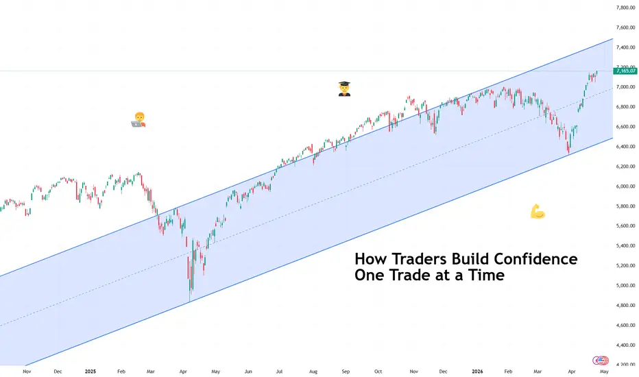
How Traders Build Confidence One Trade at a TimeAnd how you can too.
🧭 Confidence Starts Smaller Than You Think
Confidence in trading rarely arrives as a dramatic breakthrough moment. It usually begins quietly, somewhere between a well-timed entry and a disciplined exit that followed the plan exactly as intended.
Many traders expect confidence to appear after a winning streak. In practice, it grows from consistency rather than excitement. One correctly executed trade builds trust. Two reinforce it. Ten start to feel like structure instead of luck.
Confidence forms when your process begins to feel familiar.
📊 The First Ingredient Is a Repeatable Plan
A repeatable plan means knowing what conditions justify entering a trade and what conditions suggest waiting. Traders sometimes call this a ‘setup,’ which simply describes a recognizable pattern or environment that increases probability.
When traders follow setups consistently, outcomes become easier to interpret. A losing trade feels manageable because it still followed the rules. A winning trade becomes meaningful because it confirms the approach.
Confidence grows faster when decisions feel intentional rather than improvised. (And yes, that includes no revenge trading .)
🧠 Small Wins Train the Mind
Early confidence rarely comes from large profits or the hot trade of the day . It develops through smaller moments that prove discipline works. Waiting patiently for a setup. Respecting position size. Closing a trade according to plan instead of emotion.
These actions build psychological stability. Stability is a big one because markets constantly test patience, timing, and expectations. Sometimes, more than most people can handle.
Over time, repetition turns uncertainty into familiarity, and familiarity makes decisions calmer.
⏳ Reviewing Trades Builds Real Clarity
Professional traders treat review as part of the strategy rather than an afterthought. Looking back at past trades helps identify patterns that charts alone cannot reveal.
A trading journal, which could simply be a record of entries, exits, and reasoning, often becomes one of the most powerful confidence tools available. It transforms memory into evidence. Evidence strengthens conviction.
Confidence feels stronger when supported by observation rather than guesswork.
📉 Losses Still Play a Role
Losses contribute to confidence when they occur inside a structured plan. A controlled loss confirms that risk management is working as intended. Risk management refers to limiting how much capital is exposed on any single idea so that no individual trade can cause lasting damage.
Traders who manage risk effectively begin trusting their ability to stay consistent across changing market conditions (think a wild earnings season or surprise economic data ).
🚀 Confidence Changes How Trades Feel
As confidence grows, hesitation begins to fade. Entries feel clearer. Position sizes feel more appropriate. Decisions arrive with less urgency and more perspective.
Confidence isn’t predicting the market correctly every time — no one can do that, not even your favorite hedge fund bro. It means understanding your approach well enough to execute it without second-guessing each move.
🎁 OK, But How?
Confidence develops through repetition, structure, and reflection rather than dramatic breakthroughs. Each disciplined trade adds another layer of trust between the trader and the process.
Over time, those layers become something powerful: the quiet certainty that you can navigate uncertainty one decision at a time.
Off to you : How do you know you’ve developed enough confidence to be a successful trader? Share your approach in the comments!
S&P Index Cash CFD (USD)
No trades
In-depth trading ideas
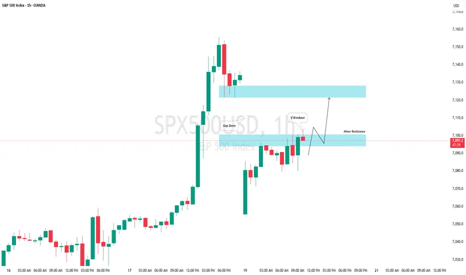
S&P500 (US500): Another Gap to Trade TodayThe ⚠️US500 opened with a gap down.
My signal to buy will be a bullish breakout of a minor intraday horizontal resistance.
A close of an hourly candle above 7100 would confirm a violation, and a bullish continuation would then be anticipated, at least to the 7122 level.
Could be a trade topIt's possible we topped today. If so, the market should keep dropping under 7k. If they hold 7k, then it's just a pullback and we'll go higher for sure. My feeling is things may go south very quickly. The president has another deadline for Iran on Wednesday, the market is probably waiting mostly to see how that latest development resolves.

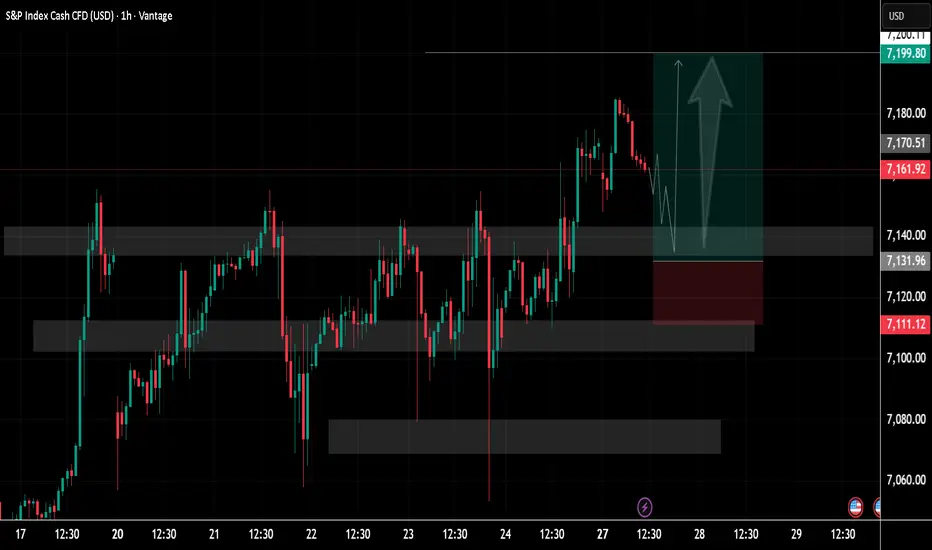
SP500 Price Update – Clean & Clear ExplanationS&P 500 in a structured bullish setup forming after a period of consolidation.
Price action has been ranging between multiple clearly marked zones, with repeated reactions from both demand and supply areas. Earlier sessions show choppy movement, but the market gradually builds higher lows and higher highs, signalling a shift toward bullish control.
A strong impulsive move upward breaks above the mid-range resistance, followed by a modest pullback. The highlighted grey zones represent key support and resistance levels, with the current price hovering just above a previously tested resistance—now acting as potential.
The projected path shows a temporary dip (liquidity grab or retest) before a continuation upward, aligning with a classic break-and-retest bullish structure.
Ps; Support with like and comments for better analysis Thanks for Supporting.
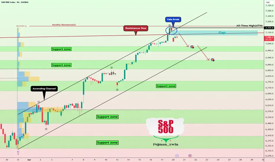
S&P 500 Index After ATH — Correction or Just a Pause?As we begin the trading week, it's good to take a look at a key financial market index—namely, the S&P 500 index ( FX:SPX500 )—because the cryptocurrency market, including Bitcoin ( BINANCE:BTCUSDT ), is closely correlated with it—especially when the index moves with strong momentum.
Before diving into technical analysis of the S&P 500, we should note that tensions in the Middle East could reignite between Iran and the U.S., and so far, a second round of negotiations hasn’t been confirmed. If talks fail, traders could fear renewed conflict, which may cause the S&P 500 to drop again.
The S&P 500 hit a new all-time high last week. However, with the start of this week, a Gap($7,134-$$7,101)—likely a breakaway gap—formed, and the index began to fall, failing to break the resistance line.
From an Elliott Wave perspective, wave 5 may have completed above the upper line of the ascending channel, so we may anticipate a short-term correction in the coming hours.
Additionally, this week is heavy with earnings reports, with around 50 S&P 500 companies reporting, including Intel, Boeing, Tesla, and Procter & Gamble.
I expect the S&P 500 could drop at least to $7,026, and if the decline is strong, we might see a break of the ascending channel and further drops.
First Target: $7,026
Second Target: $6,933
Stop Loss(SL): $7,156(Worst)
Points may shift as the market evolves
What’s your view on the S&P 500 index—will it create new all-time highs again, or are we looking at another correction?
💡 Please respect each other's opinions and express agreement or disagreement politely.
📌 S&P 500 Index Analyze (SPX500USD), 4-hour time frame.
🛑 Always set a Stop Loss(SL) for every position you open.
✅ This is just my idea; I’d love to see your thoughts too!
🔥 If you find it helpful, please BOOST this post and share it with your friends.
US500 and the Trap of Shorting StrengthMarkets pushing into new highs during periods of intense uncertainty can feel uncomfortable. When headlines are heavy and price continues to grind higher, the instinct for many is to start looking for a top, questioning whether the move has gone too far.
In practice, strong markets rarely reverse simply because they feel ‘detached from reality’. More often, they continue to trend, and it’s the traders trying to fade that strength too early who end up on the wrong side of the move.
The mistake most traders make
There’s a tendency to confuse discomfort with opportunity. When price is holding near highs while macro risks dominate the narrative, it can create the impression that the market is out of sync with reality. That belief often leads to premature short positioning without any real confirmation from price.
The issue is that markets don’t turn because they should. They turn when order flow shifts, and that shift needs to be visible in the price action. Until then, strength is not something to fight, it’s information. A breakout that holds, a trend that continues to print higher highs, and a market that absorbs negative headlines without breaking down all point to underlying demand rather than exhaustion.
This is where many traders get caught out. They lean on the narrative and anticipate a reversal, rather than waiting for the market to show signs of one. In doing so, they repeatedly step in front of a trend that hasn’t finished.
What the market is actually saying
Looking at the current structure in the S&P 500, price is still behaving constructively. The market has pushed into new highs and, importantly, is holding above the breakout area. There hasn’t been a meaningful rejection or any shift in structure that would suggest sellers are gaining control.
That doesn’t mean the backdrop is clean. Far from it. Geopolitical tensions remain elevated, negotiations continue to stall, and energy markets are still feeding through into inflation expectations and rate sensitivity. But the key point for traders is how price is responding to that backdrop.
US500 Daily Candle Chart
Past performance is not a reliable indicator of future results
Even with fresh headlines around the extension of the ceasefire and the continued build-up in the region, the reaction in equities has been relatively contained. There’s been a slight softening, but no real deterioration in structure. If anything, it appears to reinforce the idea that dips are still being absorbed rather than extended.
That’s the nuance that matters. The market isn’t ignoring what’s happening, it’s simply not responding to it in a bearish way. Until that behaviour changes, the path of least resistance remains higher, whether that feels comfortable or not.
What needs to change before a short makes sense
If the aim is to trade a turn rather than guess one, the focus has to shift from opinion to observable behaviour. A strong market only becomes a short when there’s clear evidence that the underlying strength is starting to fade.
That evidence tends to show up through a combination of signals:
• A breakout that fails and closes back within its prior range
• A sequence of lower highs after a push to new highs
• Momentum divergence aligning with weakening price structure
Even then, it’s not just about spotting the shift, it’s about timing the entry. Rather than reacting to the first sign of weakness, it often pays to wait for a clear trigger. That might be a decisive pause or small consolidation following a failed move or a break below a trendline, with risk defined above the recent high and targets aligned with the next area of support. At that point, the structure itself defines the key reference levels on both sides.
The key is that none of this is anticipatory. It’s reactive. The market has to show its hand first.
Building a repeatable process
The real challenge with counter-trend trading isn’t spotting the idea, it’s having the discipline to wait for it to set up properly. Strong trends naturally create the urge to act early, particularly when the narrative feels compelling.
A more consistent approach is to treat strength as a filter rather than a signal. When the market is trending cleanly and holding above key areas, the default stance is to respect that strength. Only when the structure begins to shift, through failed moves and weakening momentum, does the focus turn to opportunities on the other side.
This creates a simple but effective framework:
• Recognise when the market is trending and avoid the temptation to fade it too early
• Wait for clear signs of structural change
• Act only once price confirms the shift
It’s not about catching the exact top. It’s about aligning with what the market is doing, not what it feels like it should be doing.
Disclaimer: This is for information and learning purposes only. The information provided does not constitute investment advice nor take into account the individual financial circumstances or objectives of any investor. Any information that may be provided relating to past performance is not a reliable indicator of future results or performance. Social media channels are not relevant for UK residents.
Spread bets and CFDs are complex instruments and come with a high risk of losing money rapidly due to leverage. 81.31% of retail investor accounts lose money when trading spread bets and CFDs with this provider. You should consider whether you understand how spread bets and CFDs work and whether you can afford to take the high risk of losing your money.
SPX Probable Move In Coming WeeksIMO, this is the most likely path for SPX over the coming weeks. I am expecting this move to complete around June/July, followed by a bear market rally into August, before we potentially search for a bottom in September/October 2026.
I would appreciate your thoughts - do you agree or disagree with this technical outlook, and what’s your perspective on the market in the weeks and months ahead?

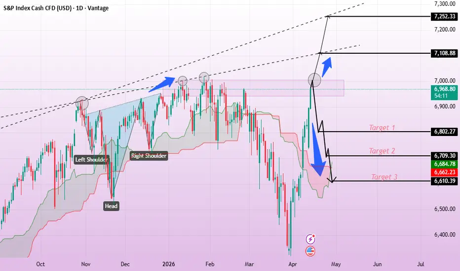
Buyers vs Sellers Battle on S&P 500The S&P 500 chart highlights a critical decision zone following a strong bullish recovery from recent lows 📈. Price previously formed an inverse head and shoulders pattern, signaling a shift in market sentiment toward buyers. The recent impulsive move upward reflects strong buying pressure; however, the index is now facing rejection near a key resistance zone 🔍. This area is acting as a barrier, creating uncertainty in the short term. If buyers gain enough momentum to break above this resistance, the bullish continuation is likely, with targets at 7,108 and 7,252 🚀. Conversely, if price fails to sustain above current levels, a corrective move could unfold. In that scenario, bearish targets come into play at 6,802, followed by 6,709 and 6,610 📉. Overall, the market remains in a consolidation phase, awaiting a decisive breakout for the next directional move ⚡.
If you found this XAUUSD analysis helpful, don’t forget to LIKE 👍 and COMMENT 💬!
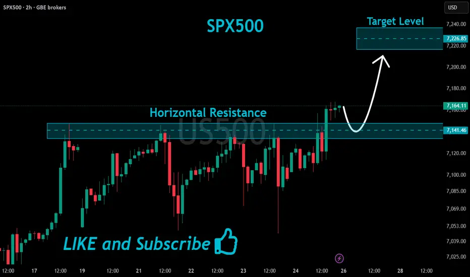
SPX500 Will Keep Growing!
HI,Traders !
#US500 is trading in an
Uptrend and the price
Made a bullish breakout
Of the key horizontal
Level of 7141.46 and the
Breakout is confirmed so
We are bullish biased
And we will be expecting
A further bullish continuation !
Comment and subscribe to help us grow !
Kelly Criterion: Why You SHOULD Use Leverage — And By How MuchHow much should you allocate to a certain investment? How much should you leverage?
If you have $10,000 available to invest, how much should you put into a stock like Tesla, and how much should go into an index fund like the S&P 500?
Most investors have no idea what the optimal allocations are to maximize their returns.
"Tesla stock? I'll put $5,000. S&P? Let's do $2,000."
Don't ask them why. They wouldn't know how to answer. And that's exactly why they're leaving huge profits on the table.
In this educational TradingView post, I will show you how much you should allocate to that Tesla stock and why you should use leverage (yes, leverage) to invest in the S&P 500 index fund.
The Expected Value Equation That Most Investors Ignore
There are two types of investors: those who calculate their EV and make money, and those who ignore it and lose money.
You probably have that friend who said they were going to buy a meme coin or a stock because it could go up 100x. The problem? They didn't calculate the probabilities.
There's less than a 0.1% chance that a meme coin/stock delivers 100x returns. So investing in a meme coin is more like a gamble with a very negative Expected Value.
Here's how you calculate the EV of this bet:
EV = (prob. success x exp. returns) + (prob. loss x exp. returns)
EV = (0.001 × 10,000%) + (0.999 × -100%) = 10% - 99.9% = -89.9%
In other words, you would lose an average of 89.9% of your capital by making this bet repeatedly over time.
But there are also good bets — ones with a positive EV. For example, the annual EV of an S&P 500 ETF like SPY is around 11%:
E V = (0.75 × +19%) + (0.25 × -11%) = 11%
Now that you have a positive EV bet in front of you, the question becomes: how much should you leverage it?
If an asset has a positive expected value, you're leaving money on the table by not leveraging it. But there's an extremely fine balance:
Too much leverage will destroy you.
Too little, and you're missing out on gains.
The Kelly Criterion: Your Leverage GPS
Harry Markowitz, the father of Modern Portfolio Theory, once said: "The only free lunch in investing is diversification."
He was half right. There's a second free lunch he missed: optimal leverage.
Diversification reduces risk, but Kelly leverage maximizes growth.
The Kelly Criterion, originally formulated by John Kelly Jr., answers an extremely important question that 99% of investors never ask: "What leverage maximizes the long-term growth of my portfolio?"
Here's the formula:
Optimal Leverage (f*) = Expected Return (μ) / Volatility² (σ²)
In simple terms:
Expected Return (μ) = How much you expect to gain per year. The more you can gain, the higher the leverage potential.
SPY: 10% annual return → Higher leverage potential
Bonds: 4% annual return → Lower leverage potential
Volatility² (σ²) = How much the asset's price swings — squared. The higher the volatility, the lower the leverage you can safely use.
SPY: 18% volatility → (0.18)² = 0.0324
Bitcoin: 90% volatility → (0.90)² = 0.81
The ratio between these two gives you the optimal leverage:
High return + Low volatility = Use MORE leverage
High return + High volatility = Use LESS leverage
Low return + High volatility = Use NO leverage
Example:
SPY: 10% / (18%)² = 10% / 0.0324 = 3.1x optimal leverage
Bitcoin: 80% / (90%)² = 80% / 0.81 = 0.99x optimal leverage (barely 1x!)
What You See on the Chart
Applied to SPY (S&P 500 ETF), the leverage/growth curve passes through different zones: underinvesting, optimal sizing, high risk, never logical, and suicidal.
Underinvesting means you're being too conservative and leaving money on the table — like holding SPY at 1x when the optimal leverage is 3x.
Optimal Sizing is the sweet spot where you use some leverage, but not too much. This is usually where half-Kelly falls — and what most experienced investors use.
High Risk involves higher leverage and sits close to what's mathematically optimal. But this could be too high if there's a crash tomorrow — use with extreme caution.
Never Logical means risk far outweighs reward, and expected growth actually declines as you take on more leverage.
Suicidal means guaranteed capital destruction over time. Even coming close to these levels is almost certain to cost you money.
How to Use the Kelly Criterion Curve
Step 1: Load the Indicator
Load the indicator on an index ETF, stock, or crypto. Set the lookback period to a realistic value — I like to use 2,000 days for long-term investing on a daily chart.
Step 2: Find Your Leverage Sweet Spot
Optimal Kelly: Maximum long-term growth (but very aggressive)
½ Kelly: Gives you 75% of the max growth with only 50% of the volatility (this is what I usually target)
Step 3: Implement with Leveraged ETFs
Say QQQ shows Optimal Kelly = 3x and 1/2 Kelly at 1.5x. What comes next depends on your risk appetite:
If you're very adventurous, use TQQQ (3x leveraged QQQ ETF).
Or go with QLD (2x leveraged QQQ ETF).
Or use a combination of cash + QQQ + QLD or TQQQ to reach your desired leverage.
You could also use a margin account or futures, but these are riskier and harder to manage.
The Truth About 1x Investing
Here's what 99% of investors don't know: if an asset has a positive expected value, 1x (no leverage) is mathematically suboptimal.
For SPY:
At 1x leverage, your expected growth rate is far from optimal.
At 2x leverage, you fall into the optimal sizing zone.
At 3x leverage, you're close to Kelly's optimal.
Here's what would have happened if you'd applied this over the last 15 years with S&P 500 leveraged ETFs:
1x leverage with SPY: 765% return
2x leverage with SSO: 2,973% return
3x leverage with UPRO: 7,200% return 😲
Leverage does increase volatility — but it also increases returns. And these excess returns outweigh the added volatility. If you can stomach that volatility over time, it's a win.
But better returns are not guaranteed:
Drawdowns are psychologically brutal
There's path dependency: if you start using leverage now and the market crashes tomorrow, you'll be in a tough spot
We can't predict black swans
That's why I like to combine leveraged ETFs with DCA.
Using the Kelly Criterion Across Different Assets
I got hooked on Kelly Criterion math after reading the paper Alpha Generation and Risk Smoothing using Managed Volatility by Tony Cooper . Cooper shows that over very long periods, applying leverage would have improved returns.
According to the paper, these were the optimal leverages:
S&P 500 (SPY): 3x leverage
Dow Jones: 2x leverage
Nasdaq-100 (QQQ): 2x leverage
Russell 2000 (IWM): 2x leverage
My indicator shows similar results:
S&P 500 (SPY): Optimal Kelly of 3.3x — pretty close to the 3x in the paper.
Nasdaq-100 (QQQ): Optimal Kelly of 2.99x — higher than the 2x in Cooper's paper. I'd still go for something closer to half Kelly.
Russell 2000 (IWM): Optimal Kelly at 1.8x, very close to the 2x in Cooper's paper.
You can also apply it to individual stocks and crypto:
Tesla: Despite good performance, Tesla is fairly volatile. The indicator shows an Optimal Kelly of 0.94x — basically no leverage.
Bitcoin: Full Kelly at 0.9x — also no leverage. This makes sense — many people who leveraged Bitcoin at "only" 2x lost everything in November 2025.
Most investors use 1x leverage simply because it's a round number and because it's what's readily available. That's not how hedge funds invest.
This piece of math puts you closer to how they invest: with mathematical precision and in a systematic manner.
But most investors will read this, nod along, and do nothing.
You now have the math. Use it to improve your returns.

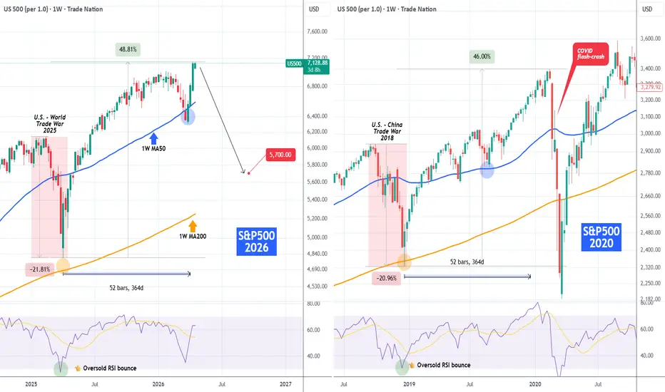
S&P500 Is Trump's post-Trade War pattern about to hit stocks??The S&P500 index (SPX) since the 2025 Trade War, has been displaying a similar pattern as the post 2018 Trade War. Both events caused by President Trump, both resulting into a -21% correction towards the 1W MA200 (orange trend-line) that eventually gave way to a 1-year +46% recovery.
Notice how on both Trade War bottoms, the 1W RSI got oversold (30.00) and bounced. We had at least one test of the 1W MA50 (blue trend-line) in between, and that brings us to today, 1 year after and at +48.80% from the April 2025 Trade War bottom.
Needless to say the February - March 2020 flash-crash was caused by the COVID outbreak (and subsequent quarantines), which is a Black Swan event that cannot be projected. But the two fractals undeniably look very similar technically and based on the technical side, another 1W MA200 test to get the 1W RSI oversold again, wouldn't be unrealistic (potentially above 5700). Especially with the 4-year Cycle model kicking in. Could a reversal on the U.S. - Iran war be the catalyst or something else (inflation, Fed rate hiking)? That remains to be seen.
---
** Please LIKE 👍, FOLLOW ✅, SHARE 🙌 and COMMENT ✍ if you enjoy this idea! Also share your ideas and charts in the comments section below! This is best way to keep it relevant, support us, keep the content here free and allow the idea to reach as many people as possible. **
---
Disclosure: I am part of Trade Nation's Influencer program and receive a monthly fee for using their TradingView charts in my analysis.
💸💸💸💸💸💸
👇 👇 👇 👇 👇 👇
Why I Don’t Trade Credit Spreads Like Most TradersMost traders love credit spreads for one reason: they look clean.
Limited risk.
Defined reward.
Time decay working in the background.
High probability on paper.
It sounds like the perfect income strategy.
But in real markets, I think the standard credit spread is deeply flawed.
Because most traders are not really trading credit spreads. They are selling a little premium and hoping the market stays quiet long enough to let them keep it.
That is not robustness.
That is fragility disguised as probability.
## The hidden weakness of standard credit spreads
The classic setup is simple: sell a far out-of-the-money spread, collect a premium, and assume price probably will not reach your strikes.
And most of the time, that assumption works.
Until it does not.
That is the trap.
The “unexpected” move is never treated seriously enough by most traders. But over time, unexpected events become inevitable. Volatility returns. Trend days happen. News hits. Positioning breaks. Markets stretch farther and faster than people model for.
When that happens, the standard credit spread reveals its true structure:
* small gains collected slowly
* large losses when price finally breaches the zone
* very little flexibility once the position is under pressure
So while traders tell themselves they are “just collecting premium,” they are still making a directional bet.
They still need the market to cooperate.
And when it stops cooperating, they usually have only three choices:
* cut the loss
* roll the trade
* or keep hoping
None of these are powerful choices.
## Even iron condors don’t solve the real problem
Many traders think iron condors fix this by selling premium on both sides.
I disagree.
Iron condors do not remove fragility. They just distribute it.
Now instead of being vulnerable in one direction, you are vulnerable in both. One aggressive move is enough to break one side, and the small collected credits often do not justify the stress and asymmetry of the risk.
So the usual retail logic becomes:
collect small premiums consistently, then try to survive the day the market stops behaving.
That is not how I want to trade.
## I like the idea of credit spreads — but not the standard structure
There is a reason traders are attracted to credit spreads in the first place.
Selling premium is powerful.
Capital efficiency is powerful.
Theta is powerful.
I agree with all of that.
What I disagree with is the standard equal-leg structure.
Most traders build credit spreads with a simple one-to-one design: one short leg, one long leg.
That is where the problem starts.
Because equal-leg structures are efficient when the market stays controlled, but fragile when the market becomes disorderly.
And real markets become disorderly all the time.
## My approach: ratio-based premium structures
Instead of using a standard one-to-one credit spread, I prefer ratio-based structures such as:
* 1:2
* 1:3
* 3:4
The exact ratio depends on the market, implied volatility, and how much opposite-side protection I want.
This is the key shift.
I still keep the best part of the credit spread idea: premium selling and efficient ROI.
But I do not trap myself inside a fragile one-direction structure.
By using uneven legs, I can build a position that is much more anti-fragile.
## What anti-fragile means here
A fragile trade needs the market to behave.
An anti-fragile trade has a way to benefit when the market behaves differently than expected.
That is exactly why I like ratio structures.
With a standard credit spread, if your direction is wrong, the trade is usually just wrong.
With a ratio structure, if the move completes hard in the opposite direction, the extra uneven protection can start working for you.
That means the trade can still make money even when the initial premium-selling direction was wrong.
That is a completely different game.
Now the structure is not relying on perfect prediction.
Now disorder itself can become useful.
That is real edge.
## Yes, the premium-side ROI may be lower
Of course, there is a tradeoff.
When you buy extra protection compared to a standard credit spread, you often lower the raw premium collected.
So if all someone cares about is maximizing immediate premium ROI, the ratio structure may look less attractive.
But that is short-term thinking.
Because what you gain is far more valuable:
* stronger hedge on the opposite side
* less dependence on perfect direction
* better survival in volatile conditions
* more flexibility when the market makes a bigger move
I will gladly accept slightly less premium if it buys me much more robustness.
That is a trade worth making.
And if the structure is better hedged, I can also size more intelligently without exposing myself to the same level of fragility as a standard spread.
## The real weak point: death valley
This does not mean ratio-based spreads are magic.
They have their own weak point.
The main risk is what I call the **death valley** — the zone between the short leg and the extra long protection.
That is the uncomfortable area where the move is too large for simple premium decay to fully save you, but not large enough for the extra protection to fully take over.
That is the area that requires respect.
But even here, I still prefer this framework because the structure gives me more flexibility. In some cases, I can convert it back toward a more standard credit spread profile to reduce that death-valley risk.
So even the weakness is more manageable than the typical retail setup of collecting pennies while hoping chaos stays away.
## This is still credit spread thinking — just upgraded
In the bigger picture, this is still part of the same family.
I still want:
* premium income
* efficient use of capital
* strong return on deployed risk
But I want it through uneven-leg structures, not equal-leg structures.
That one design decision changes everything.
Equal-leg credit spreads are built to profit from calm.
Ratio-based structures are built to survive and even benefit from disorder.
And in markets, disorder matters more than calm.
## The result that changed my conviction
Using this approach, I was able to generate about **$2,000 from a $15,000 account consistently**, roughly **13% return**, without needing to perfectly guess market direction every time.
That matters.
Because the point is not to worship prediction.
The point is to build structures where being wrong does not automatically destroy the trade.
There were times when my initial premium-selling direction was outright wrong.
And I still made money from the opposite side.
That is the power of anti-fragility.
## Final takeaway
Most traders use credit spreads as a fragile income strategy.
They collect premium while secretly hoping nothing unusual happens.
I prefer to use ratio-based spread structures that keep the premium-selling logic, but add asymmetry and protection so that bigger moves do not automatically become disasters.
The crowd sells premium and prays for stability.
I want a structure where instability can still pay me.
That is how I like to trade credit spreads.

Sunday - MondayPossibility of a move to 7k is strong in my opinion. Oil also looks like it will test 100 dollars on WTI

US500 — 5 Waves Completed → Corrective Phase Incoming?The structure from the April lows appears clean.
We can count a completed 5-wave impulsive move:
Wave (1) off the lows
Sharp Wave (2) retracement
Extended Wave (3) with strong momentum
Controlled Wave (4) consolidation above the 50 EMA
Final push into Wave (5), now approaching exhaustion
This is not random price action.
This is textbook impulsive structure.
What matters now
Once a 5-wave sequence completes, the market typically transitions into a corrective phase (ABC).
Key level to watch:
👉 7,011 area
This level acts as:
Prior structure
Potential Wave A target
Decision zone for buyers
Expected scenario
If this count is correct, the path forward looks like:
A → initial pullback into support
B → relief bounce (often traps late buyers)
C → final leg lower, deeper correction
Important nuance
This is NOT necessarily a bearish reversal.
This is a correction within a broader structure.
Meaning:
Trend traders → risk of getting trapped late
Mean reversion traders → opportunity phase
Position traders → wait for confirmation
Bottom line
The edge here is not predicting direction.
It’s recognizing where we are in the cycle.
Right now:
👉 Late impulse → early correction transition
If price starts losing structure below 7,011,
the ABC scenario gains probability quickly.
Until then, this remains a controlled distribution phase.

S&P 500 - H4 - Elliott Wave Analysis• Amateurs see red candles and assume the worst.
• Professionals see corrections as normal market behavior within a larger trend.
• Amateurs trade their emotions during pullbacks.
• Professionals use corrections to position for the next move.

S&P500: Rejection at the top of the 1H Rectangle?S&P500 is strongly bullish on its 1D technical outlook (RSI = 64.887, MACD = 4.540, ADX = 28.361), being on a rally following the recent S1 bounce. This is a 1H Rectangle pattern with already 4 confirmed points of contact. Being so close to its top (R1), the index technically eyes a new bearish wave to the S1 (TP = 7,050). That move can potentially test the 1H MA200.
See how our prior idea has worked out:
## If you like our free content follow our profile to get more daily ideas. ##
## Comments and likes are greatly appreciated. ##

SNP500 500 shorts(SELL)The trading plan is on the charts
Been trading 4years now
So this is currently my analyses for us500.
take it or leave it... LETS FUCKING GO
GODS PLAN


S&P 500 looking Overbought S&P 500 Beginning to Look Overbought…
The S&P is currently sitting in extreme overbought territory (95–96%), while the MACD continues to trend higher. This combination typically signals a short-term pullback within a broader bullish structure.#Traders
📊 Key Takeaways & Strategy
• We remain in a buy-the-dips environment following the break of the rounding top formation
• However, multi-timeframe overbought conditions (Weekly & Monthly) suggest a classic exhaustion phase is approaching #marketpsychology
📍 Support Zones to Watch
7026 – 6996 → Primary dip-buying region
6955 → Deeper support if momentum fades
6782 / 6741 → Cluster of moving averages
6707 → Critical 200-day moving average
📍 Resistance & Upside Levels
Daily Pivot: 7131 (current trading level)
R1: 7177
R2: 7206
R3: 7232
Trend Channel Top: 7280
Fib Extension (23.6%): 7352 #Fibonacci
📈 Outlook
As we push into uncharted territory, Pivot Points and Fibonacci extensions become key for identifying resistance.
A controlled pullback over the coming sessions would be constructive before any sustained move higher. #retailtrading
Holding above the Daily Pivot (7131) keeps the bullish structure intact. A failure below opens the door for a deeper retracement toward key support levels.
👀 All eyes now shift to the US session, where volatility is likely to pick up and define the next move.#proptrading
This remains a tactical market — disciplined positioning is key.
⚠️ This is not investment advice.
My Money. My Risk. #tradingstrategy #S&P500 #MarketOutlook #IndexTrading

The trend is NOT your friend!32 Million Tests Exposed What Supertrend Actually Does
"The trend is your friend." It is the first thing retail traders learn and the last thing they question. The sentence is intuitive, almost comforting. It promises that you do not need to predict the future, you just need to recognize the present direction and ride along. The Supertrend indicator, one of the most downloaded on TradingView, is the purest expression of this idea: a single line that tells you which way the market is going. Green means up. Red means down. Follow along and the trend will take care of you.
But does it? Academic finance has studied momentum effects for decades, and the findings are more nuanced than the retail version of the story. The momentum effect is real, one of the most robust anomalies in financial economics. The distance between "momentum exists as a documented factor" and "this indicator on your chart tells you when to buy" is what this study measures.
We tested 32,751,398 Supertrend configurations across 14 assets, five strategies, and 35 holding horizons. The goal was not to confirm or dismiss the indicator, but to understand exactly where it contains information and where it does not. The answer turned out to be more interesting than a simple yes or no. The Supertrend does contain real, statistically robust structure, but the structure is not where most traders look for it. It lives in the distance between price and the Supertrend line, not in the direction the line points. And that finding connects to a pattern this series has been documenting since the VWAP study: the consistent edge in technical analysis is not in following the trend. It is in recognizing when the trend has been stretched too far.
Abstract
We test five common Supertrend trading strategies across 14 liquid ETFs spanning five asset categories. From 32,751,398 parameter configurations covering ATR periods from 3 to 150, multipliers from 0.5 to 8.0, and holding periods from 1 to 252 trading days, we find 1,410,697 results surviving Bonferroni correction at alpha equal to 1.53 times ten to the negative ninth power. The aggregate long edge is positive 0.26 percentage points and the aggregate short edge is negative 0.63 percentage points. These averages are dominated by one strategy. Distance entry, where positions are taken when price is far from the Supertrend line, produces long edge of positive 0.67 percentage points with 877,891 Bonferroni-significant long results and negative short edge of minus 1.29 percentage points with 484,670 significant short results. Together, distance-based results account for 1,362,561 of the 1,410,697 total Bonferroni results, a concentration of 96.6 percent. The direction flip signal, the strategy retail traders most commonly associate with Supertrend, produces zero Bonferroni-significant results from 2,248,014 tests. The confirmation strategy produces zero from 11,240,600 tests. The Supertrend indicator contains genuine structure, but that structure is mean reversion from trend overextension, not trend following. This result extends the pattern documented across the previous five studies in this series and provides a concrete framework for building strategies around overextension from dynamic reference levels.
1. Introduction
The Supertrend indicator was developed by Olivier Seban and popularized through trading platforms in the mid-2000s. It places a single adaptive line above or below price, calculated from the Average True Range, that flips direction when price crosses it. When price is above the Supertrend line, the indicator is bullish and the line sits below price as dynamic support. When price is below, the indicator is bearish and the line sits above as resistance. The visual output is clean and unambiguous: a green line below price means buy, a red line above means sell.
This visual clarity made Supertrend one of the most popular indicators on TradingView. It appears in countless strategy scripts, tutorial videos, and trading courses. The appeal is the appeal of all trend-following tools: it promises to keep you on the right side of the market and tell you exactly when the trend has changed.
The indicator builds on a sound mechanical foundation. The Average True Range, introduced by Wilder (1978), measures the actual trading range of an asset, incorporating gaps between sessions. By using ATR rather than a simple moving average of price, the Supertrend adapts to volatility. In calm markets, the line sits close to price and flips frequently. In volatile markets, it gives price more room and flips less often. This adaptive behavior is a genuine improvement over fixed-threshold trend indicators.
What the indicator does not guarantee is that following its signals generates above-average returns. A Supertrend that flips to bullish at the start of a rally has identified the trend. Whether buying at that flip point produces returns above what you would have earned by holding the asset regardless is a separate, empirical question. The academic momentum literature, which we examine in section 8, provides context: momentum as documented in peer-reviewed research and momentum as implemented through a Supertrend on a single chart are different claims. Testing which aspects of the indicator contain real information requires the kind of exhaustive parameter search we conduct here.
2. What Supertrend measures
The Supertrend calculation begins with the Average True Range:
True Range = max(High - Low, |High - Previous Close|, |Low - Previous Close|)
ATR is an exponential moving average of True Range over n periods:
ATR(n) = (1/n) * TR + (1 - 1/n) * ATR(n-1)
The Supertrend then computes two bands around the midpoint of the current bar:
Upper Band = (High + Low) / 2 + factor * ATR(n)
Lower Band = (High + Low) / 2 - factor * ATR(n)
The Supertrend line itself is determined iteratively. In an uptrend, the line equals the lower band but never decreases: it ratchets upward as long as price stays above it. In a downtrend, the line equals the upper band but never increases: it ratchets downward as long as price stays below it. When price crosses the Supertrend line, the direction flips and the line jumps to the opposite band.
The standard parameterization uses an ATR period of 10 and a factor of 3.0. Unlike Bollinger Bands, where the standard 20/2 setup was specified by the creator, there is no canonical Supertrend parameterization. Different platforms default to different values, and the trading community uses a wide range. This ambiguity is itself worth testing: if the indicator works, it should work across a broad parameter space, not only at one specific setting.
The mathematical structure of the Supertrend is worth examining relative to other indicators in this series. RSI and MACD transform closing prices. Bollinger Bands use closing prices but access a second-order statistic through standard deviation. Supertrend uses high, low, and close, and accesses volatility through ATR. ATR is a first-order statistic of the trading range, not a second-order statistic of return dispersion. It measures how much the asset moved, not how dispersed the returns were around their mean. This is a subtler distinction than it appears. Bollinger Band width reflects return variance. ATR reflects absolute price range. Both capture some aspect of volatility, but through different lenses. Whether this matters for predictive power is part of what the data reveals.
3. Common Supertrend strategies
We tested five strategies representing how retail traders and systematic strategy builders use the Supertrend indicator.
The trend following strategy generates a long signal whenever the Supertrend direction is bullish and a short signal when it is bearish. This is the simplest interpretation: be long when the line is green, be short when the line is red. It tests the fundamental claim of the indicator, that the direction classification contains information about future returns.
The direction flip strategy generates signals only at the moment of transition. A long signal fires when the Supertrend changes from bearish to bullish. A short signal fires at the opposite transition. This is the strategy that produces the green and red arrows on TradingView charts. It tests whether the timing of the flip, rather than the ongoing state, contains predictive power.
The band bounce strategy identifies moments when price is very close to the Supertrend line in the direction of the trend. In an uptrend, price occasionally pulls back to nearly touch the rising Supertrend line before resuming higher. Traders interpret this as the trend line acting as dynamic support. A long signal fires when price is within 0.5 percent of the Supertrend line during a bullish regime. The short equivalent fires during bearish regimes.
The distance entry strategy measures how far price has moved from the Supertrend line and generates signals when the distance exceeds a threshold. In a bullish regime, large distance means price has rallied well above the Supertrend. In a bearish regime, it means price has fallen well below. Seven distance thresholds from 1 to 10 percent are tested. This strategy tests whether overextension from the trend line contains information about subsequent returns.
The confirmation strategy requires the Supertrend to have maintained the same direction for a specified number of consecutive bars before generating a signal. The idea is that new trends are unreliable and only established trends are worth following. Five confirmation thresholds from 2 to 10 bars are tested.
Of these five, the first three represent how retail traders actually use the indicator. The direction flip is the default signal. The trend filter is used in conjunction with other indicators. The bounce is the "buy the dip to the trendline" approach taught in courses. The distance and confirmation strategies are less common in retail practice but represent systematic extensions of the indicator's logic.
4. Data and methodology
4.1 Asset universe
We tested the same 14 liquid ETFs used in the Bollinger Band study: SPY, QQQ, IWM, and DIA for US equities; EFA, EEM, and VWO for international equities; GLD and SLV for commodities; TLT for bonds; XLV, XLE, XLF, and XLK for sectors.
All data is daily, sourced from TwelveData with Tiingo as fallback, covering approximately 5,000 trading days per asset.
4.2 Parameter grid
ATR periods range from 3 to 150 in steps of 1, giving 148 values. Multipliers range from 0.5 to 8.0 in steps of 0.25, giving 31 values. This produces 4,588 unique Supertrend configurations per asset. Holding periods span 35 values from 1 to 252 trading days: 1, 2, 3, 4, 5, 6, 7, 8, 9, 10, 11, 12, 13, 14, 15, 16, 18, 20, 22, 25, 28, 30, 35, 40, 45, 50, 60, 75, 90, 100, 120, 150, 180, 200, and 252. Distance thresholds use 7 values from 1 to 10 percent. Confirmation bars use 5 values from 2 to 10 consecutive bars.
The total configuration count across 14 assets is 33,721,800 target tests. After filtering for sufficient data length and minimum signal counts, 32,751,398 valid tests remain.
4.3 Forward return measurement
Edge is measured as the difference between mean forward returns following a signal and mean forward returns across all bars in the same asset sample. This baseline adjustment ensures that strategies in rising markets do not receive credit for capturing beta. A Supertrend long signal in SPY that produces the same return as holding SPY has zero edge. The indicator must beat the baseline, not merely be positive.
4.4 Statistical framework
Significance is assessed using Welch's t-test for unequal variances. Given 32,751,398 tests, the Bonferroni-corrected significance threshold is 1.53 times ten to the negative ninth power. This is the strictest correction applied in the series. A result surviving this threshold would occur by chance fewer than once in 650 million tries under the null hypothesis.
5. Results
5.1 Overview
Figure 1 presents the aggregate view. The distance strategy produces a wide positive distribution on the long side and a wide negative distribution on the short side, dominating the chart. Trend, flip, bounce, and confirmation strategies cluster tightly around zero on both sides.
Across all 32,751,398 tests, mean long edge is positive 0.26 percentage points and mean short edge is negative 0.63 percentage points. The positive aggregate long edge and the negative aggregate short edge both come from the same source: the distance strategy, which captures a long-biased mean reversion effect. Remove the distance strategy, and the remaining 17,974,824 tests produce aggregate long edge of negative 0.07 percentage points and short edge of negative 0.06 percentage points. Indistinguishable from zero.
5.2 Results by strategy
The direction flip is the strategy retail traders most associate with the Supertrend. It is the green arrow. From 2,248,014 tests, mean long edge is negative 0.24 percentage points and mean short edge is negative 0.17 percentage points. Bonferroni-significant results: zero. The flip signal does not contain predictive information about future returns beyond what holding the asset already provides. If someone asks "does buying on the Supertrend flip beat holding?", the answer across 2.2 million configurations is no. This does not mean the indicator is broken. It means the flip event itself is not where the information lives. The data points somewhere else, and we get there in the distance results below.
The confirmation strategy extends the flip logic by requiring the Supertrend to maintain direction for N bars before entering. From 11,240,600 tests, mean long edge is negative 0.06 percentage points and mean short edge is negative 0.16 percentage points. Bonferroni-significant results: zero. Waiting for the trend to establish itself delays the entry without adding signal. Section 6 explains the mechanical reason for this.
The trend following strategy, staying positioned with the Supertrend direction, produces a nuanced result. From 2,248,120 tests, mean long edge is negative 0.003 percentage points and short edge is negative 0.049 percentage points. Both are economically zero. However, 15,845 long results and 32,170 short results survive Bonferroni correction. The explanation is sample size: the trend strategy holds positions for extended periods, generating thousands of signal bars per configuration. The t-test can detect tiny deviations from zero with enough observations. The finding is real but too small to trade. It does confirm that the Supertrend direction classification is not random, it captures something, just not enough to build a strategy on by itself.
The bounce strategy tests whether the Supertrend line acts as dynamic support and resistance. From 2,238,090 tests, mean long edge is negative 0.05 percentage points and mean short edge is positive 0.31 percentage points. 121 total Bonferroni-significant results. The line shows trace evidence of a support/resistance function, but at a scale that is not practically useful. The Supertrend line is a better reference level for measuring distance than for identifying touch points.
The distance entry strategy produces the results. From 14,776,574 tests, mean long edge is positive 0.67 percentage points with 877,891 Bonferroni-significant results. On the short side, mean edge is negative 1.29 percentage points with 484,670 significant results.
Long edge of positive 0.67 percentage points means: when the Supertrend is bullish and price is far above the line, buying produces returns that exceed baseline by 0.67 percentage points on average. Strong momentum tends to persist at medium to long horizons. Short edge of negative 1.29 percentage points means: when the Supertrend is bearish and price is far below the line, the market tends to bounce. Downside overextensions correct.
Both findings point in the same direction: the market gives back extreme moves. Long-side distance captures momentum persistence combined with the equity risk premium. Short-side distance captures mean reversion from panic-driven overshoot. The Supertrend line, because it adapts to volatility through ATR, provides a useful reference for quantifying how far "too far" is.
Together, distance-based results account for 1,362,561 of the 1,410,697 total Bonferroni results: 96.6 percent. This concentration matters for strategy design: the Supertrend contains real information, but it is concentrated in one specific usage pattern that differs from the way most tutorials teach the indicator.
5.3 Statistical significance
The p-value distribution departs from uniformity, with 18.2 percent of long signals and 20.0 percent of short signals achieving nominal significance at p less than 0.05. These rates are roughly 3.5 to 4 times the chance level of 5 percent. After Bonferroni correction, 893,804 long and 516,893 short results survive, the highest absolute count in the series. But the count is misleading without context. Almost all significant results come from the distance strategy, not from the strategies that traders actually use.
5.4 Results by asset category
International equities show the strongest effects: long edge positive 0.53 and short edge negative 0.89 percentage points. US equities follow with long edge positive 0.40 and short edge negative 0.67 percentage points. Sector ETFs show long edge positive 0.16 and short edge negative 0.70 percentage points.
Commodities are nearly flat: long edge positive 0.005 percentage points and short edge negative 0.32 percentage points. The Supertrend distance effect is an equity phenomenon. Commodities, driven by supply shocks and mean-reverting inventory cycles, do not exhibit the same long-biased overextension pattern.
Bonds show the only reversal: long edge negative 0.22 percentage points and short edge near zero. Being positioned with a bullish Supertrend in TLT generates returns below baseline. Bond dynamics are dominated by central bank policy and duration risk, neither of which an ATR-based trend indicator captures.
5.5 Parameter sensitivity
The parameter landscape reveals a pattern consistent with the previous studies. Long edge increases with holding period, particularly for ATR periods between 10 and 60. Short edge is negative across nearly the entire grid, deepening at longer holding periods. The strongest long effects appear at moderate ATR periods combined with holding periods of 60 to 252 days.
Figure 7 isolates the holding period dimension. Long edge is near zero for holding periods under 10 days and increases steadily to approximately 0.7 percentage points at the 252-day horizon. Short edge starts slightly negative and deteriorates continuously, reaching approximately negative 1.5 percentage points at longer horizons. The message is consistent with the distance strategy interpretation: short-term Supertrend signals carry no edge, while long-horizon positions capture the long bias filtered through the indicator's trend classification.
6. Why the flip signal fails and what that teaches us
Understanding why the flip produces no edge is more useful than simply knowing that it does not. The mechanical reason is whipsawing. The Supertrend flips when price crosses the line, but the line itself is a function of recent ATR. In choppy, range-bound markets, price oscillates around the Supertrend repeatedly. Each crossing triggers a flip. Each flip fires a signal into a market that is going nowhere.
The Supertrend has no filter for market regime. In a trending market, flips are infrequent and directionally meaningful. In a choppy market, they are frequent and random. An ATR-based line cannot distinguish between the two states: trend volatility and range volatility look the same to it. Huang, Li, Wang, and Zhou (2020) showed that trend-following profits are concentrated in high-uncertainty states. An indicator that fires signals regardless of regime averages across states where it has edge and states where it has negative edge, and the average is approximately zero.
This explains why the confirmation strategy also fails: by the time the Supertrend has been bullish for 10 consecutive bars, the move has already happened. The entry is later, the remaining edge smaller, and the noise reduction does not compensate for the timing cost.
Zakamulin (2014) found the same pattern for moving average strategies: after accounting for data snooping, most crossing rules lose significance. The Supertrend adds ATR-based adaptation, which is a genuine sophistication, but adaptation to volatility does not solve the fundamental problem. What does solve it is asking a different question: not "which direction is the trend?" but "how far has price moved from the trend?" That question leads to the distance strategy, where the edge lives.
7. Why the distance effect exists
On the long side, positive distance in a bullish regime means price has rallied well above the rising Supertrend line. This configuration appears during strong momentum periods: sharp rallies following corrections, earnings-driven gaps, and macro-driven sector rotations. The data shows that these momentum periods tend to persist at medium to long horizons, consistent with Moskowitz, Ooi, and Pedersen (2012).
On the short side, negative distance in a bearish regime means price has fallen well below the declining Supertrend line. This appears during panic selloffs, credit events, and cascading liquidations. Returns following deep bearish overextension are significantly above baseline, meaning shorts lose money. This is the same mean reversion from extremes documented in the Bollinger Band and VWAP studies.
The asymmetry between long and short distance effects is notable: positive 0.67 versus negative 1.29 percentage points. Short-side mean reversion is roughly twice as strong as long-side momentum persistence. Drawdowns are faster and sharper than rallies, creating more pronounced overextension on the downside and stronger reversion when selling pressure exhausts.
The Supertrend line serves a genuine purpose here, just not the one most traders expect. The ATR-based adaptation scales the reference level to current volatility, which makes it a good instrument for measuring "how far is too far." That property is valuable for strategy design. The finding applies to any volatility-adaptive reference level, but the Supertrend's clean visual output makes it one of the most practical implementations on TradingView.
8. What the academic literature tells us about making this work
The academic momentum literature provides a roadmap, not for dismissing the Supertrend, but for understanding how to extract value from trend-based analysis.
Jegadeesh and Titman (1993) documented cross-sectional momentum: stocks that outperformed over 3 to 12 months tend to continue outperforming. Moskowitz, Ooi, and Pedersen (2012) extended this to time-series momentum across 58 futures contracts. Both findings are robust and widely replicated. Momentum is real.
The gap between the academic evidence and the retail Supertrend experience comes from three specific differences. First, the academic version trades dozens of instruments simultaneously. Diversification across uncorrelated markets is itself a source of risk reduction that a single-chart application forfeits. Second, the academic version uses simple past returns as the signal, not an ATR-based indicator with specific parameters. The measurement is simpler and less susceptible to overfitting. Third, Baltas and Kosowski (2013) showed that momentum profits depend on the rebalancing window: long lookbacks with infrequent rebalancing capture the effect, while short lookbacks with frequent rebalancing generate mostly transaction costs.
These are not reasons to abandon trend analysis. They are design specifications. The distance strategy result in this study is consistent with the academic findings: it captures momentum at longer horizons (60 to 252 days), it works across multiple assets, and it measures overextension rather than directional flips. A trader who wants to use the Supertrend profitably can use the academic literature as a checklist: diversify across assets, extend the holding period, and focus on the distance from the line rather than the direction of the line.
9. Where Supertrend fits in the series
Six indicators. Ninety-nine million tests. One framework. The comparison across studies reveals a pattern that is becoming increasingly useful for strategy design:
RSI: zero Bonferroni-significant results from 26 million tests.
Turn of the Month: 21 significant results from 385 tests. A real calendar anomaly.
VWAP: 150,546 significant results. Distance-from-mean edge of 0.89 percentage points (short).
MACD: 3,235 significant results. Histogram divergence long edge of 0.32 percentage points.
Bollinger Bands: 320,256 significant results. Band penetration long edge of 1.22 percentage points.
Supertrend: 1,410,697 significant results. Distance-based long edge of 0.67 percentage points.
The three strongest findings, VWAP, Bollinger, and Supertrend, all share the same structure: they measure how far price has deviated from a dynamic reference level. VWAP uses a volume-weighted mean. Bollinger uses a standard deviation envelope. Supertrend uses an ATR-adjusted trend line. Different reference levels, same principle: when price moves far from where the data says it typically sits, it tends to correct.
This is not a negative finding. It is a blueprint. The data across 99 million tests consistently points to overextension as the exploitable structure in technical indicators. That gives traders something specific to look for and build on.
10. How to use this
The data across 32.8 million tests gives specific, actionable guidance for anyone working with the Supertrend or building trend-based strategies.
Use the Supertrend as a reference level, not a signal generator. The ATR-based line adapts to volatility, which makes it a strong yardstick for measuring how stretched price is relative to the current regime. The direction flip does not beat holding. But the distance between price and the line identifies conditions with genuine statistical edge. That reframing, from "follow the arrow" to "measure the distance," is the practical takeaway.
Focus on longer holding periods. The distance effect is near zero at short horizons and grows steadily toward 60 to 252 day holdings. This aligns with the academic momentum literature: the effect operates at medium to long horizons, not at the daily level where most retail strategies live.
Diversify the application. The distance effect is strongest in equities, weaker in commodities, and absent in bonds. A strategy built on Supertrend distance across multiple equity ETFs captures diversification benefits that a single-chart approach cannot access.
Combine with a regime filter. A Supertrend distance signal that activates only during elevated VIX or widening credit spreads targets the market state where the effect is strongest.
The broader principle from this series is now well-established: the overextension from a dynamic reference level, whether that reference is a volume-weighted mean, a standard deviation band, or an ATR-adjusted trend line, is where exploitable structure consistently appears in technical indicators. That gives traders a clear direction for strategy development, grounded in 99 million tests across six indicators.
11. Limitations
The analysis uses daily data only. Supertrend is frequently applied to intraday timeframes, particularly the 15-minute and 1-hour charts. The indicator may behave differently at higher frequencies where intraday momentum dynamics differ from daily patterns.
The study tests each strategy in isolation. Combining Supertrend direction with other indicators, volume filters, or volatility regime detection could alter results. The distance strategy in particular might benefit from conditional filters that distinguish between momentum-driven and mean-reverting market states.
Execution is assumed at the close of the signal bar. In practice, Supertrend flips are often visible only after the bar closes, meaning the realistic entry is the next day's open. Overnight gaps could reduce or augment the observed effects.
Transaction costs were not deducted from the edge figures. For the distance strategy's long edge of 0.67 percentage points, round-trip costs of 0.10 to 0.15 percentage points leave a net edge of approximately 0.52 to 0.57 percentage points. This is positive but not large, and it deteriorates further for less liquid instruments or higher rebalancing frequencies.
12. Conclusion
32,751,398 configurations. Five strategies. Fourteen assets. The Supertrend indicator contains real, statistically robust information. It is just not in the signal that most traders use.
The direction flip and confirmation strategies produce zero Bonferroni-significant results. The bounce strategy produces negligible results. These are the strategies taught in tutorials and coded into default scripts. They do not beat holding the asset.
The distance strategy produces 1,362,561 significant results with long edge of 0.67 percentage points and short-side mean reversion of 1.29 percentage points. The Supertrend line, because it adapts to volatility through ATR, serves as an effective reference level for measuring overextension.
This study completes six indicators and 99 million tests. The consistent finding across the series is that indicators contain the most useful information when they measure how far price has deviated from a dynamic reference, not when they generate directional signals. VWAP, Bollinger Bands, and now Supertrend all point to the same principle.
The trend is your friend in the academic sense. Momentum is a documented and robust factor in financial markets. But the Supertrend indicator, as it is typically used on a single chart, captures that factor most effectively through distance measurement, not through the green and red arrows. The trend is the reference line. The opportunity is the deviation from it. And that distinction is the foundation for building strategies that the data actually supports.
References
Baltas, A.N. and Kosowski, R. (2013). Momentum strategies in futures markets and trend-following funds. European Financial Management, 19(3), pp. 1-44.
Huang, D., Li, J., Wang, L. and Zhou, G. (2020). Time series momentum: Is it there? Journal of Financial Economics, 135(3), pp. 774-794.
Jegadeesh, N. and Titman, S. (1993). Returns to buying winners and selling losers: Implications for stock market efficiency. Journal of Finance, 48(1), pp. 65-91.
Moskowitz, T.J., Ooi, Y.H. and Pedersen, L.H. (2012). Time series momentum. Journal of Financial Economics, 104(2), pp. 228-250.
Wilder, J.W. (1978). New Concepts in Technical Trading Systems. Trend Research, Greensboro, NC.
Zakamulin, V. (2014). The real-life performance of market timing with moving average and time-series momentum rules. Journal of Asset Management, 15(4), pp. 261-278.

Time to BUY SPX500 NOWFor weeks the spx500 has been dropping to the downside, but ever since the ceasefire has happened it has become very bullish! The price is likely to keep heading upwards with the ongoing talks with IRAN / US. The price has broken through powerful resistance levels and is now very likely to hit the next fibonacci extension level (acting as resistance AND our next take profit level). BUY NOW!

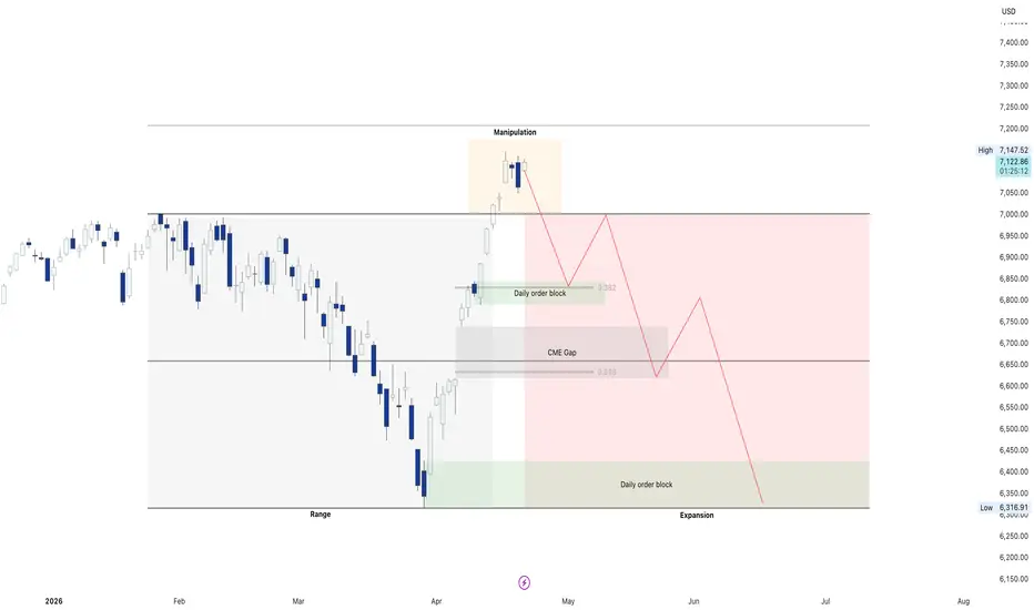
SPX - Wyckoff Distribution SchematicWith the recent developments unfolding over the weekend regarding the geopolitical situation, this could mark the final step of distribution (according to the Wyckoff Distribution Schematic) before the sustained downtrend begins.
On Friday I outlined for both BTC and ETH how the Iran deal could end up being a classic "buy the rumor, sell the news" event. The same applies to the S&P 500, and I will walk through each phase of distribution, how price has been tracking it, and the past ideas that support this hypothesis.
PS — Preliminary Supply
The first sign that large sellers are beginning to enter the market. Volume increases but price still pushes higher.
BC — Buying Climax
The peak of retail euphoria. Smart money aggressively sells into this final push higher, usually accompanied by a volume spike. In my analysis, this occurred on October 30, 2025 before the index dropped 5.75% in less than a month. Back in June 2025, when price was still trading at $6,085, I outlined that the S&P 500 would top around the 1.618 extension at $6,965 before the end of the year:
The S&P reached the Buying Climax around $6,921 on October 30, 2025 which is right in line with that prediction.
AR — Automatic Reaction
The first sharp drop after the BC, establishing the lower boundary of the trading range. This set the Automatic Reaction low at $6,550 which also happened to be the early October low before the push to the BC, creating a short-term double bottom at that level. I identified this level as important back in early March and labeled it as the "First Target" for a breakdown:
ST — Secondary Test
Price rallies back toward the BC high but fails to exceed it, confirming supply is still in control. This is where price created a lower high at $6,903 on December 11, 2025 before falling back to $6,720 on December 17, 2025.
Upthrust
A false breakout above the trading range designed to trap breakout buyers and give institutions more liquidity to sell into. I outlined this multiple times as price continued to get rejected at the 1.618 extension level with sellers overwhelming buyers:
Minor Sign of Weakness
The first break below trading range support, confirming distribution is complete. I outlined this breakdown beginning here:
Once price broke below the $6,550 AR level it created the Minor Sign of Weakness with a low of $6,317, before climbing back above the AR level and completing that phase of distribution.
Upthrust After Distribution
A second and more powerful false breakout above the range. The final liquidity grab before the markdown begins. Once headlines emerged declaring the war was over and the Strait of Hormuz was reopening, markets surged with optimism and the S&P 500 rallied to a high of $7,148 which perfectly aligns with this phase.
Now that peace talks appear to be failing and escalation is ramping back up, this could be the perfect scenario to fulfill the UTAD and validate the "sell the news" theory I outlined in my Friday BTC and ETH ideas:
If this plays out and the S&P reclaims the price range below the BC level and the 1.618 extension, this entire move to the upside will be considered a "false breakout".
LPS — Last Point of Supply
The next phase that should theoretically follow is a weak rally after the range breaks down, failing well below prior highs. This is where the red circle is highlighted on the schematic which would be the final opportunity for late shorts to enter.
Major Sign of Weakness
The accelerated breakdown and beginning of the sustained markdown phase before a true bottom is established. If this occurs, the (extended support targets outlined in the green box) from this idea could come into play:
One Final Note — Post Q1 Midterm Fractals
Something worth pointing out before wrapping up. Around this time of year in midterm election years, we have historically seen some sort of selloff begin. If this is indeed a top for the S&P 500, it would have been established on April 17th, 2026.
Looking back at 2022, price created a pivot high on April 21st before a 19.5% decline that lasted until June 15th:
Looking back at 2018, a pivot high formed on April 18th before a 4.5% decline lasting until May 3rd:
If a top does end up forming on April 17th, I find it remarkably interesting that it would align with a similar time fractal seen in the past two midterm years. What I am projecting would likely be a longer-term correction than what we saw in 2018 but either way, it is a noteworthy data point worth keeping in mind.
I am interested to hear others' opinions on this hypothesis. Is the top in, or will the S&P defy expectations and continue pushing toward new highs at $7,400? Let me know your thoughts in the comments below.
